
ENGR 1330 Computational Thinking with Data Science
Copyright © 2021 Theodore G. Cleveland and Farhang Forghanparast
Last GitHub Commit Date:
30: Regression using Exponential, Logarithmic, and Power-Law Models
Logarithmic charts
Exponential data models
Logarithmic data models
Power-Law data models
Logarithmic Charts
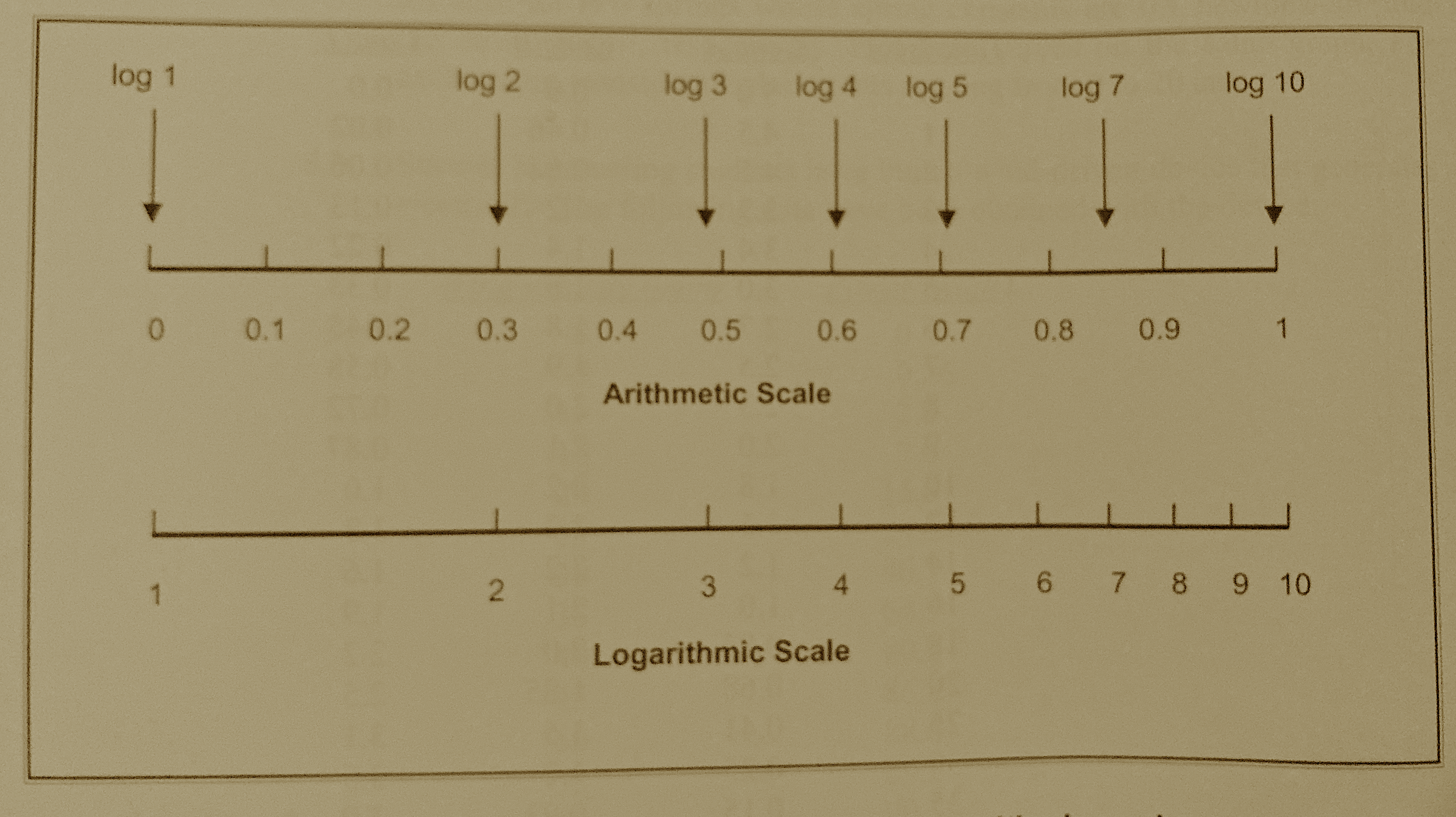
Fig. 14 Comparison of arithmetic and logarithmic scales
Semi-Log Charts
A graph in which the y-axis (the ordinate) has a logarithmic scale and the x-axis (the abcissa) has an arithmetic scale is called a semi-log graph. The orientation can be reversed (x-axis log scale, y-axis arithmetic scale) and it is still called a semi-log graph. Semi-log graphs are used in many diverse fields including engineering, chemistry, physics, biology, and economics.
Consider a capacitor whose discharge history is given by
\(V(t) = 10.0~e^{-0.5~t}\)
over the interval of 0 to 10 seconds.
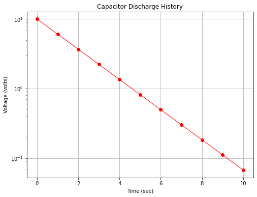
Fig. 15 is a plot of the capacitor voltage versus time (with markers at some computation points). Observe there is distinct curvature in the plot.
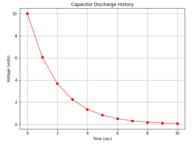
Fig. 15 An arithmetic plot of capacitor discharge voltage history
However if we plot with the y-axis (voltage) on a logarithmic scale we obtain Fig. 16 which displays as a straight line on the plot.
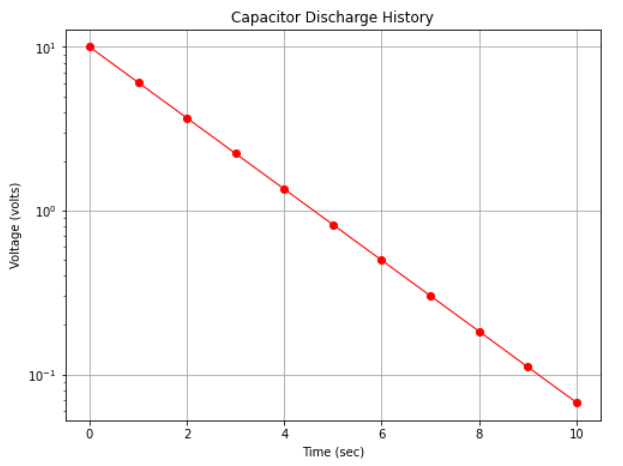
Fig. 16 A semi-log plot of capacitor discharge voltage history
Note
The data in the two plots are identical, only how the scales were rendered is different. We would also have found a straight line in arithmetic space if we plotted log(y) versus x on the arithmetic scale.
Semi-log plots are used for two primary reasons:
The range of the y-values is large, spanning several orders of magnitude (powers of 10); for example in Fig. 16 the y-axis ranges a bit beyond \(10^{-1}\) to \(10^{+1}\) (and is thus called a 3-cycle semi-log graph).
Exponential phenomenoa appear as straight lines when plotted on a semi-log graph. Many natural and engineered phenomenoa are well modeled by this relationship. Thus if data plot as a roughly straight line on a semi-log plot, that itself is convinging evidence that an exponential-type data model will be a good choice to examine as a prediction engine for the process.
To learn why the capacitor discharge history plots as a straight line consider the meaning of the logarithmic scale.
If we start with our data model: \(V(t) = 10.0~e^{-0.5~t}\)
Then take the log of the equation: \(log(V(t)) = log(10.0~e^{-0.5~t})\)
Then apply rules of exponents and logarithms: \(log(V(t)) = log(10.0)+log(e^{-0.5~t})\)
Again: \(log(V(t)) = log(10.0)-0.5~t*log(e)\)
Evaluate the \(log(e)\) and replace with the resulting constant: \(log(V(t)) = 1-0.5*0.434*t\)
Perform remaining arithmetic: \(log(V(t)) = 1-0.2171*t\)
We now have the equation of the logarithm of voltage in terms of time and some constants.
Example 7-6
The example below generates the two figures above. First figure Fig. 15. Define a function that evaluates \(V(t) = 10.0~e^{-0.5~t}\) then execute the cell to prototype the function.
def func(t):
    import math
    func = 10.0*math.exp(-0.5*t)
    return(func)
Now import our plotting tools (if we have already done so we can skip this step).
# import the package
from matplotlib import pyplot as plt
Now define a list of x-axis values to plot, and create a corresponding list of y-values using the function.
# Create two lists; time  and speed.
time = [0,1.0,2.0,3.0,4.0,5.0,6.0,7.0,8.0,9.0,10.0]
voltage = []
for i in range(len(time)):  # populate the lists using the function
    voltage.append(func(time[i]))
Now we make the plot as in other examples, changing the labels and title.
# Create a line chart of voltage on y axis and time on x axis
mydata = plt.figure(figsize = (8,6)) # build a drawing canvass from figure class; aspect ratio 4x3
plt.plot(time, voltage, c='red', marker='o',linewidth=1) # basic line plot
plt.xlabel('Time (sec)') # label the x-axis
plt.ylabel('Voltage (volts)') # label the y-axis, notice the LaTex markup
#plt.legend(['series1','series2...']) # legend for each series
plt.title('Capacitor Discharge History') # make a plot title
plt.grid() # display a grid
plt.show() # display the plot
Now to construct figure Fig. 16. We literally add a single instruction in the plotting routine to instruct the plotting package to render the y-axis on a logarithmic scale.
# Create a line chart of voltage on y axis and time on x axis
mydata = plt.figure(figsize = (8,6)) # build a drawing canvass from figure class; aspect ratio 4x3
plt.plot(time, voltage, c='red', marker='o',linewidth=1) # basic line plot
plt.yscale('log') # set y-axis to display a logarithmic scale #################
plt.xlabel('Time (sec)') # label the x-axis
plt.ylabel('Voltage (volts)') # label the y-axis, notice the LaTex markup
#plt.legend(['series1','series2...']) # legend for each series
plt.title('Capacitor Discharge History') # make a plot title
plt.grid() # display a grid
plt.show() # display the plot
The chart itself can be used to infer the underlying equation. Notice the model is of the form (structure)
\(\text{ordinate}=\text{constant}+\text{slope}\cdot\text{abscissa}\)
or
\(log~y =\beta_0+\beta_1 \cdot x\)
In the present example \(\beta_0 = 1\) which inverse mapped back to arithmetic space is \(10^{\beta_0} = 10\) The slope \(\beta_1= \frac{log(y_2)-log(y_1)}{x_2-x_1} = \frac{log(y_2/y_1)}{x_2-x_1}\) Using the values at x=0 and x=9.2 for \(x_1\) and \(x_2\) and the corresponding y values the slope is about \(-0.2174\) Knowing that our model should be in base \(e\) logs, we divide by the constant 0.434 (or multiply by 2.303) to obtain 0.5006 so the inverse transformation is
\(y = 10^{\beta_0}*e^{\beta_1 * 2.303 *t} = 10*e^{0.5006~t}\) which is darn close to the generating model.
import math
(math.log10(0.1)-math.log10(10))/(9.2-0)
-0.2173913043478261
Now that we see the value of logarithmic charts, lest devise a scheme to fit data to a logarithmic form.
Exponential Data Models
An exponential model is
where \(\beta_0\) and \(\beta_1\) are the model coefficients to be determined.
If we transform the model to
this result is linear in \(ln\beta_0\) and \(\beta_1\)
The equivalent normal equations are
Example 30-1
The transient behavior of a capacitor has been studied by measuring the voltage drop across the device as a function of time. The following data are observed
Time(sec) |
Voltage(V) |
|---|---|
0 |
10.0 |
1 |
6.1 |
2 |
3.7 |
3 |
2.2 |
4 |
1.4 |
5 |
0.8 |
6 |
0.5 |
7 |
0.3 |
8 |
0.2 |
9 |
0.1 |
11 |
0.07 |
12 |
0.03 |
Fit an exponential function to the data set using a regression model.
Step 1
Prepare the data set, log transform the response variable
t = [0,1,2,3,4,5,6,7,8,9,10,12]
v = [10.0,6.1,3.7,2.2,1.4,0.8,0.5,0.3,0.2,0.1,0.07,0.03]
import math
x = t
y = []
for i in range(len(x)):
    y.append(math.log(v[i]))
Step 2
Load the necessary packages and build a dataframe from the data lists
#Load the necessary packages
import numpy as np
import pandas as pd
import statistics
from matplotlib import pyplot as plt
import statsmodels.formula.api as smf # here is the regression package to fit lines
data = pd.DataFrame({'X':t, 'Y':y}) # we use X,Y as column names for simplicity
data.head()
| X | Y | |
|---|---|---|
| 0 | 0 | 2.302585 |
| 1 | 1 | 1.808289 |
| 2 | 2 | 1.308333 |
| 3 | 3 | 0.788457 |
| 4 | 4 | 0.336472 |
Step 3
Fit a linear model keeping in mind we have a logarithmic component in th design matrix
# Initialise and fit linear regression model using `statsmodels`
model = smf.ols('Y ~ X', data=data) # model object constructor syntax
model = model.fit()
Step 4
Prepare a plot, extract package values for display
# Predict values
y_pred = model.predict()

beta0 = model.params[0] # the fitted intercept
beta1 = model.params[1]
sse = model.ssr
rsq = model.rsquared

titleline = "Capacitor Discharge History \n Data model y = " + str(round(beta0,3)) + " + " + str(round(beta1,3)) + "x" # put the model into the title
titleline = titleline + '\n SSE = ' + str(round(sse,4)) + '\n R^2 = ' + str(round(rsq,3))

# Plot regression against actual data
plt.figure(figsize=(12, 6))
plt.plot(data['X'], data['Y'], 'o')           # scatter plot showing actual data
plt.plot(data['X'], y_pred, 'r', linewidth=1)   # regression line
plt.xlabel('Time (sec)')
plt.ylabel('Ln Voltage (ln V)')
plt.legend(['Observed Values','Data Model'])
plt.title(titleline)

plt.show();
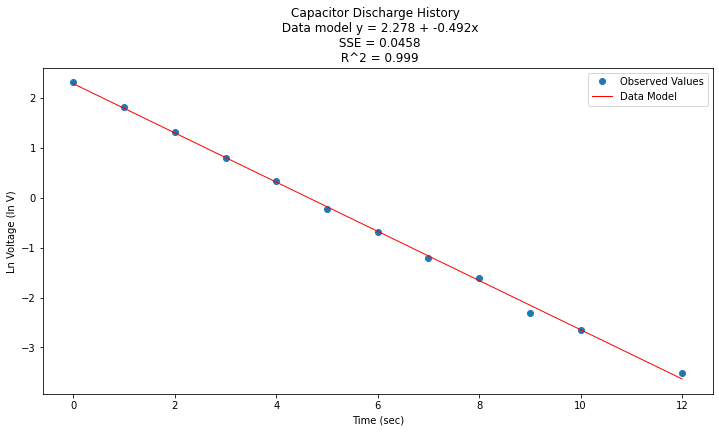
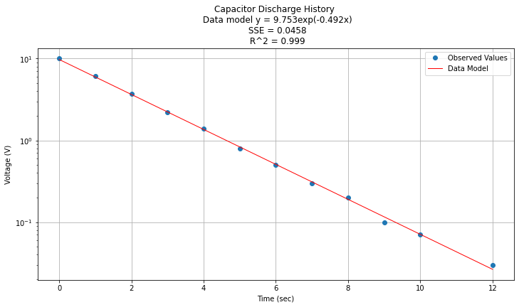
Now to return to original variables:
\(y(x) = e^{\beta_0} e^{\beta_1 x} = e^{2.278} e^{-0.492 x}\)
Now plotted in origional space
data['Yorg']=data['Y'].apply(math.exp)
data['Ymod']=math.exp(beta0)*(beta1*data['X']).apply(math.exp)
#data.head()

titleline = "Capacitor Discharge History \n Data model y = " + str(round(math.exp(beta0),3)) + "exp(" + str(round(beta1,3)) + "x)" # put the model into the title
titleline = titleline + '\n SSE = ' + str(round(sse,4)) + '\n R^2 = ' + str(round(rsq,3))

# Plot regression against actual data
plt.figure(figsize=(12, 6))
plt.plot(data['X'], data['Yorg'], 'o')           # scatter plot showing actual data
plt.plot(data['X'], data['Ymod'], 'r', linewidth=1)   # regression line
plt.yscale('log') # set y-axis to display a logarithmic scale #################
plt.xlabel('Time (sec)')
plt.ylabel('Voltage (V)')
plt.legend(['Observed Values','Data Model'])
plt.grid()
plt.title(titleline)

plt.show();
Logarithmic Functions
Similar to the exponential case, another situation arises when the x-axis is logarithmic. In this case the data model becomes
a least squares minimization leads to the following pair of normal equations
The process of analysis is the same as above except the x-axis is log transformed (and inverse transformed).
Power-Law Models
A power-law model is of the form
The model is incredibly useful in engineering applications.
If the equation is log transformed as before the resulting model is
a least squares minimization leads to the following pair of normal equations
Example 30-2
Consider a chemical engineer examining the rate at which a reactant is consumed in a reaction in the manufacture of a polymer. The following data were obtained showing the reaction rate in moles/second as a function of the reactant moles/liter.
Concentration (mol/l) |
Rate (mol/sec) |
|---|---|
100 |
2.85 |
80 |
2.00 |
60 |
1.25 |
40 |
0.67 |
20 |
0.22 |
10 |
0.072 |
5 |
0.024 |
1 |
0.0018 |
Reaction rates of this type are often modeled using the reactant concentration raised to some power.
Here we will fit a power-law model to the data and report the result. First in this case a plot is in order to get an idea of the relationship.
conc = [100,80,60,40,20,10,5,1]
rate = [2.85,2.00,1.25,0.67,0.22,0.072,0.024,0.0018]
import math
x = conc
y = rate
# Plot regression against actual data
plt.figure(figsize=(12, 6))
plt.plot(x, y, marker='o', linewidth=1)           # scatter plot showing actual data
plt.xlabel('Concentration (M)')
plt.ylabel('Rate (mol/sec)')
#plt.legend(['Observed Values','Data Model'])
plt.grid()
plt.title("Reaction Rate vs Reactant Concentration");
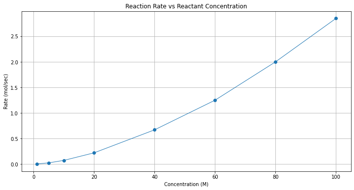
Clearly not a straight line, one could try some log scales (left to the reader - they do straighten out the line)
# Plot regression against actual data
plt.figure(figsize=(12, 6))
plt.plot(x, y, marker='o', linewidth=1)           # scatter plot showing actual data
plt.yscale('log') # set y-axis to display a logarithmic scale #################
plt.xscale('log') # set x-axis to display a logarithmic scale #################
plt.xlabel('Concentration (M)')
plt.ylabel('Rate (mol/sec)')
#plt.legend(['Observed Values','Data Model'])
plt.grid()
plt.title("Reaction Rate vs Reactant Concentration");
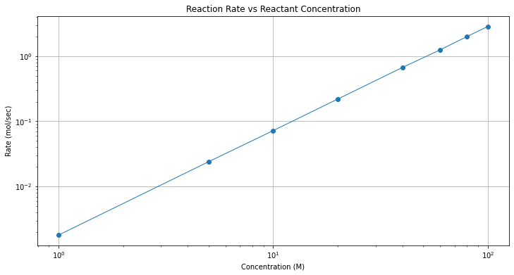
A log-log plot is good evidence that a power-law model might be a good data model.
Now to build the design matrix
data = pd.DataFrame({'X':x, 'Y':y}) # we use X,Y as column names for simplicity
data['lnX']=data['X'].apply(math.log)
data['lnY']=data['Y'].apply(math.log)
data.head()
| X | Y | lnX | lnY | |
|---|---|---|---|---|
| 0 | 100 | 2.85 | 4.605170 | 1.047319 |
| 1 | 80 | 2.00 | 4.382027 | 0.693147 |
| 2 | 60 | 1.25 | 4.094345 | 0.223144 |
| 3 | 40 | 0.67 | 3.688879 | -0.400478 |
| 4 | 20 | 0.22 | 2.995732 | -1.514128 |
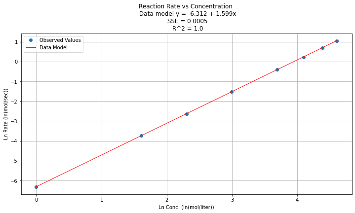
Now fit a linear model to the log-log part of the dataframe
# Initialise and fit linear regression model using `statsmodels`
model = smf.ols('lnY ~ lnX', data=data) # model object constructor syntax
model = model.fit()
Now predict and plot results
# Predict values
y_pred = model.predict()

beta0 = model.params[0] # the fitted intercept
beta1 = model.params[1]
sse = model.ssr
rsq = model.rsquared
titleline = "Reaction Rate vs Concentration \n Data model y = " + str(round(beta0,3)) + " + " + str(round(beta1,3)) + "x" # put the model into the title
titleline = titleline + '\n SSE = ' + str(round(sse,4)) + '\n R^2 = ' + str(round(rsq,4))

# Plot regression against actual data
plt.figure(figsize=(12, 6))
plt.plot(data['lnX'], data['lnY'], 'o')           # scatter plot showing actual data
plt.plot(data['lnX'], y_pred, 'r', linewidth=1)   # regression line
plt.xlabel('Ln Conc. (ln(mol/liter))')
plt.ylabel('Ln Rate (ln(mol/sec))')
plt.legend(['Observed Values','Data Model'])
plt.grid()
plt.title(titleline)

plt.show();
Step 5
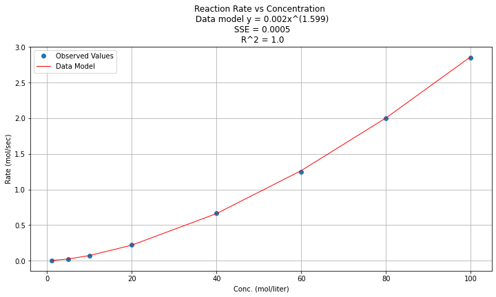
Now to return to original variables:
\(y(x) = e^{\beta_0} x^{\beta_1 } = e^{-6.312} x^{1.599}\)
Now plotted in origional space (but use a log-log scale on both axes)
data['Ymod']=math.exp(beta0)*(data['X']**beta1)
data.head()
| X | Y | lnX | lnY | Ymod | |
|---|---|---|---|---|---|
| 0 | 100 | 2.85 | 4.605170 | 1.047319 | 2.863215 |
| 1 | 80 | 2.00 | 4.382027 | 0.693147 | 2.004008 |
| 2 | 60 | 1.25 | 4.094345 | 0.223144 | 1.265110 |
| 3 | 40 | 0.67 | 3.688879 | -0.400478 | 0.661556 |
| 4 | 20 | 0.22 | 2.995732 | -1.514128 | 0.218390 |
titleline = "Reaction Rate vs Concentration \n Data model y = " + str(round(math.exp(beta0),3)) + "x^(" + str(round(beta1,3)) + ")" # put the model into the title
titleline = titleline + '\n SSE = ' + str(round(sse,4)) + '\n R^2 = ' + str(round(rsq,3))
# Plot regression against actual data
plt.figure(figsize=(12, 6))
plt.plot(data['X'], data['Y'], 'o')           # scatter plot showing actual data
plt.plot(data['X'], data['Ymod'], 'r', linewidth=1)   # regression line
#plt.yscale('log') # set y-axis to display a logarithmic scale #################
plt.xlabel('Conc. (mol/liter)')
plt.ylabel('Rate (mol/sec)')
plt.legend(['Observed Values','Data Model'])
plt.grid()
plt.title(titleline)

plt.show();
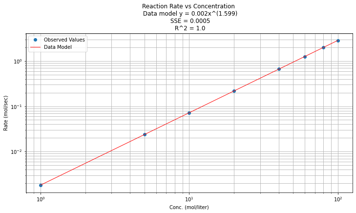
And now on log-log scales
# Plot regression against actual data
plt.figure(figsize=(12, 6))
plt.plot(data['X'], data['Y'], 'o')           # scatter plot showing actual data
plt.plot(data['X'], data['Ymod'], 'r', linewidth=1)   # regression line
plt.yscale('log') # set y-axis to display a logarithmic scale #################
plt.xscale('log') # set x-axis to display a logarithmic scale #################
plt.xlabel('Conc. (mol/liter)')
plt.ylabel('Rate (mol/sec)')
plt.legend(['Observed Values','Data Model'])
plt.grid(which='both')
plt.title(titleline)

plt.show();
Laboratory 30
Examine (click) Laboratory 30 as a webpage at Laboratory 30.html
Download (right-click, save target as …) Laboratory 30 as a jupyterlab notebook from Laboratory 30.ipynb
Exercise Set 30
Examine (click) Exercise Set 30 as a webpage at Exercise 30.html
Download (right-click, save target as …) Exercise Set 30 as a jupyterlab notebook at Exercise Set 30.ipynb