ENGR 1330 Computational Thinking with Data Science
Copyright © 2021 Theodore G. Cleveland and Farhang Forghanparast
Last GitHub Commit Date:
14: Visual display of data
This lesson is a prelude to the matplotlib external module package, used to construct
line charts, scatter plots, bar charts, box plot, and histograms. matplotlib is used herein to generate some different plots; with additional detail in a subseqent lesson.
plot types
plot uses
plot conventions
Objectives
List common plot types and their uses
Identify the parts of a line (or scatter) plot
Define the ordinate, abscissa
Define independent and dependent variables
Define how to plot experimental data (observations) and theoretical data (model)
Marker conventions
Line conventions
Legends
About matplotlib
Quoting from: https://matplotlib.org/tutorials/introductory/pyplot.html#sphx-glr-tutorials-introductory-pyplot-py
matplotlib.pyplot is a collection of functions that make matplotlib work like MATLAB. Each pyplot function makes some change to a figure: e.g., creates a figure, creates a plotting area in a figure, plots some lines in a plotting area, decorates the plot with labels, etc.
In matplotlib.pyplot various states are preserved across function calls, so that it keeps track of things like the current figure and plotting area, and the plotting functions are directed to the current axes (please note that “axes” here and in most places in the documentation refers to the axes part of a figure and not the strict mathematical term for more than one axis).
Computational thinking (CT) concepts involved are:
Decomposition: Break a problem down into smaller pieces; separating plotting from other parts of analysis simplifies maintenace of scriptsAbstraction: Pulling out specific differences to make one solution work for multiple problems; wrappers around generic plot calls enhances reuseAlgorithms: A list of steps that you can follow to finish a task; Often the last step and most important to make professional graphics to justify the expense (of paying you to do engineering) to the client.
Graphics Conventions for Plots
Note
This section needs to have graphics replaced with author generated examples in future editions
Terminology: Ordinate, Abscissa, Dependent and Independent Variables
A few terms are used in describing plots:
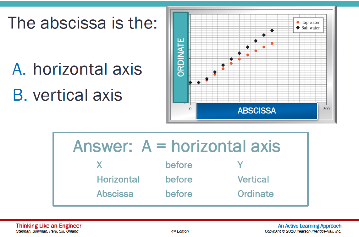
Abscissa – the horizontal axis on a plot (the left-right axis)
Ordinate – the vertical axis on a plot (the up-down axis)
A few terms in describing data models
Independent Variable (Explainatory, Predictor, Feature, …) – a variable that can be controlled/manipulated in an experiment or theoretical analysis
Dependent Variable (Response, Prediction, …) – the variable that measured/observed as a function of the independent variable
Plotting convention in most cases assigns explainatory variables to the horizontal axis (e.g. Independent variable is plotted on the Abscissa) and the response variable(s) to the vertical axis (e.g. Dependent Variable is plotted on the Ordinate)
Conventions for Proper Plots
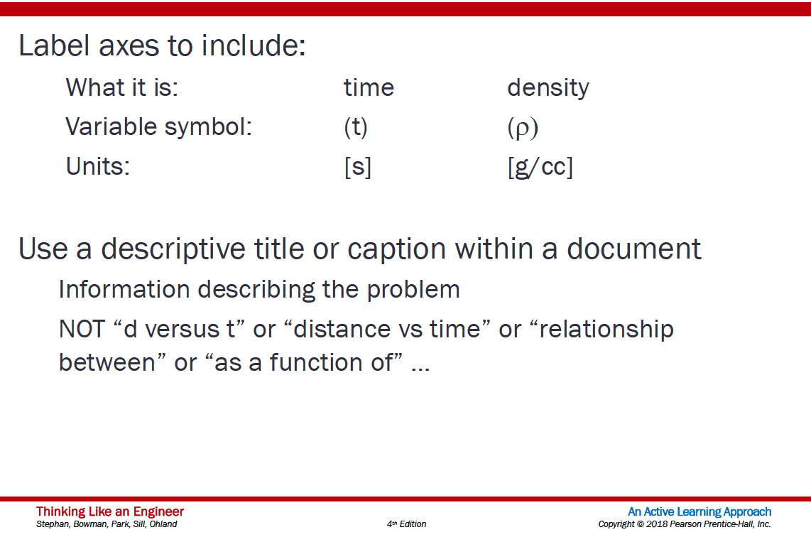
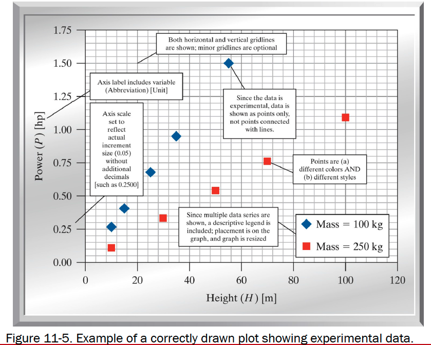
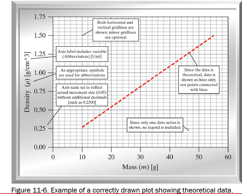
Include a title OR a caption with a brief description of the plot
Label both axes clearly
Include the variable name, the variable, and the unit in each label
If possible, select increments for both the x and y axes that provide for easy interpolation

Include gridlines
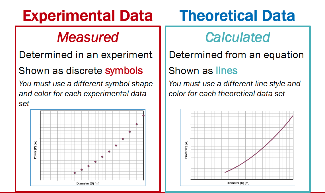
Show experimental measurements as symbols
Show model (theoretical) relationships as lines
Use portrait orientation when making your plot
Make the plot large enough to be easily read
If more than one experimental dataset is plotted
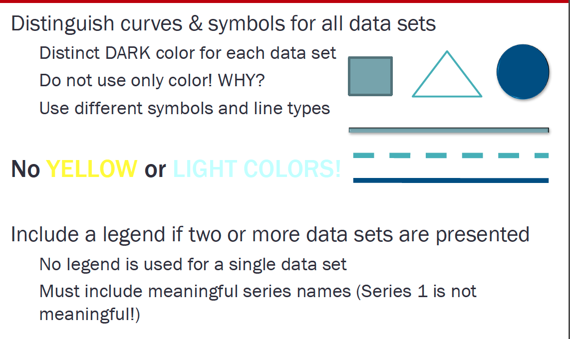
Use different shapes for each dataset
Use different colors for each dataset
Include a legend defining the datasets
Line Charts using matplotlib
A line chart or line plot or line graph or curve chart is a type of chart which displays information as a series of data points called ‘markers’ connected by straight line segments.
It is a basic type of chart common in many fields. It is similar to a scatter plot (below) except that the measurement points are ordered (typically by their x-axis value) and joined with straight line segments.
A line chart is often used to visualize a trend in data over intervals of time – a time series – thus the line is often drawn chronologically.
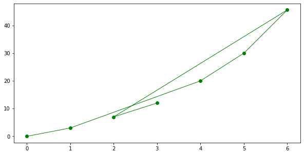
The x-axis spacing is sometimes tricky, hence line charts can unintentionally decieve - so be careful that it is the appropriate chart for your application.
Example
Consider the experimental data below
Elapsed Time (s) |
Speed (m/s) |
|---|---|
0 |
0 |
1.0 |
3 |
2.0 |
7 |
3.0 |
12 |
4.0 |
20 |
5.0 |
30 |
6.0 |
45.6 |
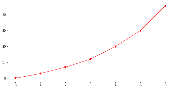
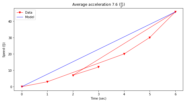
Show the relationship between time and speed. Is the relationship indicating acceleration? How much?
# import the package
from matplotlib import pyplot as plt
# Create two lists; time  and speed.
time = [0,1.0,2.0,3.0,4.0,5.0,6.0]
speed = [0,3,7,12,20,30,45.6]
# Create a line chart of speed on y axis and time on x axis
mydata = plt.figure(figsize = (10,5)) # build a square drawing canvass from figure class
plt.plot(time, speed, c='red', marker='v',linewidth=1) # basic line plot
plt.show()
time = [0,1.0,4.0,5.0,6.0,2.0,3.0]
speed = [0,3,20,30,45.6,7,12]
# Create a line chart of speed on y axis and time on x axis
mydata = plt.figure(figsize = (10,5)) # build a square drawing canvass from figure class
plt.plot(time, speed, c='green', marker='o',linewidth=1) # basic line plot
plt.show()
# Estimate acceleration (naive)
dvdt = (max(speed) - min(speed))/(max(time)-min(time))
plottitle = 'Average acceleration %.1f' % (dvdt) + r' ($\frac{m}{s^2}$)'
seriesnames = ['Data','Model']
modely = [min(speed),max(speed)]
modelx = [min(time),max(time)]
mydata = plt.figure(figsize = (10,5)) # build a square drawing canvass from figure class
plt.plot(time, speed, c='red', marker='v',linewidth=1) # basic line plot
plt.plot(modelx, modely, c='blue',linewidth=1) # basic line plot
plt.xlabel('Time (sec)')
plt.ylabel('Speed '+r'($\frac{m}{s}$)')
plt.legend(seriesnames)
plt.title(plottitle)
plt.show()
Line Charts in Pandas
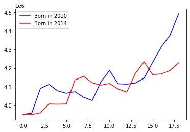
The next few examples use graphics in pandas. The example below uses a database table from census_18.csv
import pandas as pd

df = pd.read_csv('census_18.csv')
df.head()
| AGE | 2010 | 2014 | |
|---|---|---|---|
| 0 | 0 | 3951330 | 3949775 |
| 1 | 1 | 3957888 | 3949776 |
| 2 | 2 | 4090862 | 3959664 |
| 3 | 3 | 4111920 | 4007079 |
| 4 | 4 | 4077551 | 4005716 |
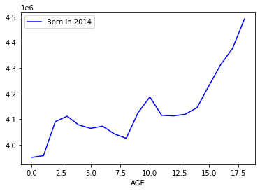
df.plot.line(x="AGE", y="2010", label="Born in 2014", c="blue")
<AxesSubplot:xlabel='AGE'>
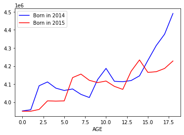
ax = df.plot.line(x="AGE", y="2010", label="Born in 2014", c="blue")
df.plot.line(x="AGE", y="2014", label="Born in 2015", c="red", ax=ax)
<AxesSubplot:xlabel='AGE'>
import matplotlib.pyplot as plt

age = df['AGE']
born2010 = df['2010']
born2014 = df['2014']

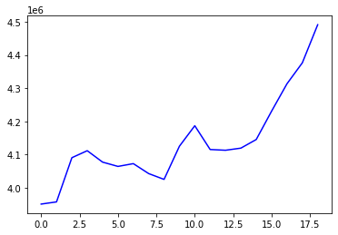
plt.plot(age, born2010, c='blue')
plt.show()
plt.plot(age, born2010, c='blue', label='Born in 2010')
plt.plot(age, born2014, c='red', label='Born in 2014')
plt.legend()
plt.show()
References
Grus, Joel (2015-04-14). Data Science from Scratch: First Principles with Python (Kindle Locations 1190-1191). O’Reilly Media. Kindle Edition.
Call Expressions in “Adhikari, A. and DeNero, J. Computational and Inferential Thinking The Foundations of Data Science” https://www.inferentialthinking.com/chapters/03/3/Calls.html
Functions and Tables in “Adhikari, A. and DeNero, J. Computational and Inferential Thinking The Foundations of Data Science” https://www.inferentialthinking.com/chapters/08/Functions_and_Tables.html
Visualization in “Adhikari, A. and DeNero, J. Computational and Inferential Thinking The Foundations of Data Science” https://www.inferentialthinking.com/chapters/07/Visualization.html
Documentation; The Python Standard Library; 9. Numeric and Mathematical Modules https://docs.python.org/2/library/math.html
Addendum (Scripts that are Interactive)
Note
The addendum is intended for in-class demonstration
# python script to illustrate plotting
# CODE BELOW IS ADAPTED FROM:
# Grus, Joel (2015-04-14). Data Science from Scratch: First Principles with Python
# (Kindle Locations 1190-1191). O'Reilly Media. Kindle Edition.
#
from matplotlib import pyplot as plt # import the plotting library from matplotlibplt.show()

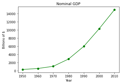
years = [1950, 1960, 1970, 1980, 1990, 2000, 2010]  # define one list for years
gdp = [300.2, 543.3, 1075.9, 2862.5, 5979.6, 10289.7, 14958.3] # and another one for Gross Domestic Product (GDP)
plt.plot( years, gdp, color ='green', marker ='o', linestyle ='solid') # create a line chart, years on x-axis, gdp on y-axis
                                                                       # what if "^", "P", "*" for marker?
                                                                       # what if "red" for color?
                                                                       # what if "dashdot", '--' for linestyle?


plt.title("Nominal GDP")# add a title
plt.ylabel("Billions of $")# add a label to the x and y-axes
plt.xlabel("Year")
plt.show() # display the plot

Now lets put the plotting script into a function so we can make line charts of any two numeric lists
def plotAline(list1,list2,strx,stry,strtitle): # plot list1 on x, list2 on y, xlabel, ylabel, title
    from matplotlib import pyplot as plt # import the plotting library from matplotlibplt.show()
    plt.plot( list1, list2, color ='green', marker ='o', linestyle ='solid') # create a line chart, years on x-axis, gdp on y-axis
    plt.title(strtitle)# add a title
    plt.ylabel(stry)# add a label to the x and y-axes
    plt.xlabel(strx)
    plt.show() # display the plot
    return #null return
# wrapper
years = [1950, 1960, 1970, 1980, 1990, 2000, 2010]  # define two lists years and gdp
gdp = [300.2, 543.3, 1075.9, 2862.5, 5979.6, 10289.7, 14958.3]
print(type(years[0]))
print(type(gdp[0]))
plotAline(years,gdp,"Year","Billions of $","Nominal GDP")
<class 'int'>
<class 'float'>
Example
Use the plotting script and create a function that draws a straight line between two points.
    def Line():
    from matplotlib import pyplot as plt # import the plotting library from matplotlibplt.show()
    x1 = input('Please enter x value for point 1')
    y1 = input('Please enter y value for point 1')
    x2 = input('Please enter x value for point 2')
    y2 = input('Please enter y value for point 2')
    xlist = [x1,x2]
    ylist = [y1,y2]
    plt.plot( xlist, ylist, color ='orange', marker ='*', linestyle ='solid')
    #plt.title(strtitle)# add a title
    plt.ylabel("Y-axis")# add a label to the x and y-axes
    plt.xlabel("X-axis")
    plt.show() # display the plot
    return #null return
Laboratory 14
Examine (click) Laboratory 15 as a webpage at Laboratory 14.html
Download (right-click, save target as …) Laboratory 15 as a jupyterlab notebook from Laboratory 14.ipynb
Exercise Set 14
Examine (click) Exercise Set 15 as a webpage at Exercise 14.html
Download (right-click, save target as …) Exercise Set 15 as a jupyterlab notebook at Exercise Set 14.ipynb
