2. Exploratory Data Analysis#
Course Website
Readings#
Burkov, A. (2019) The One Hundred Page Machine Learning Book Required Textbook
Rashid, Tariq. (2016) Make Your Own Neural Network. Kindle Edition. Required Textbook
Tukey, J (1977). Exploratory Data Analysis. Addison-Wessley (Amazon)
Tukey, J (1977). Exploratory Data Analysis. Addison-Wessley (Copy)
Applications of Statistics in Water Resources (TWRI Book 4 A3)
Chan, Jamie. Machine Learning With Python For Beginners: A Step-By-Step Guide with Hands-On Projects (Learn Coding Fast with Hands-On Project Book 7) (p. 5-7). Kindle Edition.
Skew and Kurtosis: 2 Important Statistics terms you need to know in Data Science
Videos#
Concepts#
Before performing any advanced calculations, it is important to understand the data. For example image data may be in different structural formats that your code accepts - you have to supply the rotations yourself, the only way to figure out how to wrassle the images is to examine one (as data) to learn the structure. This effort is solidly in the domain of exploratory data analysis (EDA).
EDA was advocated by Tukey, J (1977) Exploratory Data Analysis and its goal is to provide initial insights into the data, and guidance of how to proceede with an analysis. EDA uses summary measures and visualization to understand data. There are no rigorous analyses carried out
The objective of EDA is to look for patterns and unique features in the dataset. We try to see things that we do not initially think about. How to do EDA is subjective (there are no set rules;there are no set of tools or procedures) for performing EDA. Knowing some particular data summary and visualization tools is about the best one can do - so we proceede with those.
EDA can be reasonably classified into
Exploratory Analysis using Data Summaries
Descriptive Statistics
Record lengths
Array shapes
…
…
Exploratory Analysis using Visual Summaries
Scatter plots
Box-Plots
Histograms
Contour Plots
Violin Plots
…
…
Tukey himself is credited with the invention of the modern Box-Plot although there is no doubt that it preceeded his introduction of it in his 1977 book (linked above).
Exploratory Analysis using Data Summaries#
A fundamental part of working with data is describing it. Descriptive statistics help simplify and summarize large amounts of data in a sensible manner. Herein, we will discuss descriptive statistics and cover a variety of methods for summarizing, describing, and representing datasets to ultimately support our machine learning efforts.
Initially consider we are discussing single variables, think like a column in a spreadsheet as the variable. Its easily extended to collections of related columns, but generally we summarize each column.
Here is table of some numerical descriptive measures:
Some Numerical Data Measures |
||||
|---|---|---|---|---|
Location |
Dispersion |
Symmetry |
Shape |
|
Arithmetic Mean |
Range |
Skewness (3rd moment) and Pearson’s Skewness |
Kurtosis |
|
Median |
Interquartile Range (IQR) |
Bowley’s Skewness (based on quartiles) |
L-Kurtosis (τ₄) |
|
Mode |
Variance |
MedCouple |
Tail Index (Hill Estimator) |
|
Geometric Mean |
Standard Deviation |
Groeneveld and Meeden’s Skewness |
Entropy-Based Measures |
|
Quantile(s) |
Coefficient of Variation |
L-moment Skewness (τ₃) |
Modality Measures (Number of Peaks) |
Measures of Location#
Location measures give us an estimate of the location of a data distribution in the numberbet (like the alphabet, but a buttload more letters) and a sense of a typical value we would expect to see.
The three major measures of location are the mean, median, and mode. Naturally because mathematicians were involved there are a buttload of diferent kinds of mean (that’s mean!)
Arithmetic Mean#
The most familiar and intuitive mean.
Additive: Total sum divided by count.
Assumes equal weighting per difference across the range.
For discrete data the computed mean value may lies between reportable values.
Use it when:
All values have the same units.
You’re interested in total quantities (e.g., total rainfall, total income, average height).
Illustrative example (python practice)
We could write our own functions using for loops, or while loops, but these functions are available in a variety of packages in the examples below scipy.stats and statistics are reasonable high-level packages frequently used for such work.
Let’s calculate the average budget of the Top10 highest-grossing films. First we have to get the data, we will study this in more datail later in this chapter, but the simple code below should suffice
import numpy        # Module with useful arithmetic and linear algebra and array manipulation
import pandas       # Module to process panel data (like spreadsheets)
import statistics   # Statistics module
import scipy.stats  # Another statistics module

import requests     # Module to process http/https requests
remote_url="http://54.243.252.9/ce-5319-webroot/ce5319jb/lessons/lesson8/HighestGrossingMovies.csv"  # set the url
response = requests.get(remote_url, allow_redirects=True)                                            # get the remote resource, follow imbedded links
open('HighestGrossingMovies.csv','wb').write(response.content);                                      # extract from the remote the contents, assign to a local file same name
Movies = pandas.read_csv("HighestGrossingMovies.csv")
Budget = Movies['Budget_million$']
print("Mean Budget $",Budget.mean()," million USD")
Mean Budget $ 115.66 million USD
A couple of other ways to get the mean values are:
print("Mean Budget $",numpy.mean(Budget)," million USD") # using numpy
Mean Budget $ 115.66 million USD
print("Mean Budget $",statistics.mean(Budget)," million USD") # using statistics package
Mean Budget $ 115.66 million USD
print("Mean Budget $",scipy.stats.describe(Budget)[2]," million USD") # using scipy.stats package - a bit weird because describe returns a tuple, and the mean is the 3-rd item
Mean Budget $ 115.66 million USD
Harmonic Mean#
The harmonic mean is the reciprocal of the mean of the reciprocals of all items in the dataset.
Use it when:
You are averaging rates, such as speed, density, or price per unit.
You want to give more weight to smaller values.
Units are of the form “something per something” (e.g., km/h, $/kg).
Example: If you drive 60 km at 30 km/h and return the same 60 km at 60 km/h, your total travel time is 3 hours to cover the 120 kilometers; your average speed is not 45 km/h—it’s 40 km/h, the harmonic mean.
Let’s calculate the harmonic mean for the same movie dataset:
print("Harmonic Mean Budget $ ",round(statistics.harmonic_mean(Budget),2),"million USD") # via the Statistics library:
Harmonic Mean Budget $ 13.38 million USD
print("Harmonic Mean Budget ",round(scipy.stats.hmean(Budget),2),"million USD") # via the scipy.stats library:
Harmonic Mean Budget 13.38 million USD
Geometric Mean#
The geometric mean is the \(n-\)th root of the product of all \(n\) elements \(a_i\) in a dataset.
Represents the multiplicative average.
Use it when:
You’re averaging ratios or percentages.
The values have different units, or represent relative change.
Common for compound growth rates: population, investment returns, ecological indices.
Important: All values must be positive.
Example: A population that grows 10%, then shrinks 10% doesn’t return to the original size—geometric mean reflects this more accurately than the arithmetic mean.
Let’s calculate the geometric mean for the movie database:
print("Geometric Mean Budget $ ",round(statistics.geometric_mean(Budget),2),"million USD") # via the Statistics library:
Geometric Mean Budget $ 34.96 million USD
print("Geometric Mean Budget ",round(scipy.stats.gmean(Budget),2),"million USD") # via the scipy.stats library:
Geometric Mean Budget 34.96 million USD
Arithmetic or Geometric or Harmonic?#
When summarizing a set of numbers with a single representative value, we often turn to one of the classic means: arithmetic, geometric, or harmonic. While they all describe central tendency, each has a distinct interpretation and appropriate context.
The figure below helps visualize the relationship among them, particularly when the data consists of only two positive values:

Mean Type |
Use Case |
Formula |
Notes |
|---|---|---|---|
Arithmetic |
Same-unit quantities, totals |
\(\frac{1}{n} \sum x_i\) |
Most common |
Geometric |
Growth rates, ratios, % changes |
\(\left( \prod x_i \right)^{1/n}\) |
Log-scale behavior |
Harmonic |
Rates, unit prices, inverse ratios |
\(n / \sum (1/x_i)\) |
Sensitive to small values |
Decision Flow
Same units and additive quantities? → Use arithmetic mean.
If values have differing units; Multiplicative or percentage-type growth? → Use geometric mean.
Rates (like speed, cost/unit, efficiency)? → Use harmonic mean.
References:
“Arithmetic, Geometric, and Harmonic Means for Machine Learning Arithmetic, Geometric, and Harmonic Means for Machine Learning” by Jason Brownlee, available @ https://machinelearningmastery.com/arithmetic-geometric-and-harmonic-means-for-machine-learning/#:~:text=The arithmetic mean is appropriate,with different measures%2C called rates.
“On Average, You’re Using the Wrong Average: Geometric & Harmonic Means in Data Analysis” by Daniel McNichol, available @ https://towardsdatascience.com/on-average-youre-using-the-wrong-average-geometric-harmonic-means-in-data-analysis-2a703e21ea0
Median#
Median is the middle value of a sorted dataset—it separates the upper half from the lower half. In other words, 50% of the data values lie above the median and 50% lie below it.
To compute the median:
Sort the dataset in increasing (or decreasing) order.
If the number of data points \(n\) is odd, the median is the value at position:
Which corresponds to the exact middle value.
If \(n\) is even, the median is the arithmetic mean of the two middle values—specifically the values at positions:
Again this is a common enough activity its encoded into many packages.
Why is the median important?
The median is less sensitive to outliers or extreme values than the arithmetic mean. For example, in a dataset of household incomes, a few extremely high incomes can inflate the mean, making it unrepresentative of most households. The median, by contrast, provides a more robust measure of central tendency, especially in skewed distributions.
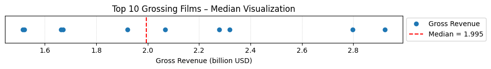
Let’s apply this by finding the median of the gross revenues of the Top 10 highest-grossing films.
Gross = Movies['Gross_million$']
print("The median of gross of the Top10 highest-grossing films is ",Gross.median(),"million USD") #via the Pandas library:
print("The median of gross of the Top10 highest-grossing films is ",numpy.median(Gross),"million USD") #via the Numpy library:
print("The median of gross of the Top10 highest-grossing films is ",statistics.median(Gross),"million USD") #via the Statistics library:
print("        low median :",statistics.median_low(Gross),"million USD")
print("       high median :",statistics.median_high(Gross),"million USD")
The median of gross of the Top10 highest-grossing films is  2673.5 million USD
The median of gross of the Top10 highest-grossing films is  2673.5 million USD
The median of gross of the Top10 highest-grossing films is  2673.5 million USD
        low median : 2549 million USD
       high median : 2798 million USD
Here’s a similar script with plotting (different input data)
import numpy as np
import matplotlib.pyplot as plt

# Gross revenue (in billions) of Top 10 highest-grossing films
top10_gross = [2.923, 2.798, 2.320, 2.279, 2.068, 1.922, 1.671, 1.663, 1.519, 1.515]

# Convert to NumPy array
data = np.array(top10_gross)

# Compute the median
median_value = np.median(data)

# Sort for plotting
data_sorted = np.sort(data)

# Plot the values and mark the median
plt.figure(figsize=(10, 1.5))
plt.plot(data_sorted, np.zeros_like(data_sorted), 'o', label='Gross Revenue')
plt.axvline(median_value, color='red', linestyle='--', label=f'Median = {median_value:.3f}')
plt.title("Top 10 Grossing Films – Median Visualization")
plt.xlabel("Gross Revenue (billion USD)")
plt.yticks([])
#plt.legend(loc='upper right')
plt.legend(loc='center left', bbox_to_anchor=(1, 0.5))
plt.grid(axis='x', linestyle=':', linewidth=0.5)
plt.tight_layout()
plt.show()
The main difference between the behavior of the mean and median is related to dataset outliers or extremes. The mean is heavily affected by outliers, but the median only depends on outliers either slightly or not at all. You can compare the mean and median as one way to detect outliers and asymmetry in your data. Whether the mean value or the median value is more useful to you depends on the context of your particular problem. The mean is a better choice when there are no extreme values that can affect it. It is a better summary because the information from every observation is included rather than median, which is just the middle value. However, in the presence of outliers, median is considered a better alternative. Check this out:
newgross = [99999,3257,3081,3043,2798,2549,2489,2356,2233,2202] #We have replaced 3706 with 99999- an extremely high number (an outlier)
newmean = numpy.mean(newgross)
newmedian = numpy.median(newgross)
print(newmean)   #A huge change from the previous value (115.66) - Mean is very sensitive to outliers and extreme values
print(newmedian) #No Change- the median only depends on outliers either slightly or not at all.
12400.7
2673.5
Mode: Most Frequent Value#
The mode is the value that occurs most frequently in a dataset. It is directly tied to the concept of frequency and highlights the most recurrent element(s) in a distribution.
Unlike the mean and median, which always return a single central value, the mode may:
Be unique (unimodal),
Appear twice (bimodal),
Or occur multiple times (multimodal).
If no value repeats, the dataset is said to have no mode.
Why is the mode useful?
The mode is especially helpful for categorical data or discrete quantities where numerical averaging doesn’t make sense (e.g., shoe sizes, colors, voting preferences).
In continuous data, mode can reveal clusters or common outcomes, particularly when used alongside histograms or density plots.
Example: Let’s find the mode in the gross of the Top10 highest-grossing films:
# In primitive Python:
# Create a list of all the numbers:
gross = [3.9,237,200,11,356,8.2,10.5,13,11,306]
mode1 = max((gross.count(item), item) for item in gross)[1]
print("mode1",mode1) # This is a unimodal set.

#via the Pandas library:
Gross = Movies['Budget_million$']
mode2 = Gross.mode()
print("mode2",mode2) #Returns all modal values- This is a unimodal set.

#via the Statistics library:
Gross = Movies['Budget_million$']
mode3 = statistics.mode(Gross)
print("mode3",mode3) #Return a single value
mode4 = statistics.multimode(Gross)
print("mode4",mode4) #Returns a list of all modes

#via the scipy.stats library:
Gross = Movies['Budget_million$']
mode5 = scipy.stats.mode(Gross)
print("mode5",mode5) #Returns the object with the modal value and the number of times it occurs- If multimodal: only the smallest value
mode1 11
mode2 0    11.0
Name: Budget_million$, dtype: float64
mode3 11.0
mode4 [11.0]
mode5 ModeResult(mode=np.float64(11.0), count=np.int64(2))
Mode is not useful when our distribution is flat; i.e., the frequencies of all groups are similar. Mode makes sense when we do not have a numeric-valued data set which is required in case of the mean and the median. For instance:
Director = Movies['Director']
# via statistics:
mode6 = statistics.mode(Director)
print(mode6) #"James Cameron" with two films (x2 repeats) is the mode
# via pandas:
mode7 = Director.mode()
print(mode7) #"James Cameron" with two films (x2 repeats) is the mode
James Cameron
0    James Cameron
Name: Director, dtype: object
Measures of Dispersion#
Measures of dispersion are values that describe how the data varies. It gives us a sense of how much the data tends to diverge from the typical value. Aka measures of variability, they quantify the spread of data points.The major measures of dispersion include range, percentiles, inter-quentile range, variance, standard deviation, skeness and kurtosis.
Range#
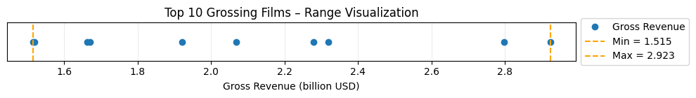
The range gives a quick sense of the spread of the distribution to those who require only a rough indication of the data. There are some disadvantages of using the range as a measure of spread. One being it does not give any information of the data in between maximum and minimum. Also, the range is very sensitive to extreme values. Let’s calculate the range for the budget of the Top10 highest-grossing films:
# Primitive Python:
budget = [3.9,237,200,11,356,8.2,10.5,13,11,306]
range1 = max(budget)-min(budget)
print("The range of the budget of the Top10 highest-grossing films is ",range1,"million USD")

# via the Statistics library:
Budget = Movies['Budget_million$']
range2 = numpy.ptp(Budget) #ptp stands for Peak To Peak
print("The range of the budget of the Top10 highest-grossing films is ",range2,"million USD")
The range of the budget of the Top10 highest-grossing films is  352.1 million USD
The range of the budget of the Top10 highest-grossing films is  352.1 million USD
import numpy as np
import matplotlib.pyplot as plt

# Gross revenue (in billions) of Top 10 highest-grossing films
top10_gross = [2.923, 2.798, 2.320, 2.279, 2.068, 1.922, 1.671, 1.663, 1.519, 1.515]
data = np.array(top10_gross)
data_sorted = np.sort(data)
mean_value = np.mean(data)
std_dev = np.std(data)
variance = np.var(data)
data_range = np.max(data) - np.min(data)

# --- Plot Range ---
plt.figure(figsize=(10, 1.5))
plt.plot(data_sorted, np.zeros_like(data_sorted), 'o', label='Gross Revenue')
plt.axvline(np.min(data), color='orange', linestyle='--', label=f'Min = {np.min(data):.3f}')
plt.axvline(np.max(data), color='orange', linestyle='--', label=f'Max = {np.max(data):.3f}')
plt.title("Top 10 Grossing Films – Range Visualization")
plt.xlabel("Gross Revenue (billion USD)")
plt.yticks([])
plt.legend(loc='center left', bbox_to_anchor=(1, 0.5))
plt.grid(axis='x', linestyle=':', linewidth=0.5)
plt.tight_layout()
plt.show()
Percentiles, Quantiles and Quartiles#
A measure which indicates the value below which a given percentage of points in a dataset fall. The sample 𝑝 percentile is the element in the dataset such that 𝑝% of the elements in the dataset are less than or equal to that value. Also, (100 − 𝑝)% of the elements are greater than or equal to that value. For example, median represents the 50th percentile. Similarly, we can have 0th percentile representing the minimum and 100th percentile representing the maximum of all data points. Percentile gives the relative position of a particular value within the dataset. It also helps in comparing the data sets which have different means and deviations. Each dataset has three quartiles, which are the percentiles that divide the dataset into four parts:
The first quartile (Q1) is the sample 25th percentile. It divides roughly 25% of the smallest items from the rest of the dataset.
The second quartile Q2) is the sample 50th percentile or the median. Approximately 25% of the items lie between the first and second quartiles and another 25% between the second and third quartiles.
The third quartile (Q3) is the sample 75th percentile. It divides roughly 25% of the largest items from the rest of the dataset.
Budget = Movies['Budget_million$']
#via Numpy:
p10 = numpy.percentile(Budget, 10) #returns the 10th percentile
print("The 10th percentile of the budget of the Top10 highest-grossing films is ",p10)
p4070 = numpy.percentile(Budget, [40,70]) #returns the 40th and 70th percentile
print("The 40th and 70th percentile of the budget of the Top10 highest-grossing films are ",p4070)
#via Pandas:
p10n = Budget.quantile(0.10) #returns the 10th percentile - notice the difference from Numpy
print("The 10th percentile of the budget of the Top10 highest-grossing films is ",p10n)
#via Statistics:
Qs = statistics.quantiles(Budget, n=4, method='inclusive')     #The parameter n defines the number of resulting equal-probability percentiles:
                                                               #n=4 returns the quartiles | n=2 returns the median
print("The quartiles of the budget of the Top10 highest-grossing films is ",Qs)
The 10th percentile of the budget of the Top10 highest-grossing films is  7.77
The 40th and 70th percentile of the budget of the Top10 highest-grossing films are  [ 11.  211.1]
The 10th percentile of the budget of the Top10 highest-grossing films is  7.77
The quartiles of the budget of the Top10 highest-grossing films is  [10.625, 12.0, 227.75]
InterQuartile Range (IQR)#
IQR is the difference between the third quartile and the first quartile (Q3-Q1). The interquartile range is a better option than range because it is not affected by outliers. It removes the outliers by just focusing on the distance within the middle 50% of the data.
Budget = Movies['Budget_million$']
#via Numpy:
IQR1 = numpy.percentile(Budget, 75) - numpy.percentile(Budget, 25)    #returns the IQR = Q3-Q1 = P75-P25
print("The IQR of the budget of the Top10 highest-grossing films is ",IQR1)
#via scipy.stats:
IQR2 = scipy.stats.iqr(Budget)    #returns the IQR- Can be used for other percentile differences as well >> iqr(object, rng=(p1, p2))
print("The IQR of the budget of the Top10 highest-grossing films is ",IQR2)
The IQR of the budget of the Top10 highest-grossing films is  217.125
The IQR of the budget of the Top10 highest-grossing films is  217.125
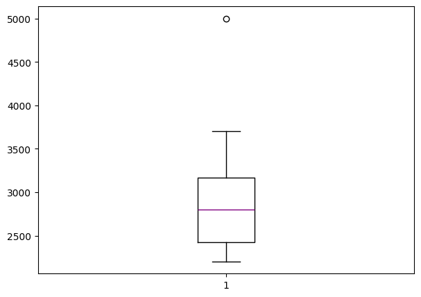
The Five-number Summary#
A five-number summary is especially useful in descriptive analyses or during the preliminary investigation of a large data set. A summary consists of five values: the most extreme values in the data set (the maximum and minimum values), the lower and upper quartiles, and the median. Five-number summary can be used to describe any data distribution. Boxplots are extremely useful graphical representation of the 5-number summary that we will discuss later.
Budget = Movies['Budget_million$']
Budget.describe()     #Remember this jewel from Pandas? -It directly return the 5-number summary AND MORE!
count     10.000000
mean     115.660000
std      142.739991
min        3.900000
25%       10.625000
50%       12.000000
75%      227.750000
max      356.000000
Name: Budget_million$, dtype: float64
Boxplots are extremely useful graphical representation of the 5-number summary. It can show the range, interquartile range, median, mode, outliers, and all quartiles.
import matplotlib.pyplot as plt  #Required for the plot

gross = [3706,3257,3081,3043,2798,2549,2489,2356,2233,2202,5000] #same data + an outlier: 5000

fig = plt.figure(figsize =(7, 5))
plt.boxplot(gross,medianprops={'linewidth': 1, 'color': 'purple'})

plt.show()
Quantiles and Quantile Functions#
A quantile function is a mathematical function that, given a probability \(p\) (ranging from 0 to 1), returns the value in a dataset below which the proportion \(p\) of the data lies. It is essentially the inverse of the cumulative distribution function (CDF), mapping probabilities to corresponding data values. Quantile functions are widely used to summarize distributions, identify thresholds (e.g., medians, quartiles, percentiles), and support decision-making in fields like statistics, finance, and engineering.
Quantile functions are vital in the inversion of probability to magnitudes as stated above. While the description seems a lot like the definition of percentile, they are not the same thing. Percentiles and quantiles are related but not entirely synonymous. Here’s the distinction(s):
Percentiles:
A percentile divides a dataset into 100 equal parts. Each percentile represents the value below which a certain percentage of the data falls. For example, the 25th percentile (P25) is the value below which 25% of the data lies. Percentiles are specific cases of quantiles where the dataset is divided into 100 intervals.
Quantiles:
A quantile is a more general term referring to the division of a dataset into equal-sized intervals. Quantiles can include percentiles but also quartiles (dividing data into 4 parts), deciles (10 parts), or any other number of equal divisions. For instance: Quartiles: Q1 (25%), Q2 (50% or median), Q3 (75%). Deciles: Values that divide the data into 10 equal parts (10%, 20%, …, 90%).
Relationship:
Percentiles are a subset of quantiles specifically referring to divisions into 100 parts. In other words, all percentiles are quantiles, but not all quantiles are percentiles.
Synonymy in Usage:
While they are not strictly synonymous, the terms are sometimes used interchangeably in contexts where percentiles are implied as a type of quantile. However, in precise statistical discussions, it’s better to differentiate them as above.
Variance#
The sample variance quantifies the spread of the data. It shows numerically how far the data points are from the mean. The observations may or may not be meaningful if observations in data sets are highly spread. Let’s calculate the variance for budget of the Top10 highest-grossing films.
Note that if we are working with the entire population (and not the sample), the denominator should be “n” instead of “n-1”.
# Primitive Python:
budget = [3.9,237,200,11,356,8.2,10.5,13,11,306]
n = len(budget)
mean = sum(budget) / n
var1 = sum((item - mean)**2 for item in budget) / (n - 1)
print("The variance of the budget of the Top10 highest-grossing films is ",var1)

# via the Statistics library:
Budget = Movies['Budget_million$']
var2 = statistics.variance(Budget)
print("The variance of the budget of the Top10 highest-grossing films is ",var2)
The variance of the budget of the Top10 highest-grossing films is  20374.70488888889
The variance of the budget of the Top10 highest-grossing films is  20374.70488888889
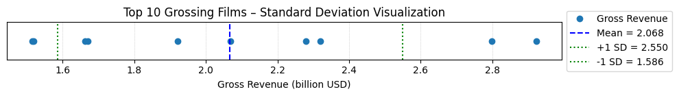
Standard Deviation#
The sample standard deviation is another measure of data spread. It’s connected to the sample variance, as standard deviation, 𝑠, is the positive square root of the sample variance. The standard deviation is often more convenient than the variance because it has the same unit as the data points.
Below is a script to naievly compute the standard deviation, followed by a more refined scriptthat visualizes the results in comparison with the mean value.
# Primitive Python:
budget = [3.9,237,200,11,356,8.2,10.5,13,11,306]
n = len(budget)
mean = sum(budget) / n
var = sum((item - mean)**2 for item in budget) / (n - 1)
sd1 = var**0.5
print("The standard deviation of the budget of the Top10 highest-grossing films is ",sd1,"million USD")

# via the Statistics library:
Budget = Movies['Budget_million$']
sd2 = statistics.stdev(Budget)
print("The standard deviation of the budget of the Top10 highest-grossing films is ",sd2,"million USD")
The standard deviation of the budget of the Top10 highest-grossing films is  142.73999050332353 million USD
The standard deviation of the budget of the Top10 highest-grossing films is  142.73999050332353 million USD
import numpy as np
import matplotlib.pyplot as plt

# Gross revenue (in billions) of Top 10 highest-grossing films
top10_gross = [2.923, 2.798, 2.320, 2.279, 2.068, 1.922, 1.671, 1.663, 1.519, 1.515]
data = np.array(top10_gross)
data_sorted = np.sort(data)
mean_value = np.mean(data)
std_dev = np.std(data)
variance = np.var(data)
data_range = np.max(data) - np.min(data)

# --- Plot Standard Deviation ---
plt.figure(figsize=(10, 1.5))
plt.plot(data_sorted, np.zeros_like(data_sorted), 'o', label='Gross Revenue')
plt.axvline(mean_value, color='blue', linestyle='--', label=f'Mean = {mean_value:.3f}')
plt.axvline(mean_value + std_dev, color='green', linestyle=':', label=f'+1 SD = {mean_value + std_dev:.3f}')
plt.axvline(mean_value - std_dev, color='green', linestyle=':', label=f'-1 SD = {mean_value - std_dev:.3f}')
plt.title("Top 10 Grossing Films – Standard Deviation Visualization")
plt.xlabel("Gross Revenue (billion USD)")
plt.yticks([])
plt.legend(loc='center left', bbox_to_anchor=(1, 0.5))
plt.grid(axis='x', linestyle=':', linewidth=0.5)
plt.tight_layout()
plt.show()
Skewness#
The sample skewness measures the asymmetry of a data sample. There are several mathematical definitions of skewness. The Fisher-Pearson standardized moment coefficient is calculated by using mean, median and standard deviation of the data.

Usually, negative skewness values indicate that there’s a dominant tail on the left side. Positive skewness values correspond to a longer or fatter tail on the right side. If the skewness is close to 0 (for example, between −0.5 and 0.5), then the dataset is considered quite symmetrical.
# Primitive Python:
budget = [3.9,237,200,11,356,8.2,10.5,13,11,306]
n = len(budget)
mean = sum(budget) / n
var = sum((item - mean)**2 for item in budget) / (n - 1)
std = var**0.5
skew1 = (sum((item - mean)**3 for item in budget)
         * n / ((n - 1) * (n - 2) * std**3))
print("The skewness of the budget of the Top10 highest-grossing films is ",skew1)

# via the scipy.stats library:
Budget = Movies['Budget_million$']
skew2 = scipy.stats.skew(Budget, bias=False)
print("The skewness of the budget of the Top10 highest-grossing films is ",skew2)

# via the Pandas library:
Budget = Movies['Budget_million$']
skew3 = Budget.skew()
print("The skewness of the budget of the Top10 highest-grossing films is ",skew3)
The skewness of the budget of the Top10 highest-grossing films is  0.7636547490528159
The skewness of the budget of the Top10 highest-grossing films is  0.763654749052816
The skewness of the budget of the Top10 highest-grossing films is  0.763654749052816
Kurtosis#
Kurtosis describes the peakedness of the distribution. In other words, Kurtosis identifies whether the tails of a given distribution contain extreme values. While Skewness essentially measures the symmetry of the distribution, kurtosis determines the heaviness of the distribution tails.
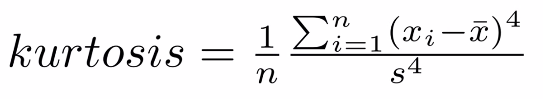
If the distribution is tall and thin it is called a leptokurtic distribution. Values in a leptokurtic distribution are near the mean or at the extremes. A flat distribution where the values are moderately spread out (i.e., unlike leptokurtic) is called platykurtic distribution. A distribution whose shape is in between a leptokurtic distribution and a platykurtic distribution is called a mesokurtic distribution.
# via the scipy.stats library:
Budget = Movies['Budget_million$']
Kurt = scipy.stats.kurtosis(Budget)
print("The kurtosis of the budget of the Top10 highest-grossing films is ",Kurt) #a platykurtic distribution | the tails are heavy
The kurtosis of the budget of the Top10 highest-grossing films is -1.3110307923262225
Association Measures (Covariance and Correlation)#
Covariance: is a measure of the joint variability of two random variables. The formula to compute covariance is:
If the greater values of one variable mainly correspond with the greater values of the other variable, and the same holds for the lesser values, (i.e., the variables tend to show similar behavior), the covariance is positive. In the opposite case, when the greater values of one variable mainly correspond to the lesser values of the other, (i.e., the variables tend to show opposite behavior), the covariance is negative. The sign of the covariance therefore shows the tendency of any linear relationship between the variables. The magnitude of the covariance is not particularly useful to interpret because it depends on the magnitudes of the variables.
A normalized version of the covariance, the correlation coefficient, however, is useful in terms of sign and magnitude.
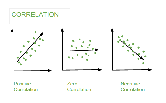
Correlation Coefficient: is a measure how strong a relationship is between two variables. There are several types of correlation coefficients, but the most popular is Pearson’s. Pearson’s correlation (also called Pearson’s R) is a correlation coefficient commonly used in linear regression. Correlation coefficient formulas are used to find how strong a relationship is between data. The formula for Pearson’s R is:
The correlation coefficient returns a value between -1 and 1, where:
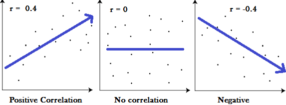
1 : A correlation coefficient of 1 means that for every positive increase in one variable, there is a positive increase of a fixed proportion in the other. For example, shoe sizes go up in (almost) perfect correlation with foot length.
-1: A correlation coefficient of -1 means that for every positive increase in one variable, there is a negative decrease of a fixed proportion in the other. For example, the amount of gas in a tank decreases in (almost) perfect correlation with speed.
0 : Zero means that for every increase, there isn’t a positive or negative increase. The two just aren’t related.
Exploratory Analysis using Visual Summaries#
Visual summaries are critical tools in Exploratory Data Analysis (EDA). They enable a quick understanding of data distributions, relationships, and outliers by transforming raw data into intuitive visual formats. This section introduces key types of visual summaries and demonstrates their usage with Python.
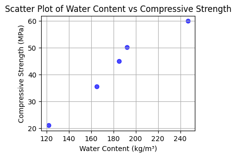
Scatter Plots#
Scatter plots visualize relationships between two variables. Each data point represents a pair of values, plotted along the x- and y-axes. Scatter plots can reveal trends, clusters, or outliers.
import pandas as pd
import matplotlib.pyplot as plt

# Example dataset (different from the large dataset above)
data = {
    "Water_Content": [121.75, 164.9, 185.0, 192.0, 247.0],
    "Compressive_Strength": [21.0, 35.5, 45.0, 50.2, 60.0]
}

df = pd.DataFrame(data)

# Create scatter plot
plt.figure(figsize=(4, 3))
plt.scatter(df["Water_Content"], df["Compressive_Strength"], c='blue', alpha=0.7)
plt.title("Scatter Plot of Water Content vs Compressive Strength")
plt.xlabel("Water Content (kg/m³)")
plt.ylabel("Compressive Strength (MPa)")
plt.grid()
plt.show()
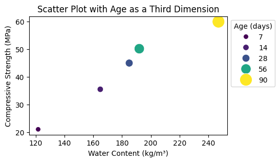
Higher Dimensional Scatter Plots#
Higher-dimensional scatter plots encode additional variables using color, size, or marker style.
Here is an example:
import seaborn as sns

# Adding a third dimension: Age
df["Age"] = [7, 14, 28, 56, 90]

plt.figure(figsize=(5, 3))
sns.scatterplot(data=df, x="Water_Content", y="Compressive_Strength", hue="Age", size="Age", sizes=(50, 300), palette="viridis")
plt.title("Scatter Plot with Age as a Third Dimension")
plt.xlabel("Water Content (kg/m³)")
plt.ylabel("Compressive Strength (MPa)")
plt.legend(title="Age (days)", loc='upper left', bbox_to_anchor=(1, 1))
plt.show()
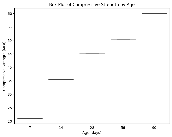
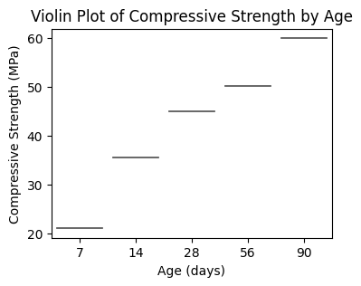
Box Plots (aka Tukey’s work)#
Box plots summarize data distributions through their quartiles and highlight potential outliers.
Python Example:
plt.figure(figsize=(8, 6))
sns.boxplot(data=df, x="Age", y="Compressive_Strength")
plt.title("Box Plot of Compressive Strength by Age")
plt.xlabel("Age (days)")
plt.ylabel("Compressive Strength (MPa)")
plt.show()
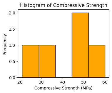
Histograms#
Histograms depict the frequency distribution of a single variable.
Python Example:
plt.figure(figsize=(4, 3))
plt.hist(df["Compressive_Strength"], bins=5, color="orange", edgecolor="black")
plt.title("Histogram of Compressive Strength")
plt.xlabel("Compressive Strength (MPa)")
plt.ylabel("Frequency")
plt.show()
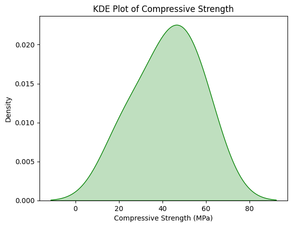
Kernel Density Estimation (KDE) Plots#
KDE plots estimate and visualize the probability density function of a variable.
Python Example:
sns.kdeplot(data=df, x="Compressive_Strength", fill=True, color="green")
plt.title("KDE Plot of Compressive Strength")
plt.xlabel("Compressive Strength (MPa)")
plt.ylabel("Density")
plt.show()
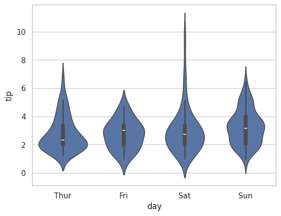
Violin Plots#
Violin Plots combine box plots with kernel density estimation, offering insights into the data’s distribution shape.
Python Example:
plt.figure(figsize=(4, 3))
sns.violinplot(
    data=df,
    x="Age",
    y="Compressive_Strength",
    hue="Age",  # Assigning `x` to `hue`
    palette="muted",
    legend=False
)
plt.title("Violin Plot of Compressive Strength by Age")
plt.xlabel("Age (days)")
plt.ylabel("Compressive Strength (MPa)")
plt.show()
# another example using a built-in dataset
sns.set(style = 'whitegrid')
tip = sns.load_dataset('tips')
sns.violinplot(x ='day', y ='tip', data = tip)
<Axes: xlabel='day', ylabel='tip'>
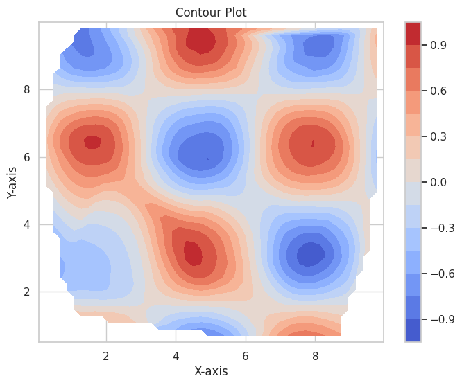
Contour Plots#
Contour plots visualize relationships between three variables using contour lines or color gradients. Topographic maps (elevation) are a type of specialized contour plot.
Python Example:
import numpy as np
from scipy.interpolate import griddata

# Example data
x = np.random.uniform(0, 10, 100)
y = np.random.uniform(0, 10, 100)
z = np.sin(x) * np.cos(y)

# Interpolate to a grid
xi, yi = np.linspace(x.min(), x.max(), 50), np.linspace(y.min(), y.max(), 50)
X, Y = np.meshgrid(xi, yi)
Z = griddata((x, y), z, (X, Y), method='cubic')

# Contour plot
plt.figure(figsize=(8, 6))
contour = plt.contourf(X, Y, Z, levels=15, cmap="coolwarm")
plt.colorbar(contour)
plt.title("Contour Plot")
plt.xlabel("X-axis")
plt.ylabel("Y-axis")
plt.show()
Extended Example#
Using a concrete database, download and explore its contents using EDA tools.
Concrete Compressive Strength#
The Compressive Strength of Concrete determines the quality of Concrete. The strength is determined by a standard crushing test on a concrete cylinder, that requires engineers to build small concrete cylinders with different combinations of raw materials and test these cylinders for strength variations with a change in each raw material. The recommended wait time for testing the cylinder is 28 days to ensure correct results, although there are formulas for making estimates from shorter cure times. The formal 28-day approach consumes a lot of time and labor to prepare different prototypes and test them. Also, this method is prone to human error and one small mistake can cause the wait time to drastically increase.
One way of reducing the wait time and reducing the number of combinations to try is to make use of digital simulations, where we can provide information to the computer about what we know and the computer tries different combinations to predict the compressive strength. This approach can reduce the number of combinations we can try physically and reduce the total amount of time for experimentation. But, to design such software we have to know the relations between all the raw materials and how one material affects the strength. It is possible to derive mathematical equations and run simulations based on these equations, but we cannot expect the relations to be same in real-world. Also, these tests have been performed for many numbers of times now and we have enough real-world data that can be used for predictive modelling.
We are going to analyse a Concrete Compressive Strength dataset and build a Machine Learning Model to predict the compressive strength for given mixture (inputs).
Dataset Description#
The dataset consists of 1030 instances with 9 attributes and has no missing values. There are 8 input variables and 1 output variable. Seven input variables represent the amount of raw material (measured in \(kg/m^3\)) and one represents Age (in Days). The target variable is Concrete Compressive Strength measured in (MPa — Mega Pascal). We shall explore the data to see how input features are affecting compressive strength.
Obtain the Database, Perform Initial EDA#
Get the database from a repository
Import/install support packages (if install required, either on your machine, or contact network admin to do a root install)
EDA
Local (our server copy)
import requests # Module to process http/https requests
remote_url="http://54.243.252.9/ce-5319-webroot/1-Databases/ConcreteMixtures/concreteData.csv"  # set the url
response = requests.get(remote_url, allow_redirects=True)  # get the remote resource, follow imbedded links
open('concreteData.csv','wb').write(response.content); # extract from the remote the contents, assign to a local file same name
The script below gets the file from the actual remote repository
#Get database -- use the Get Data From URL Script
#Step 1: import needed modules to interact with the internet
import requests
#Step 2: make the connection to the remote file (actually its implementing "bash curl -O http://fqdn/path ...")
remote_url = 'https://archive.ics.uci.edu/ml/machine-learning-databases/concrete/compressive/Concrete_Data.xls' # an Excel file
response = requests.get(remote_url) # Gets the file contents puts into an object
output = open('concreteData.xls', 'wb') # Prepare a destination, local
output.write(response.content) # write contents of object to named local file
output.close() # close the connection
Import/install support packages (if install required, either on your machine, or contact network admin to do a root install)
# The usual suspects plus some newish ones!
### Import/install support packages
import numpy as np
import pandas
import matplotlib.pyplot as plt
import seaborn
#%matplotlib inline
Now try to read the file, use pandas methods
data = pandas.read_excel("concreteData.xls")
Now lets examine the file, first the length the head method
print("How many rows :",len(data))
How many rows : 1030
A quick look at the sturcture of the data object
data.tail() # head is a pandas method that becomes accessible when the dataframe is created with the read above
| Cement (component 1)(kg in a m^3 mixture) | Blast Furnace Slag (component 2)(kg in a m^3 mixture) | Fly Ash (component 3)(kg in a m^3 mixture) | Water (component 4)(kg in a m^3 mixture) | Superplasticizer (component 5)(kg in a m^3 mixture) | Coarse Aggregate (component 6)(kg in a m^3 mixture) | Fine Aggregate (component 7)(kg in a m^3 mixture) | Age (day) | Concrete compressive strength(MPa, megapascals) | |
|---|---|---|---|---|---|---|---|---|---|
| 1025 | 276.4 | 116.0 | 90.3 | 179.6 | 8.9 | 870.1 | 768.3 | 28 | 44.284354 |
| 1026 | 322.2 | 0.0 | 115.6 | 196.0 | 10.4 | 817.9 | 813.4 | 28 | 31.178794 |
| 1027 | 148.5 | 139.4 | 108.6 | 192.7 | 6.1 | 892.4 | 780.0 | 28 | 23.696601 |
| 1028 | 159.1 | 186.7 | 0.0 | 175.6 | 11.3 | 989.6 | 788.9 | 28 | 32.768036 |
| 1029 | 260.9 | 100.5 | 78.3 | 200.6 | 8.6 | 864.5 | 761.5 | 28 | 32.401235 |
Rename the columns to simpler names, notice use of a set constructor. Once renamed, again look at the first few rows
req_col_names = ["Cement", "BlastFurnaceSlag", "FlyAsh", "Water", "Superplasticizer",
                 "CoarseAggregate", "FineAggregate", "Age", "CC_Strength"]
curr_col_names = list(data.columns)

mapper = {}
for i, name in enumerate(curr_col_names):
    mapper[name] = req_col_names[i]

data = data.rename(columns=mapper)

data.head()
| Cement | BlastFurnaceSlag | FlyAsh | Water | Superplasticizer | CoarseAggregate | FineAggregate | Age | CC_Strength | |
|---|---|---|---|---|---|---|---|---|---|
| 0 | 540.0 | 0.0 | 0.0 | 162.0 | 2.5 | 1040.0 | 676.0 | 28 | 79.986111 |
| 1 | 540.0 | 0.0 | 0.0 | 162.0 | 2.5 | 1055.0 | 676.0 | 28 | 61.887366 |
| 2 | 332.5 | 142.5 | 0.0 | 228.0 | 0.0 | 932.0 | 594.0 | 270 | 40.269535 |
| 3 | 332.5 | 142.5 | 0.0 | 228.0 | 0.0 | 932.0 | 594.0 | 365 | 41.052780 |
| 4 | 198.6 | 132.4 | 0.0 | 192.0 | 0.0 | 978.4 | 825.5 | 360 | 44.296075 |
Exploratory Data Analysis#
The first step in a Data Science project is to understand the data and gain insights from the data before doing any modelling. This includes checking for any missing values, plotting the features with respect to the target variable, observing the distributions of all the features and so on. Let us import the data and start analysing.
First we check for null values, as the database grows, one can expect null values, so check for presence. We wont act in this case, but concievably would in future iterations.
data.isna().sum() # isna() and sum() are pandas methods that become accessible when the dataframe is created with the read above
Cement              0
BlastFurnaceSlag    0
FlyAsh              0
Water               0
Superplasticizer    0
CoarseAggregate     0
FineAggregate       0
Age                 0
CC_Strength         0
dtype: int64
Lets explore the database a little bit
data.describe() # describe is a pandas method that becomes accessible when the dataframe is created with the read above
| Cement | BlastFurnaceSlag | FlyAsh | Water | Superplasticizer | CoarseAggregate | FineAggregate | Age | CC_Strength | |
|---|---|---|---|---|---|---|---|---|---|
| count | 1030.000000 | 1030.000000 | 1030.000000 | 1030.000000 | 1030.000000 | 1030.000000 | 1030.000000 | 1030.000000 | 1030.000000 |
| mean | 281.165631 | 73.895485 | 54.187136 | 181.566359 | 6.203112 | 972.918592 | 773.578883 | 45.662136 | 35.817836 |
| std | 104.507142 | 86.279104 | 63.996469 | 21.355567 | 5.973492 | 77.753818 | 80.175427 | 63.169912 | 16.705679 |
| min | 102.000000 | 0.000000 | 0.000000 | 121.750000 | 0.000000 | 801.000000 | 594.000000 | 1.000000 | 2.331808 |
| 25% | 192.375000 | 0.000000 | 0.000000 | 164.900000 | 0.000000 | 932.000000 | 730.950000 | 7.000000 | 23.707115 |
| 50% | 272.900000 | 22.000000 | 0.000000 | 185.000000 | 6.350000 | 968.000000 | 779.510000 | 28.000000 | 34.442774 |
| 75% | 350.000000 | 142.950000 | 118.270000 | 192.000000 | 10.160000 | 1029.400000 | 824.000000 | 56.000000 | 46.136287 |
| max | 540.000000 | 359.400000 | 200.100000 | 247.000000 | 32.200000 | 1145.000000 | 992.600000 | 365.000000 | 82.599225 |
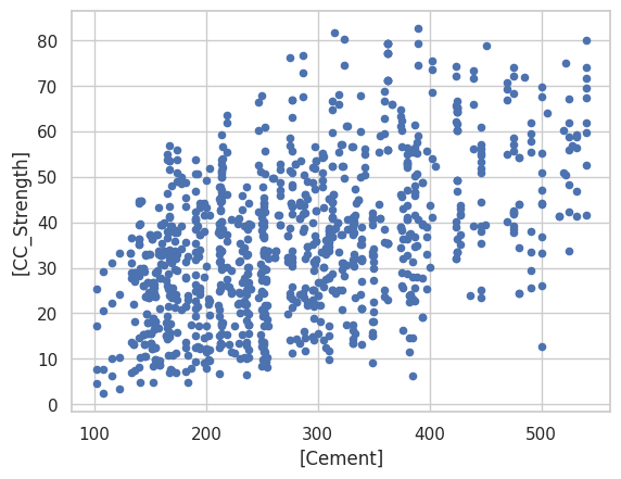
data.plot.scatter(x=['Cement'],y=['CC_Strength']); # some plotting methods come with pandas dataframes
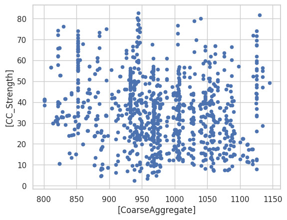
data.plot.scatter(x=['CoarseAggregate'],y=['CC_Strength']) # some plotting methods come with pandas dataframes
<Axes: xlabel='[CoarseAggregate]', ylabel='[CC_Strength]'>
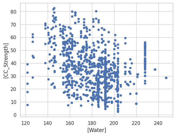
data.plot.scatter(x=['Water'],y=['CC_Strength']) # some plotting methods come with pandas dataframes
<Axes: xlabel='[Water]', ylabel='[CC_Strength]'>
data.corr() # corr (Pearson's correlation coefficient) is a pandas method that becomes accessible when the dataframe is created with the read above
| Cement | BlastFurnaceSlag | FlyAsh | Water | Superplasticizer | CoarseAggregate | FineAggregate | Age | CC_Strength | |
|---|---|---|---|---|---|---|---|---|---|
| Cement | 1.000000 | -0.275193 | -0.397475 | -0.081544 | 0.092771 | -0.109356 | -0.222720 | 0.081947 | 0.497833 |
| BlastFurnaceSlag | -0.275193 | 1.000000 | -0.323569 | 0.107286 | 0.043376 | -0.283998 | -0.281593 | -0.044246 | 0.134824 |
| FlyAsh | -0.397475 | -0.323569 | 1.000000 | -0.257044 | 0.377340 | -0.009977 | 0.079076 | -0.154370 | -0.105753 |
| Water | -0.081544 | 0.107286 | -0.257044 | 1.000000 | -0.657464 | -0.182312 | -0.450635 | 0.277604 | -0.289613 |
| Superplasticizer | 0.092771 | 0.043376 | 0.377340 | -0.657464 | 1.000000 | -0.266303 | 0.222501 | -0.192717 | 0.366102 |
| CoarseAggregate | -0.109356 | -0.283998 | -0.009977 | -0.182312 | -0.266303 | 1.000000 | -0.178506 | -0.003016 | -0.164928 |
| FineAggregate | -0.222720 | -0.281593 | 0.079076 | -0.450635 | 0.222501 | -0.178506 | 1.000000 | -0.156094 | -0.167249 |
| Age | 0.081947 | -0.044246 | -0.154370 | 0.277604 | -0.192717 | -0.003016 | -0.156094 | 1.000000 | 0.328877 |
| CC_Strength | 0.497833 | 0.134824 | -0.105753 | -0.289613 | 0.366102 | -0.164928 | -0.167249 | 0.328877 | 1.000000 |
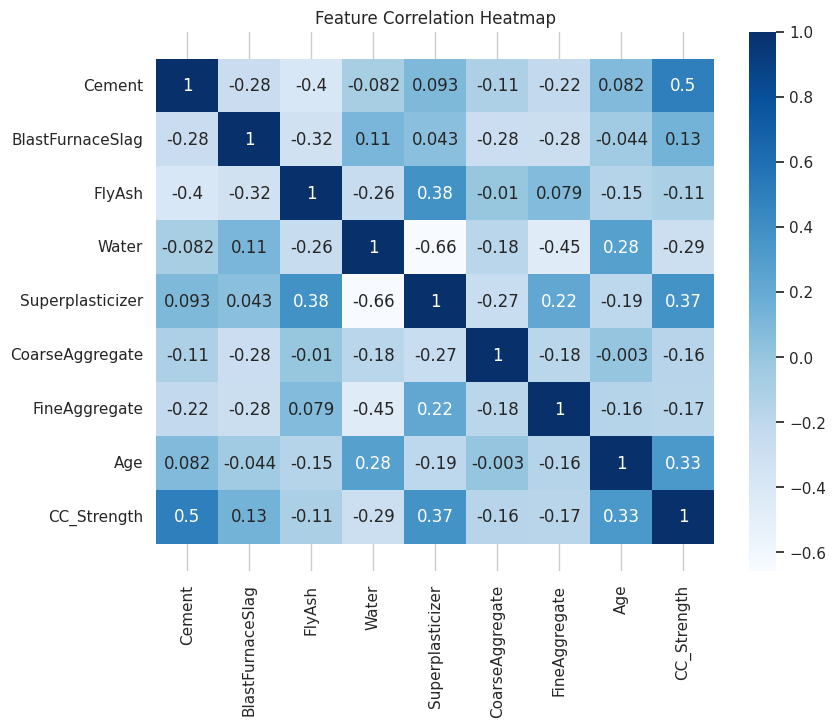
corr = data.corr()
plt.figure(figsize=(9,7))
seaborn.heatmap(corr, annot=True, cmap='Blues')
b, t = plt.ylim()
plt.ylim(b+0.5, t-0.5)
plt.title("Feature Correlation Heatmap")
plt.show()
Initial Observations#
The high correlations (> 0.3) between Compressive strength and other features are for Cement, Age and Super plasticizer. Notice water has a negative correlation which is well known and the reason for dry mixtures in high performance concrete. Super Plasticizer has a negative high correlation with Water (also well known, SP is used to replace water in the blends and provide necessary workability), positive correlations with Fly ash and Fine aggregate.
We can further analyze these correlations visually by plotting these relations.
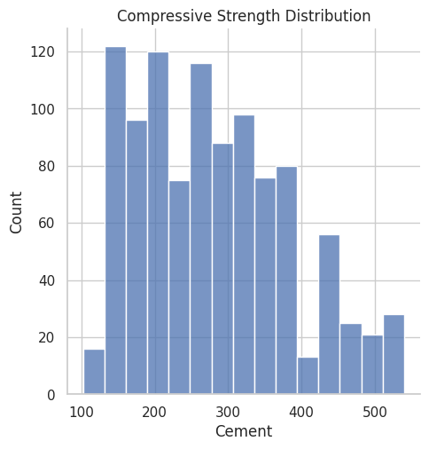
#ax = seaborn.distplot(data.Cement); deprecated function
#ax.set_title("Compressive Strength Distribution"); deprecated function
ax = seaborn.displot(data.Cement)
plt.title("Compressive Strength Distribution")
plt.show()
fig, ax = plt.subplots(figsize=(10,7))
seaborn.scatterplot(y="CC_Strength", x="Cement", hue="Water", size="Age", data=data, ax=ax, sizes=(50, 300))
ax.set_title("CC Strength vs (Cement, Age, Water)")
ax.legend(loc="upper left", bbox_to_anchor=(1,1))
plt.show()
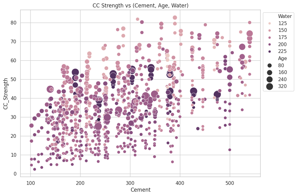
The observations we can make from this plot,
Compressive strength increases as the amount of cement increases, as the dots move up when we move towards right on the x-axis.
Compressive strength increases with age (as the size of dots represents the age), this not the case always but can be up to an extent.
Cement with less age requires more cement for higher strength, as the smaller dots are moving up when we move towards right on the x-axis. The older the cement is the more water it requires, can be confirmed by observing the colour of the dots. Larger dots with dark colour indicate high age and more water.
Concrete strength increases when less water is used in preparing it since the dots on the lower side (y-axis) are darker and the dots on higher-end (y-axis) are brighter.
Continuing with the exploratory analysis, same features, but different plot structure:
fig, ax = plt.subplots(figsize=(10,7))
seaborn.scatterplot(y="CC_Strength", x="FineAggregate", hue="FlyAsh",
   size="Superplasticizer", data=data, ax=ax, sizes=(50, 300))
ax.set_title("CC Strength vs (FineAggregate, FlyAsh, Superplasticizer)")
ax.legend(loc="upper left", bbox_to_anchor=(1,1))
plt.show()
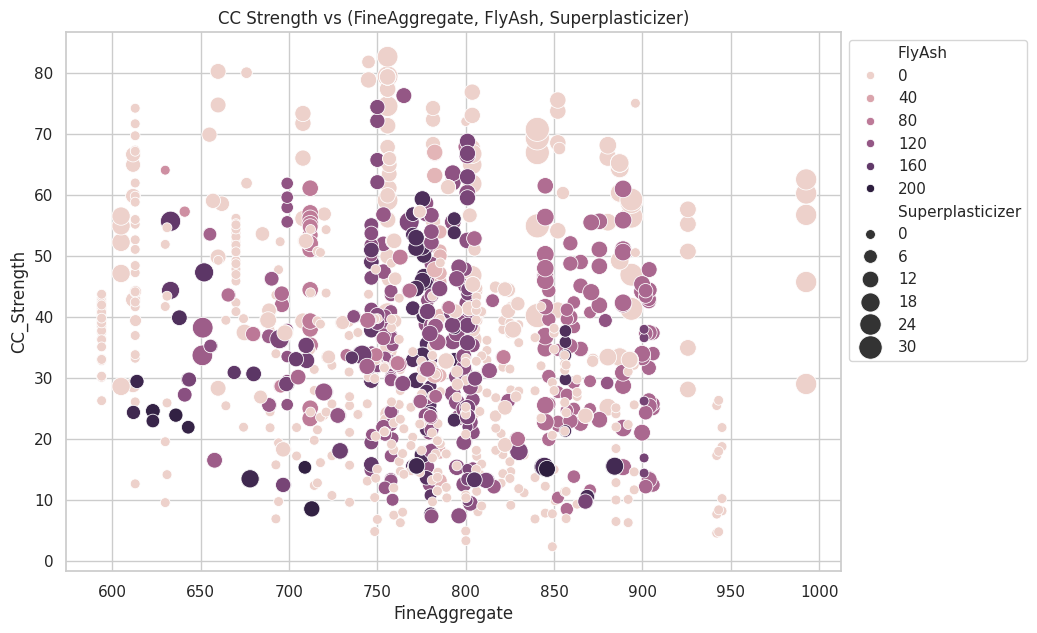
Observations,
Compressive strength decreases Fly ash increases, as darker dots are concentrated in the region representing low compressive strength.
Compressive strength increases with Superplasticizer since larger the dot the higher they are in the plot.
We can visually understand 2D, 3D and max up to 4D plots (features represented by colour and size) as shown above, we can further use row-wise and column-wise plotting features by seaborn to do further analysis, but still, we lack the ability to track all these correlations by ourselves.
Addendum #1 Elevation Maps#
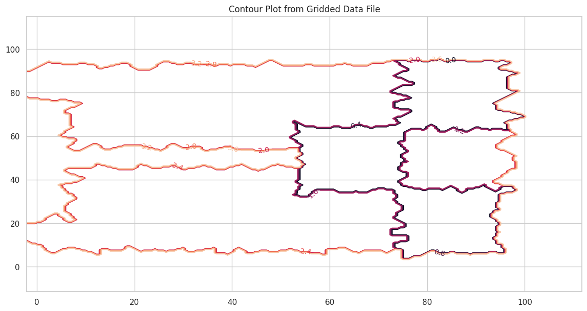
Here is another contour example with a file that contains topographic data in XYZ format. Topographic maps are a type of contour plot.
The file is pip-corner-sumps.txt
The first few lines of the file are
X-Easting	Y-Northing	Z-Elevation
74.90959724	93.21251922	0
75.17907367	64.40278759	0
94.9935575	93.07951286	0
95.26234119	64.60091165	0
54.04976655	64.21159095	0
54.52914363	35.06934342	0
75.44993558	34.93079513	0
Clearly NOT regular spaced in the X and Y axes. Here is a simple script to load the irregular data and interpolate onto a uniform spaced XYZ grid for plotting.
#Step 1: import needed modules to interact with the internet
import requests
#Step 2: make the connection to the remote file (actually its implementing "bash curl -O http://fqdn/path ...")
remote_url="http://54.243.252.9/ce-5319-webroot/ce5319jb/lessons/lesson8/pip-corner-sumps.txt"  # set the url
response = requests.get(remote_url, allow_redirects=True)
#Step 3: read the file and store a copy locally
open('pip-corner-sumps.txt','wb').write(response.content);# extract from the remote the contents, assign to a local file same name
#Step 4: Read and process the file, generate the contour plot
# http://54.243.252.9/engr-1330-webroot/8-Labs/Lab07/Lab07.html
# https://clouds.eos.ubc.ca/~phil/docs/problem_solving/06-Plotting-with-Matplotlib/06.14-Contour-Plots.html
# https://docs.scipy.org/doc/scipy/reference/generated/scipy.interpolate.griddata.html
# https://stackoverflow.com/questions/332289/how-do-you-change-the-size-of-figures-drawn-with-matplotlib
# https://stackoverflow.com/questions/18730044/converting-two-lists-into-a-matrix
# https://stackoverflow.com/questions/3242382/interpolation-over-an-irregular-grid
# https://stackoverflow.com/questions/33919875/interpolate-irregular-3d-data-from-a-xyz-file-to-a-regular-grid
import pandas
my_xyz = pandas.read_csv('pip-corner-sumps.txt',sep='\t') # read an ascii file already prepared, delimiter is tabs
my_xyz = pandas.DataFrame(my_xyz) # convert into a data frame
#print(my_xyz) # activate to examine the dataframe
import numpy
import matplotlib.pyplot
from scipy.interpolate import griddata
# extract lists from the dataframe
coord_x = my_xyz['X-Easting'].values.tolist()
coord_y = my_xyz['Y-Northing'].values.tolist()
coord_z = my_xyz['Z-Elevation'].values.tolist()
coord_xy = numpy.column_stack((coord_x, coord_y))
# Set plotting range in original data units
lon = numpy.linspace(min(coord_x), max(coord_x), 200)
lat = numpy.linspace(min(coord_y), max(coord_y), 200)
X, Y = numpy.meshgrid(lon, lat)
# Grid the data; use linear interpolation (choices are nearest, linear, cubic)
Z = griddata(numpy.array(coord_xy), numpy.array(coord_z), (X, Y), method='nearest')
# Build the map
fig, ax = matplotlib.pyplot.subplots()
fig.set_size_inches(14, 7)
CS = ax.contour(X, Y, Z, levels = 12)
ax.clabel(CS, inline=2, fontsize=10)
ax.set_title('Contour Plot from Gridded Data File')
Text(0.5, 1.0, 'Contour Plot from Gridded Data File')
Addendum 2: 3D Scatter Plot/Point Clouds in Exploratory Data Analysis#
3D scatter plots, also known as point clouds, are powerful tools in Exploratory Data Analysis (EDA) for visualizing relationships among three continuous variables. They extend the concept of 2D scatter plots by adding a third dimension, often representing it through a z-axis. This visualization method provides depth and enables the identification of patterns, clusters, or outliers that might not be apparent in lower-dimensional plots. Importance in EDA
In EDA, understanding the interaction between multiple variables is crucial, especially in complex datasets where relationships might span multiple dimensions. For instance:
Correlation Analysis: 3D scatter plots help explore how three variables interact simultaneously. For example, examining how temperature, humidity, and energy consumption vary together.
Clustering and Segmentation: They reveal natural groupings or clusters in the data.
Anomaly Detection: Outliers that deviate significantly in one or more dimensions become visually apparent.
Example in Practice
Consider analyzing concrete compressive strength in relation to its ingredients. A 3D scatter plot could visualize the relationship between the amounts of cement, water, and the resulting compressive strength. Patterns such as higher strength with increased cement and decreased water become easily noticeable in 3D space.
Python Code Example:
import numpy as np
import matplotlib.pyplot as plt
from mpl_toolkits.mplot3d import Axes3D

# Example data
cement = np.random.uniform(100, 500, 50)
water = np.random.uniform(150, 200, 50)
strength = 0.5 * cement - 0.2 * water + np.random.normal(0, 10, 50)

# 3D Scatter Plot
fig = plt.figure(figsize=(10, 7))
ax = fig.add_subplot(111, projection='3d')
scatter = ax.scatter(cement, water, strength, c=strength, cmap='viridis', s=50)

ax.set_title('3D Scatter Plot: Cement, Water, and Strength')
ax.set_xlabel('Cement (kg/m³)')
ax.set_ylabel('Water (kg/m³)')
ax.set_zlabel('Compressive Strength (MPa)')

# Add a color bar for strength values
color_bar = fig.colorbar(scatter, ax=ax, shrink=0.5, aspect=10)
color_bar.set_label('Compressive Strength (MPa)')

plt.show()
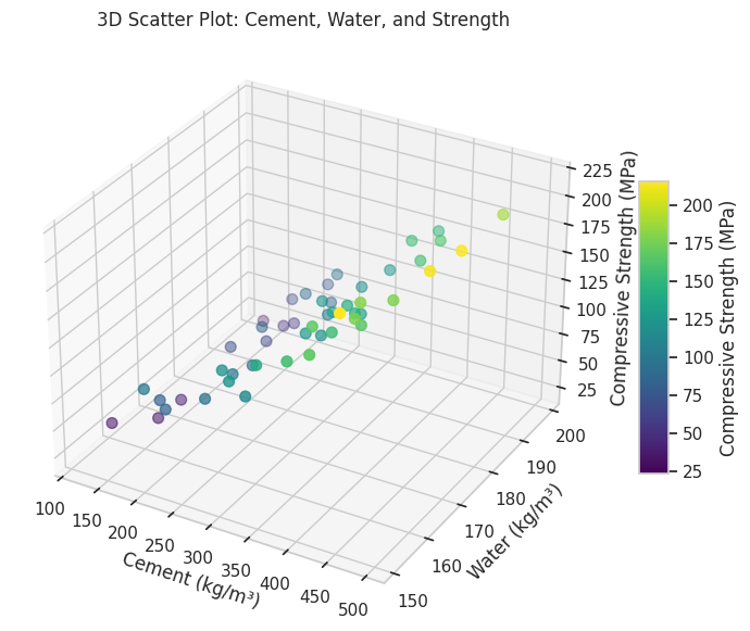
Benefits and Limitations
Benefits: Provides an intuitive understanding of interactions between three variables. Allows identification of multidimensional patterns and trends.
Limitations: Difficult to interpret with very large datasets due to overlapping points. Limited to three variables; higher-dimensional relationships require alternative visualizations like parallel coordinates or dimensionality reduction.
3D scatter plots are a cornerstone of EDA for multidimensional datasets, offering insights that drive further analysis and hypothesis generation.
Sometimes 3D point clouds can help interpret physical objects. The gridded elevation data (from the XYZ file) contained is regularly spaced we can use a 3D point cloud plot to examine.
# Import libraries
from mpl_toolkits import mplot3d
import numpy as np
import matplotlib.pyplot as plt


# Creating figure
fig = plt.figure(figsize = (10, 7))
ax = plt.axes(projection ="3d")

# Creating plot
ax.scatter3D(coord_x, coord_y, coord_z, color = "green")
#ax.scatter3D(x1, y1, z1, color = "red")
plt.title("simple 3D scatter plot")
zangle = 55
ax.view_init(30, zangle)

# show plot
plt.show()
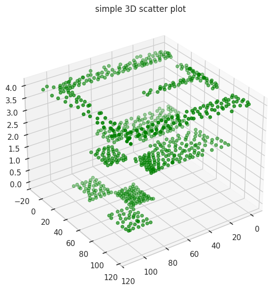
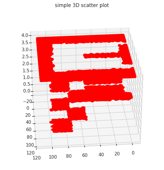
Its hard to interpret but these data are from a CFD geometry where flow is supplied in one corner of a tank with internal baffle, and three intentional low parts (called pond-in-pond). Now repeating (in red) with the gridded data
# Import libraries
from mpl_toolkits import mplot3d
import numpy as np
import matplotlib.pyplot as plt
#
model_x = X.tolist()
model_y = Y.tolist()
model_z = Z.tolist()

#coord_x = my_xyz['X-Easting'].values.tolist()
# Creating figure
fig = plt.figure(figsize = (10, 7))
ax = plt.axes(projection ="3d")

# Creating plot
ax.scatter3D(model_x, model_y, model_z, color = "red")
#ax.scatter3D(x1, y1, z1, color = "red")
plt.title("simple 3D scatter plot")
zangle = 85
ax.view_init(30, zangle)

# show plot
plt.show()
Addendum 3: Surface Plots in Exploratory Data Analysis#
Surface Plots are a powerful visualization tool in Exploratory Data Analysis (EDA) for representing relationships among three continuous variables. Unlike 3D scatter plots, which show individual data points, surface plots render these points as a continuous surface, either as smooth facets or a wireframe. This provides a clearer depiction of trends and gradients across the data, making it particularly useful for examining functional relationships or interpolating between data points. Importance in EDA
Surface plots are especially valuable when exploring datasets where:
Functional Relationships: The goal is to understand how two independent variables interact to influence a dependent variable. For example, how temperature and pressure influence material strength.
Data Interpolation: Surface plots can interpolate sparse data points into a smooth representation, aiding in identifying trends in areas without direct observations.
Gradient Analysis: They help in detecting steep changes, flat regions, or nonlinear interactions in the data.
Example in Practice
Consider analyzing how water content and superplasticizer dosage affect the compressive strength of concrete. A surface plot can show the combined effect of these variables on strength, enabling engineers to identify optimal ranges for material proportions.
Python Code Example:
import numpy as np
import matplotlib.pyplot as plt
from mpl_toolkits.mplot3d import Axes3D

# Example data
water = np.linspace(150, 200, 30)
superplasticizer = np.linspace(5, 15, 30)
water, superplasticizer = np.meshgrid(water, superplasticizer)
strength = 0.5 * water - 0.3 * superplasticizer + 10 * np.sin(water / 30) + 50

# Surface Plot
fig = plt.figure(figsize=(12, 8))
ax = fig.add_subplot(111, projection='3d')
surf = ax.plot_surface(
    water, superplasticizer, strength, cmap='viridis', edgecolor='none', alpha=0.8
)
ax.set_title("Surface Plot: Water, Superplasticizer, and Strength")
ax.set_xlabel("Water Content (kg/m³)")
ax.set_ylabel("Superplasticizer (kg/m³)")
ax.set_zlabel("Compressive Strength (MPa)")

# Add color bar
color_bar = fig.colorbar(surf, ax=ax, shrink=0.5, aspect=10)
color_bar.set_label("Compressive Strength (MPa)")

plt.show()
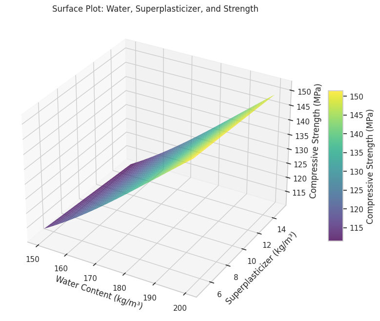
Benefits and Applications
Benefits:
Intuitive Visualization: Provides a clear and smooth depiction of relationships between variables.
Enhanced Insight: Highlights interactions and trends not immediately visible in scatter plots.
Gradient Analysis: Useful for identifying regions of rapid change or stability.
Applications:
Engineering: Studying material behavior under varying environmental conditions.
Environmental Science: Understanding how factors like rainfall and temperature impact crop yield.
Economics: Analyzing the combined effect of price and demand on revenue.
Limitations
Complexity: Requires interpolation for datasets with irregular spacing, which may introduce artifacts.
Overlapping Trends: Multiple surfaces can be challenging to interpret without careful design.
Scalability: Difficult to extend beyond three variables; multidimensional datasets may require dimensionality reduction techniques.
Surface plots bridge the gap between data points and a continuous understanding of relationships in multidimensional datasets. By providing a smooth and visually engaging representation, they are an essential tool in EDA for analyzing complex interactions and deriving actionable insights.
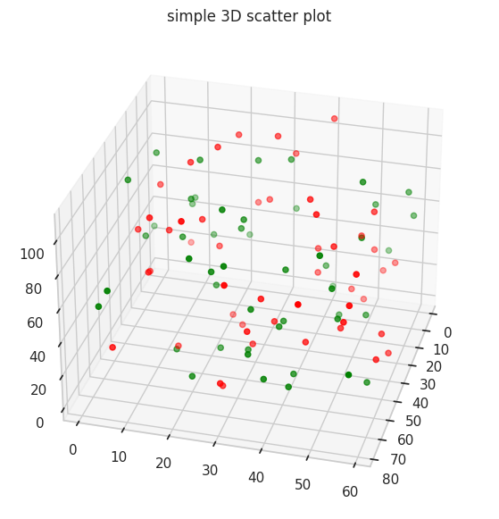
Undocumented (by me) Plots#
# Import libraries
from mpl_toolkits import mplot3d
import numpy as np
import matplotlib.pyplot as plt

# Create datasets
z = np.random.randint(100, size =(50))
x = np.random.randint(80, size =(50))
y = np.random.randint(60, size =(50))

z1 = np.random.randint(110, size =(50))
x1 = np.random.randint(80, size =(50))
y1 = np.random.randint(60, size =(50))

# Creating figure
fig = plt.figure(figsize = (10, 7))
ax = plt.axes(projection ="3d")

# Creating plot
ax.scatter3D(x, y, z, color = "green")
ax.scatter3D(x1, y1, z1, color = "red")
plt.title("simple 3D scatter plot")
zangle = 15
ax.view_init(30, zangle)

# show plot
plt.show()
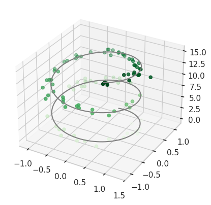
Plotting a trajectory through a point cloud#
from mpl_toolkits import mplot3d
%matplotlib inline
import numpy as np
import matplotlib.pyplot as plt


fig = plt.figure()
ax = plt.axes(projection='3d')

#ax = plt.axes(projection='3d')

# Data for a three-dimensional line
zline = np.linspace(0, 15, 1000)
xline = np.sin(zline)
yline = np.cos(zline)
ax.plot3D(xline, yline, zline, 'gray')

# Data for three-dimensional scattered points
zdata = 15 * np.random.random(100)
xdata = np.sin(zdata) + 0.1 * np.random.randn(100)
ydata = np.cos(zdata) + 0.1 * np.random.randn(100)
ax.scatter3D(xdata, ydata, zdata, c=zdata, cmap='Greens');
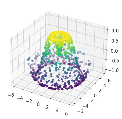
Point cloud with color scale#
def f(x, y):
    return np.sin(np.sqrt(x ** 2 + y ** 2))

theta = 2 * np.pi * np.random.random(1000)
r = 6 * np.random.random(1000)
x = np.ravel(r * np.sin(theta))
y = np.ravel(r * np.cos(theta))
z = f(x, y)


ax = plt.axes(projection='3d')
ax.scatter3D(x, y, z, c=z, cmap='viridis', linewidth=0.5);
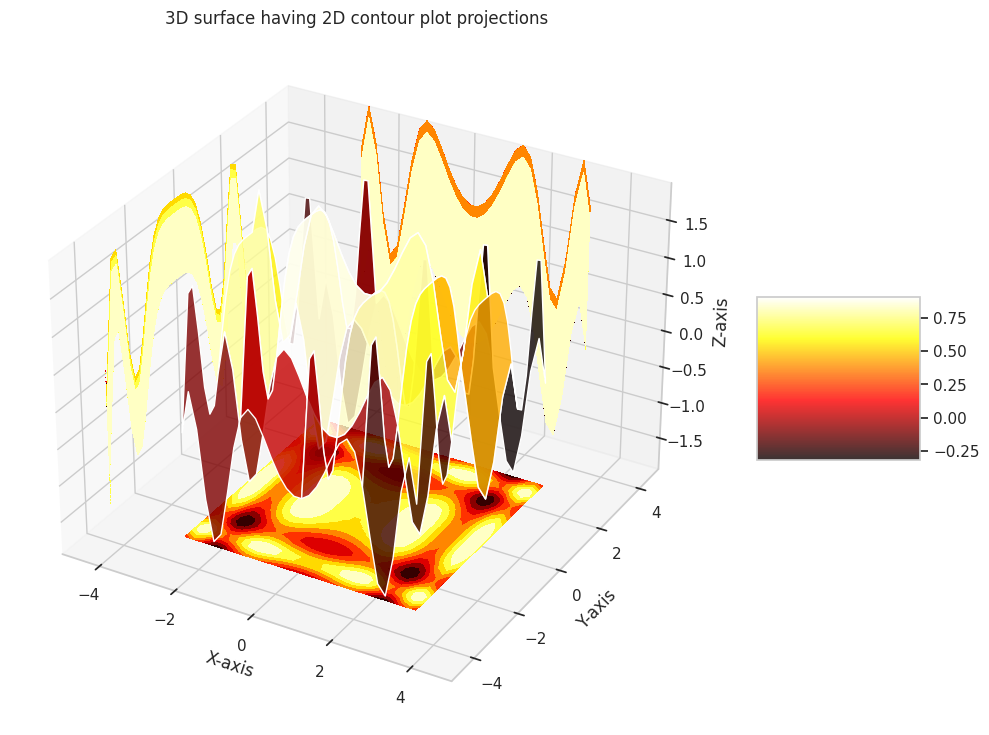
Surface plot over a contour plot#
# Import libraries
from mpl_toolkits import mplot3d
import numpy as np
import matplotlib.pyplot as plt

# Creating dataset
x = np.outer(np.linspace(-3, 3, 32), np.ones(32))
y = x.copy().T # transpose
z = (np.sin(x **2) + np.cos(y **2) )
##x = X
##y = Y
##z = Z

# Creating figure
fig = plt.figure(figsize =(14, 9))
ax = plt.axes(projection ='3d')

# Creating color map
my_cmap = plt.get_cmap('hot')

# Creating plot
surf = ax.plot_surface(x, y, z,
                       rstride = 8,
                       cstride = 8,
                       alpha = 0.8,
                       cmap = my_cmap)
cset = ax.contourf(x, y, z,
                   zdir ='z',
                   offset = np.min(z),
                   cmap = my_cmap)
cset = ax.contourf(x, y, z,
                   zdir ='x',
                   offset =-5,
                   cmap = my_cmap)
cset = ax.contourf(x, y, z,
                   zdir ='y',
                   offset = 5,
                   cmap = my_cmap)
fig.colorbar(surf, ax = ax,
             shrink = 0.5,
             aspect = 1)

# Adding labels
ax.set_xlabel('X-axis')
ax.set_xlim(-5, 5)
ax.set_ylabel('Y-axis')
ax.set_ylim(-5, 5)
ax.set_zlabel('Z-axis')
ax.set_zlim(np.min(z), np.max(z))
ax.set_title('3D surface having 2D contour plot projections')

# show plot
plt.show()
Presentation Graphics#
The primary goal of engineering and science studies is to support decision-making with credible, data-driven conclusions. While decisions can be made arbitrarily (e.g., flipping a coin), science and data enhance credibility.
Why Use Presentation Graphics?#
Decisions require explanation and support.
Written materials may imply potential litigation, making clear presentation essential.
Graphics simplify and clarify complex information.
Types of Graphics#
Graphs: Highlight relationships, differentiate “signal” from “noise.”
Tables: Present similar data but are harder to interpret.
Maps: Depict spatial relationships effectively.
Thematic Maps: Show grouped spatial relationships.
Psychology of Graphs#
Precision and Audience#
Use lower precision for general audiences.
Use higher precision for technical audiences.
Color#
Hot colors (e.g., red) appear larger than cool colors (e.g., blue) of the same size; pastels avoid this bias.
Avoid “newspaper” graphics.
Use color lines instead of B&W where feasible.
Be cautious with red/green combinations—common colorblindness affects perception.
Shading and Size#
Shading is hard to interpret in thematic maps with varying area sizes; limit to ~5 distinguishable shades.
Volume/Area#
Pie charts only show large differences well; prefer ordered bar graphs.
Pie charts with percentages indicate poor design.
Angle, Slope, and Curvature#
Hard to perceive; plot differences when variations matter.
Use raw data when uniformity is key.
Length#
Judging lengths is difficult without a common scale; color and shading distort perception.
Grouped vs. Stacked Bar Charts#
Favor dot charts or boxplots for better clarity.
Pitfalls to Avoid#
Perspective: Distorts scales; acceptable for marketing but not technical presentations.
Scale Breaks: Must be obvious (e.g., in financial charts).
Overlapping Histograms: Confusing and unclear.