Logarithmic Charts
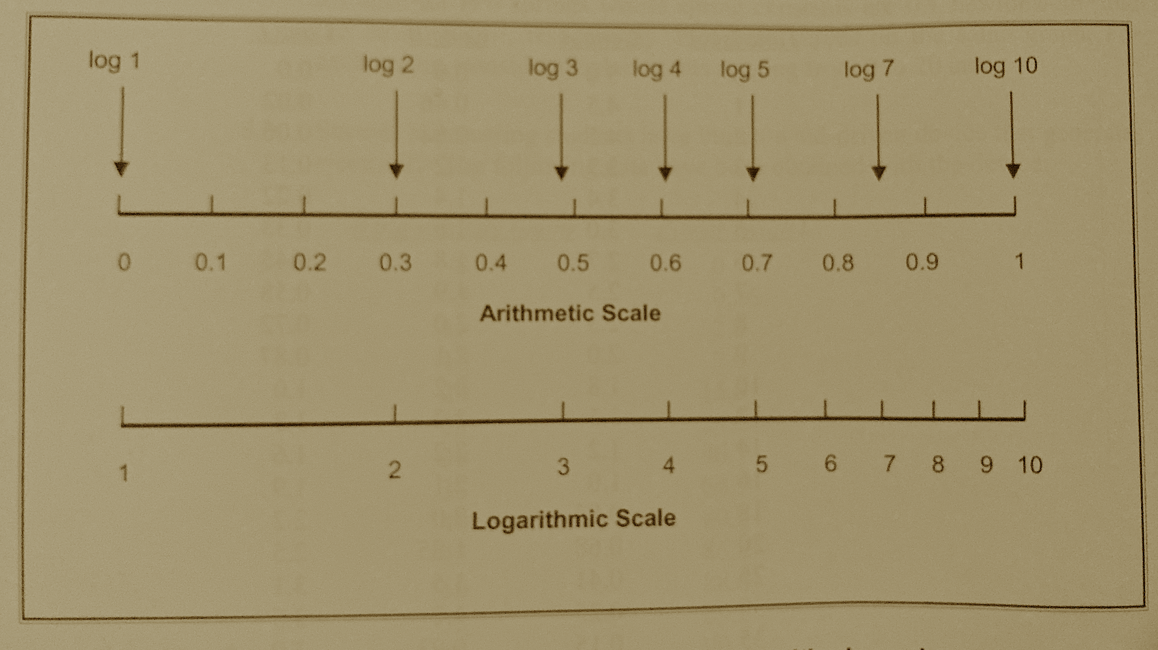
Fig. 8 Comparison of arithmetic and logarithmic scales
Semi-Log Charts
A graph in which the y-axis (the ordinate) has a logarithmic scale and the x-axis (the abcissa) has an arithmetic scale is called a semi-log graph. The orientation can be reversed (x-axis log scale, y-axis arithmetic scale) and it is still called a semi-log graph. Semi-log graphs are used in many diverse fields including engineering, chemistry, physics, biology, and economics.
Consider a capacitor whose discharge history is given by
\(V(t) = 10.0~e^{-0.5~t}\)
over the interval of 0 to 10 seconds.
Fig. 9 is a plot of the capacitor voltage versus time (with markers at some computation points). Observe there is distinct curvature in the plot.
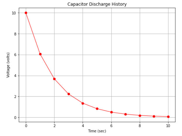
Fig. 9 An arithmetic plot of capacitor discharge voltage history
However if we plot with the y-axis (voltage) on a logarithmic scale we obtain Fig. 10 which displays as a straight line on the plot.
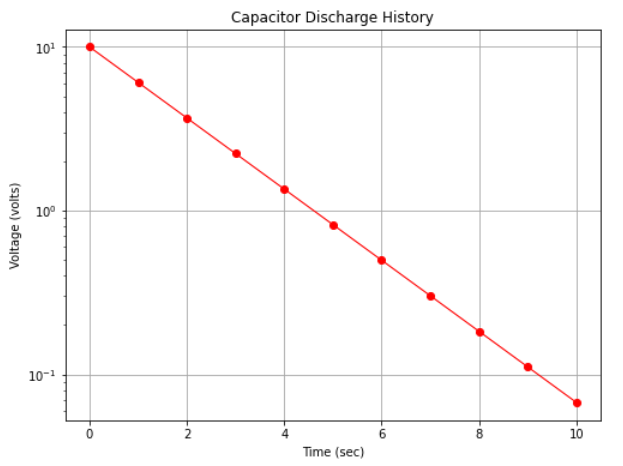
Fig. 10 A semi-log plot of capacitor discharge voltage history
Note
The data in the two plots are identical, only how the scales were rendered is different. We would also have found a straight line in arithmetic space if we plotted log(y) versus x on the arithmetic scale.
Semi-log plots are used for two primary reasons:
The range of the y-values is large, spanning several orders of magnitude (powers of 10); for example in Fig. 10 the y-axis ranges a bit beyond \(10^{-1}\) to \(10^{+1}\) (and is thus called a 3-cycle semi-log graph).
Exponential phenomenoa appear as straight lines when plotted on a semi-log graph. Many natural and engineered phenomenoa are well modeled by this relationship. Thus if data plot as a roughly straight line on a semi-log plot, that itself is convinging evidence that an exponential-type data model will be a good choice to examine as a prediction engine for the process.
To learn why the capacitor discharge history plots as a straight line consider the meaning of the logarithmic scale.
If we start with our data model: \(V(t) = 10.0~e^{-0.5~t}\)
Then take the log of the equation: \(log(V(t)) = log(10.0~e^{-0.5~t})\)
Then apply rules of exponents and logarithms: \(log(V(t)) = log(10.0)+log(e^{-0.5~t})\)
Again: \(log(V(t)) = log(10.0)-0.5~t*log(e)\)
Evaluate the \(log(e)\) and replace with the resulting constant: \(log(V(t)) = 1-0.5*0.434*t\)
Perform remaining arithmetic: \(log(V(t)) = 1-0.2171*t\)
We now have the equation of the logarithm of voltage in terms of time and some constants.
Example 7-6
The example below generates the two figures above. First figure Fig. 9. Define a function that evaluates \(V(t) = 10.0~e^{-0.5~t}\) then execute the cell to prototype the function.
def func(t):
    import math
    func = 10.0*math.exp(-0.5*t)
    return(func)
Now import our plotting tools (if we have already done so we can skip this step).
# import the package
from matplotlib import pyplot as plt
Now define a list of x-axis values to plot, and create a corresponding list of y-values using the function.
# Create two lists; time  and speed.
time = [0,1.0,2.0,3.0,4.0,5.0,6.0,7.0,8.0,9.0,10.0]
voltage = []
for i in range(len(time)):  # populate the lists using the function
    voltage.append(func(time[i]))
Now we make the plot as in other examples, changing the labels and title.
# Create a line chart of voltage on y axis and time on x axis
mydata = plt.figure(figsize = (8,6)) # build a drawing canvass from figure class; aspect ratio 4x3
plt.plot(time, voltage, c='red', marker='o',linewidth=1) # basic line plot
plt.xlabel('Time (sec)') # label the x-axis
plt.ylabel('Voltage (volts)') # label the y-axis, notice the LaTex markup
#plt.legend(['series1','series2...']) # legend for each series
plt.title('Capacitor Discharge History') # make a plot title
plt.grid() # display a grid
plt.show() # display the plot
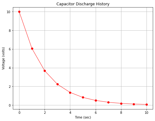
Now to construct figure Fig. 10. We literally add a single instruction in the plotting routine to instruct the plotting package to render the y-axis on a logarithmic scale.
# Create a line chart of voltage on y axis and time on x axis
mydata = plt.figure(figsize = (8,6)) # build a drawing canvass from figure class; aspect ratio 4x3
plt.plot(time, voltage, c='red', marker='o',linewidth=1) # basic line plot
plt.yscale('log') # set y-axis to display a logarithmic scale #################
plt.xlabel('Time (sec)') # label the x-axis
plt.ylabel('Voltage (volts)') # label the y-axis, notice the LaTex markup
#plt.legend(['series1','series2...']) # legend for each series
plt.title('Capacitor Discharge History') # make a plot title
plt.grid() # display a grid
plt.show() # display the plot
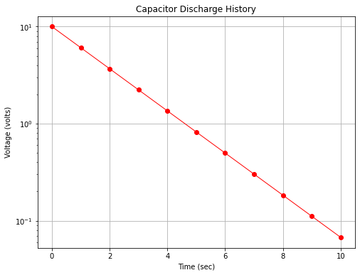
The chart itself can be used to infer the underlying equation. Notice the model is of the form (structure)
\(\text{ordinate}=\text{constant}+\text{slope}\cdot\text{abscissa}\)
or
\(log~y =\beta_0+\beta_1 \cdot x\)
In the present example \(\beta_0 = 1\) which inverse mapped back to arithmetic space is \(10^{\beta_0} = 10\) The slope \(\beta_1= \frac{log(y_2)-log(y_1)}{x_2-x_1} = \frac{y_2/y_1}{x_2-x_1}\) Using the values at x=0 and x=9.2 for \(x_1\) and \(x_2\) and the corresponding y values the slope is about \(-0.2174\) Knowing that our model should be in base \(e\) logs, we divide by the constant 0.434 (or multiply by 2.303) to obtain 0.5006 so the inverse transformation is
\(y = 10^{\beta_0}*e^{\beta_1 * 2.303 *t} = 10*e^{0.5006~t}\) which is darn close to the generating model.
import math
(math.log10(0.1)-math.log10(10))/(9.2-0)
-0.2173913043478261
