The matplotlib package
matplotlib is the container package for several plotting tools, the one in particular that is used herein is the pyplot sub-package.
matplotlib.pyplot is a collection of functions that make matplotlib work like MATLAB. Each pyplot function makes some change to a figure: e.g., creates a figure, creates a plotting area in a figure, plots some lines in a plotting area, decorates the plot with labels, etc.
In matplotlib.pyplot various states are preserved across function calls, so that it keeps track of things like the current figure and plotting area, and the plotting functions are directed to the current axes (please note that “axes” here and in most places in the documentation refers to the axes part of a figure and not the strict mathematical term for more than one axis).
importing matplotlib.pyplot
The import directive must precede any plotting you perform, the kernel has to prototype all the functions, so its usually convienent to just import at the beginning (top) of your notebook using any of the following directives:
import matplotlib.pyplot

#or

import matplotlib.pyplot as plt

#or

from matplotlib import pyplot as plt
Line Charts
A line chart or line plot or line graph or curve chart is a type of chart which displays information as a series of data points called ‘markers’ connected by straight line segments.
It is a basic type of chart common in many fields. It is similar to a scatter plot (below) except that the measurement points are ordered (typically by their x-axis value) and joined with straight line segments.
Note
The line segments can be suppressed by specifying a zero linewidth
A line chart is often used to visualize a trend in data over intervals of time – a time series – thus the line is often drawn chronologically, hence the implicit ordering makes sense.
The x-axis spacing is sometimes tricky, hence line charts can unintentionally decieve - so be careful that it is the appropriate chart for your application.
The examples below illustrate various line charts that were presented in the previous section - all those charts are variations of the general line chart type.
Example 7-1
This example generates the plot shown on Fig. 3.
# import the package
from matplotlib import pyplot as plt
# Create two lists; time  and speed.
time = [0,1.0,2.0,3.0,4.0,5.0,6.0]
speed = [0,3,7,12,20,30,45.6]
# Create a line chart of speed on y axis and time on x axis
mydata = plt.figure(figsize = (8,6)) # build a drawing canvass from figure class; aspect ratio 4x3
plt.plot(time, speed, c='red', marker='o',linewidth=0) # basic line plot
plt.xlabel('Time (sec)') # label the x-axis
plt.ylabel('Speed '+r'($\frac{m}{s}$)') # label the y-axis, notice the LaTex markup
#plt.legend(['series1','series2...']) # legend for each series
plt.title('Vehicle Speed vs Time') # make a plot title
plt.grid() # display a grid
plt.show() # display the plot
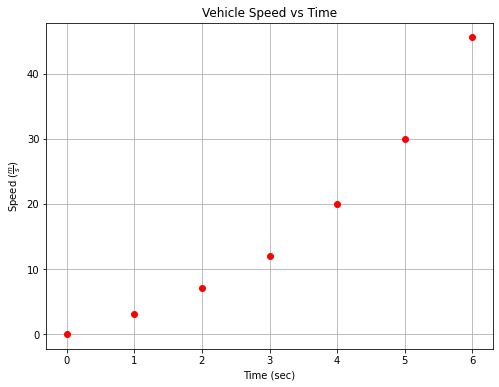
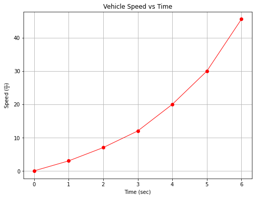
To activate the “line” joining the markers, change linewidth to non-zero to produce Fig. 4
# Create a line chart of speed on y axis and time on x axis
mydata = plt.figure(figsize = (8,6)) # build a drawing canvass from figure class; aspect ratio 4x3
plt.plot(time, speed, c='red', marker='o',linewidth=1) # basic line plot
plt.xlabel('Time (sec)') # label the x-axis
plt.ylabel('Speed '+r'($\frac{m}{s}$)') # label the y-axis, notice the LaTex markup
#plt.legend(['series1','series2...']) # legend for each series
plt.title('Vehicle Speed vs Time') # make a plot title
plt.grid() # display a grid
plt.show() # display the plot
Example 7-2
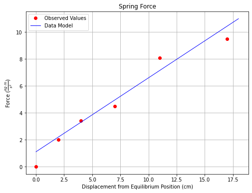
This example generates the plot shown on Fig. 5.
# Create two lists; displacement and force.
displacement = [0,2.0,4.0,7.0,11.0,17.0]
force = [0,2,3.4,4.5,8.1,9.5]
# Create a line chart of displacement on x axis and force on y axis
mydata = plt.figure(figsize = (8,6)) # build a square drawing canvass from figure class
plt.plot(displacement, force, c='red', marker='o',linewidth=0) # basic line plot
#plt.plot([0,18],[1.1,11],c='blue',linewidth=1)
plt.xlabel('Displacement from Equilibrium Position (cm)')
plt.ylabel('Force '+r'($\frac{kg~m}{s^2}$)')
#plt.legend(seriesnames)
plt.title('Spring Force')
plt.grid()
plt.show()
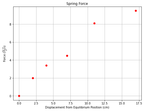
To plot a straight line, simply create a second series, activate the legend and proceede. The code below generates the plot shown on Fig. 6.
# Create a line chart of displacement on x axis and force on y axis
mydata = plt.figure(figsize = (8,6)) # build a square drawing canvass from figure class
plt.plot(displacement, force, c='red', marker='o',linewidth=0) # basic line plot
plt.plot([0,18],[1.1,11],c='blue',linewidth=1)
plt.xlabel('Displacement from Equilibrium Position (cm)')
plt.ylabel('Force '+r'($\frac{kg~m}{s^2}$)')
#plt.legend(['Observed Values','Data Model'])
plt.title('Spring Force')
plt.grid()
plt.show()
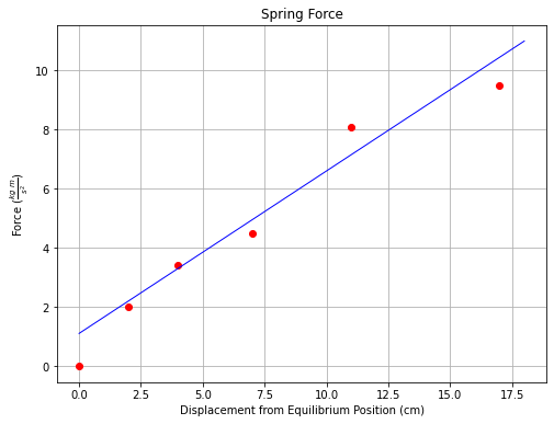
We can further decorate the plot by activating a legend as shown below.
# Create a line chart of displacement on x axis and force on y axis
mydata = plt.figure(figsize = (8,6)) # build a square drawing canvass from figure class
plt.plot(displacement, force, c='red', marker='o',linewidth=0) # basic line plot
plt.plot([0,18],[1.1,11],c='blue',linewidth=1)
plt.xlabel('Displacement from Equilibrium Position (cm)')
plt.ylabel('Force '+r'($\frac{kg~m}{s^2}$)')
plt.legend(['Observed Values','Data Model'])
plt.title('Spring Force')
plt.grid()
plt.show()
Example 7-3
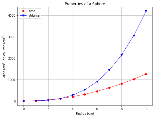
This example generates the two-series plot (Volume and Area) shown in Fig. 7
To make the graph, a list of radii are created, and two empty lists are created to store the volume and arae values. A repetition structure (for loop) is used to evaluate the equations that produces the volume and surface area of a sphere.
Area Formula: \(A(r) = 4 \pi r^2\)
Volume Formula: \(V(r) = \frac{4}{3} \pi r^3\)
Notice we use the math package to obtain the constant \(\pi\)
# Create two lists; time  and speed.
import math
radius = [0,1,2,3,4,5,6,7,8,9,10] # list of radii
area = [] # empty list to store computed area
volume = [] # empty list to store computed volume
for i in range(len(radius)):  # populate the lists using sphere formulas
    area.append(4.0*math.pi*radius[i]**2)
    volume.append((4.0/3.0)*math.pi*radius[i]**3)
# Create a line chart of area or volume y axis and radius on x axis
mydata = plt.figure(figsize = (8,6)) # build a square drawing canvass from figure class
plt.plot(radius, area, c='red', marker='o',linewidth=1) # basic line plot
plt.plot(radius,volume,c='blue',marker='v',linewidth=1)
plt.xlabel('Radius (cm)')
plt.ylabel('Area '+r'($cm^2$)'+' or Volume '+r'($cm^3$)')
#plt.legend(seriesnames)
plt.title('Properties of a Sphere')
plt.grid()
plt.legend(['Area','Volume'])
plt.show()
Scatterplots
A scatter plot (also called a scatterplot, scatter graph, scatter chart, scattergram, or scatter diagram) is a type of plot or mathematical diagram using Cartesian coordinates to display values for typically two variables for a set of data. If the points are coded (color/shape/size), one additional variable can be displayed. The data are displayed as a collection of points, each having the value of one variable determining the position on the horizontal axis and the value of the other variable determining the position on the vertical axis.
A scatter plot can be used either when one continuous variable that is under the control of the experimenter and the other depends on it or when both continuous variables are independent. If a parameter exists that is systematically incremented and/or decremented by the other, it is called the control parameter or independent variable and is customarily plotted along the horizontal axis. The measured or dependent variable is customarily plotted along the vertical axis. If no dependent variable exists, either type of variable can be plotted on either axis and a scatter plot will illustrate only the degree of correlation (not causation) between two variables.
A scatter plot can suggest various kinds of correlations between variables with a certain confidence interval. For example, weight and height, weight would be on y axis and height would be on the x axis. Correlations may be positive (rising), negative (falling), or null (uncorrelated). If the pattern of dots slopes from lower left to upper right, it indicates a positive correlation between the variables being studied. If the pattern of dots slopes from upper left to lower right, it indicates a negative correlation.
A line of best fit (our datamodel alternatively called trendline) can be drawn in order to study the relationship between the variables. An equation for the correlation between the variables can be determined by established best-fit procedures. For a linear correlation, the best-fit procedure is known as linear regression and is guaranteed to generate a correct solution in a finite time. No universal best-fit procedure is guaranteed to generate a solution for arbitrary relationships. A scatter plot is also very useful when we wish to see how two comparable data sets agree and to identify nonlinear relationships between variables.
Furthermore, if the data are represented by a mixture model of simple relationships, these relationships will be visually evident as superimposed patterns.
Scatter charts can be built in the form of bubble, marker, or/and line charts.
Much of the above is verbatim/adapted from: https://en.wikipedia.org/wiki/Scatter_plot
The example below uses a database table from galton_subset.csv and the pandas package
Example 7-4A
This example generates a two-series scatterplot using data extracted from a dataframe (hence the need for pandas). First we download a copy of the database using the requests module using the code block below.
# This code block will get the database, execute exactly as written
import requests
remote_url="http://54.243.252.9/engr-1330-webroot/4-Databases/galton_subset.csv"  # set the url
rget = requests.get(remote_url, allow_redirects=True)  # get the remote resource, follow imbedded links
localfile = open('galton_subset.csv','wb') # open connection to a local file same name as remote
localfile.write(rget.content) # extract from the remote the contents,insert into the local file same name
localfile.close() # close connection to the local file
Next we import the data from a file using the pandas read file method, and use the .head() mehtod to examine the dataframe.
import pandas as pd
# Example 1.  A data file containing heights of fathers, mothers, and sons is to be examined
df = pd.read_csv('galton_subset.csv')
df['child']= df['son'] ; df.drop('son', axis=1, inplace = True) # rename son to child - got to imagine there are some daughters
df.head()
| father | mother | child | |
|---|---|---|---|
| 0 | 78.5 | 67.0 | 73.2 |
| 1 | 75.5 | 66.5 | 73.5 |
| 2 | 75.0 | 64.0 | 71.0 |
| 3 | 75.0 | 64.0 | 70.5 |
| 4 | 75.0 | 58.5 | 72.0 |
Dataframe is 3 columns, next create lists from the dataframe so we can use the syntax from the previous examples in our plot calls.
# build some lists
daddy = df['father'] ; mommy = df['mother'] ; baby = df['child']
Rudimentary plot call to see if we have enough syntax structure to proceede
myfamily = plt.figure(figsize = (4, 4)) # build a square drawing canvass from figure class
plt.scatter(baby, daddy, c='red') # basic scatter plot
plt.show()
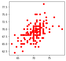
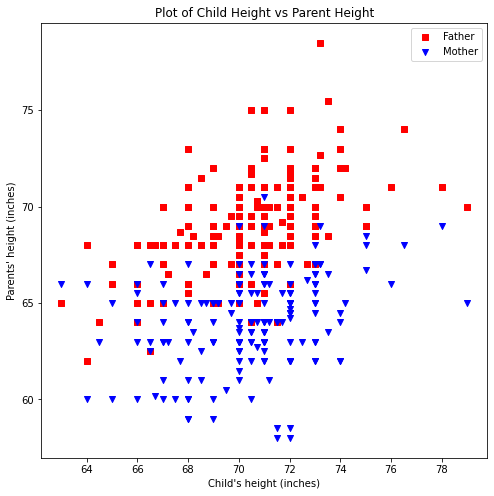
The plot is rendering, so now lets plot the data as classified by mother and father, and include the elements of a good chart.
Title
Label x,y axes and include units
Legend
Color/marker to identify each data series
The script below improves the figure
myfamily = plt.figure(figsize = (8, 8)) # build a square drawing canvass from figure class
plt.scatter(baby, daddy, c='red' , marker='s', label='Father') # one plot series
plt.scatter(baby, mommy, c='blue', marker='v',label='Mother') # two plot series
plt.xlabel("Child's height (inches)")
plt.ylabel("Parents' height (inches)")
plt.title("Plot of Child Height vs Parent Height")
plt.legend()
plt.show() # render the two plots
Example 7-4B
It is also possible to make the plots directly in pandas as shown below
ax = df.plot.scatter(x="child", y="father", c="red", marker="s", label='Father')
ax = df.plot.scatter(x="child", y="mother", c="blue", marker="v",label='Mother', ax=ax)
ax.set_title("Plot of Child Height vs Parent Height")
ax.set_xlabel("Child's height (inches)")
ax.set_ylabel("Parents' Height (inches)");# notice the ; what happens if it is left out?
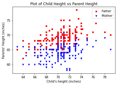
Changing the plot size in pandas is a bit more complicated and is left as a laboratory exercise
Summary
Line plots and scatterplots are similar
Line plots implicitly assume ordering of the x-axis (usually), if the line is suppressed the result is the same
Scatterplots make no such assumption, they are simply plots of (x,y) pairs. Color and marker shape are used to show multiple related sets on the same graph.
Exercise 2:
A polymeric material contains a solvent that dissolves as a function of time. The concentration of the solvent, expressed as a percentage of the total weight of the polymer, is shown in the table below.
Solvent Concentration (w%) |
Time(sec) |
|---|---|
30.2 |
0 |
44.7 |
2 |
22.5 |
4 |
41.3 |
6 |
28.8 |
8 |
14.0 |
10 |
26.2 |
12 |
11.0 |
14 |
23.4 |
16 |
14.5 |
18 |
4.2 |
20 |
Fit a linear data model to the data, plot the data and model. Determine the equation of the data model and the corresponding RMSE and R\(^2\) value. Compare the results for this data with the example, which data set produces a better fit? Why?
