
Simple Logistic Regression Examples
Logistic regression is a type of model fitting exercise where the observed responses are binary encoded (0,1). The input design matrix is a collection of features much like ordinary linear regression.
The logistic function is
where \(X_i\) is the i-th row of the design matrix, and \(\beta\) are unknown coefficients.
The associated optimization problem is to minimize some measure of error between the model values (above) and the observed values, typically a squared error is considered.
If we consider a single observatyon \(Y_i\) its value is either 0 or 1. So the error is
The function we wish to minimize is
The minimization method is a matter of analyst preference - these are usually well behaved minimization problems (the examples will use Powell’s Direction Set Method, and the Broyden–Fletcher–Goldfarb–Shanno algorithm; most professional tools operate on the logarithm of the components to avoid numerical overflow during the minimization process.
Note
Powell’s method is robust and comparatively simple to program, here is some older code Powell’s Method FORTRAN source code that is fairly readable and still works today!
The model result \(\pi_i\) will range between 0 and 1, and can be interpreted as a probability that the inputs predict a value of 1. Normally the decision boundary is set at 0.5, so when the model is cast into a prediction engine it will first compute a \(\pi_i\) value, then apply the decision boundary rule to either snap the result to 1 or 0 as indicated by the probability.
The example below should help clarify a bit.
Success at Task vs Experience
A systems analyst studied the effect of experience on ability to complete a complex task within a specified time. The participants had varying amounts of experience measured in months as shown in the table below, where E represents months of experience, and S is binary 0=FAIL, 1=SUCCESS
 E  S
14  0
29  0
 6  0
25  1
18  1
 4  0
18  0
12  0
22  1
 6  0
30  1
11  0
30  1
 5  0
20  1
13  0
 9  0
32  1
24  0
13  1
19  0
 4  0
28  1
22  1
 8  1
Perform a logistic regression and estimate the experience required to ensure sucess with an empirical probability of 75 percent.
# Load the data
experience=[14,29,6,25,18,4,18,12,22,6,30,11,30,5,20,13,9,32,24,13,19,4,28,22,8]
result=[0,0,0,1,1,0,0,0,1,0,1,0,1,0,1,0,0,1,0,1,0,0,1,1,1]
Now lets plot the data and see what we can learn, later on we will need a model and data plot on same figure, so just build it here
# Load a Plotting Tool
import matplotlib.pyplot as plt
def make1plot(listx1,listy1,strlablx,strlably,strtitle):
    mydata = plt.figure(figsize = (6,6)) # build a square drawing canvass from figure class
    plt.plot(listx1,listy1, c='red', marker='o',linewidth=0) # basic data plot
    plt.xlabel(strlablx)
    plt.ylabel(strlably)
    plt.legend(['Data','Model'])# modify for argument insertion
    plt.title(strtitle)
    plt.grid(axis='y')
    plt.show()
def make2plot(listx1,listy1,listx2,listy2,strlablx,strlably,strtitle):
    mydata = plt.figure(figsize = (6,6)) # build a square drawing canvass from figure class
    plt.plot(listx1,listy1, c='red', marker='o',linewidth=0) # basic data plot
    plt.plot(listx2,listy2, c='blue',linewidth=1) # basic model plot
    plt.xlabel(strlablx)
    plt.ylabel(strlably)
    plt.legend(['Data','Model'])# modify for argument insertion
    plt.title(strtitle)
    plt.grid(axis='y')
    plt.show()
Now plot the data
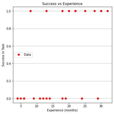
make1plot(experience,result,"Experience (months)","Success in Task","Success vs Experience")
Now a logistic model, we will need 3 prototype functions; a sigmoid function, an error function (here we use sum of squared error) and a merit function to minimize by changing \(\beta_0\) and \(\beta_1\).
The sigmoid function is
def pii(b0,b1,x): #sigmoidal function
    import math
    pii = math.exp(b0+b1*x)/(1+ math.exp(b0+b1*x))
    return(pii)

def sse(mod,obs): #compute sse from observations and model values
    howmany = len(mod)
    sse=0.0
    for i in range(howmany):
        sse=sse+(mod[i]-obs[i])**2
    return(sse)

def merit(beta): # merit function to minimize
    global result,experience #access lists already defined external to function
    mod=[0 for i in range(len(experience))]
    for i in range(len(experience)):
        mod[i]=pii(beta[0],beta[1],experience[i])
    merit = sse(mod,result)
    return(merit)
Now we will attempt to minimize the merit function by changing values of \(\beta\), first lets apply an initial value and check that our merit function works
beta = [0,0] #initial guess of betas
merit(beta) #check that does not raise an exception
6.25
Good we obtained a value, and not an error, now an optimizer
import numpy as np
from scipy.optimize import minimize

#x0 = np.array([-3.0597,0.1615])
x0 = np.array(beta)
res = minimize(merit, x0, method='powell',options={'disp': True})
Optimization terminated successfully.
         Current function value: 4.199713
         Iterations: 5
         Function evaluations: 145
Yay! It found some answer, examine and plot the findings
fitted=[0 for i in range(40)]
xaxis =[0 for i in range(40)]
beta[0]=res.x[0]
beta[1]=res.x[1]
for i in range(40):
xaxis[i]=float(i)
fitted[i]=pii(res.x[0],res.x[1],float(i))
print(" b0 = ",res.x[0])
print(" b1 = ",res.x[1])
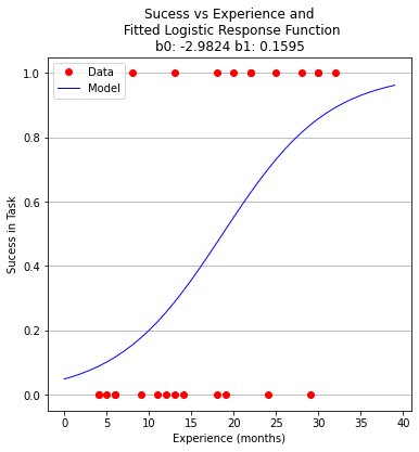
plottitle = 'Sucess vs Experience and\n Fitted Logistic Response Function\n'+'b0: '+ str(round(res.x[0],4))+ ' b1: ' +str(round(res.x[1],4))
make2plot(experience,result,xaxis,fitted,'Experience (months)','Sucess in Task',plottitle)
 b0 =  -2.982390266878914
 b1 =  0.15954743797099522
Now to recover estimates of success for different experience levels
guess = 25.5
pii(res.x[0],res.x[1],guess)
0.7476408418994896
So we expect that someone with 25 to 26 months of experience would have a 75 percent chance of success. Similarily the time to median success is 18 months and 3 weeks.
guess = 18.75
pii(res.x[0],res.x[1],guess)
0.5022810329444896
Now using the same data, but a formal logistic package
# import the class
import numpy
from sklearn.linear_model import LogisticRegression
X = numpy.array(experience)
y = numpy.array(result)
# instantiate the model (using the default parameters)
logreg = LogisticRegression(solver='lbfgs',max_iter=10000)
# fit the model with data  -TRAIN the model
#logreg.fit(X,y)
logreg.fit(X.reshape(-1, 1),y)
LogisticRegression(max_iter=10000)
logreg.coef_
array([[0.1608086]])
xplot = numpy.array(xaxis)
y_pred=logreg.predict(xplot.reshape(-1,1))
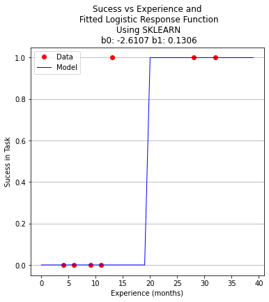
b0 = logreg.intercept_[0]
b1 = logreg.coef_[0][0]
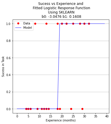
plottitle = 'Sucess vs Experience and\n Fitted Logistic Response Function\n Using SKLEARN\n '+'b0: '+ str(round(b0,4)) + ' b1: ' + str(round(b1,4))
make2plot(experience,result,xplot,y_pred,'Experience (months)','Sucess in Task',plottitle)
for i in range(40):
xaxis[i]=float(i)
fitted[i]=pii(beta[0],beta[1],float(i))
# fitted[i]=pii(b0,b1,float(i))
if fitted[i] > 0.5:
fitted[i] = 1.0
else:
fitted[i]=0.0
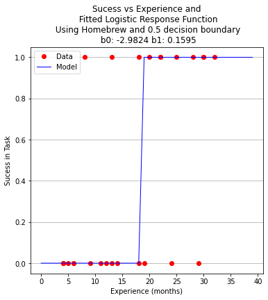
plottitle = 'Sucess vs Experience and\n Fitted Logistic Response Function\n Using Homebrew and 0.5 decision boundary\n '+'b0: '+ str(round(beta[0],4)) + ' b1: ' + str(round(beta[1],4))
make2plot(experience,result,xaxis,fitted,'Experience (months)','Sucess in Task',plottitle)
A proper ML approach would create a hold-out set (split) to provide some test of the model - in this example the data set is too small but to explore the syntax using ML workflow ….
Split the Data Set
from sklearn.model_selection import train_test_split
X_train,X_test,y_train,y_test=train_test_split(X,y,test_size=0.25,random_state=0)
Now perform the ML execrise in typical workflow
# instantiate the model (using the default parameters)
logreg = LogisticRegression(solver='lbfgs',max_iter=10000)
# fit the model with data  -TRAIN the model
logreg.fit(X_train.reshape(-1, 1),y_train)
LogisticRegression(max_iter=10000)
xplot = numpy.array(xaxis)
y_pred=logreg.predict(X_test.reshape(-1,1))

b0 = logreg.intercept_[0]
b1 = logreg.coef_[0][0]

for i in range(40):
    xaxis[i]=float(i)
#    fitted[i]=pii(beta[0],beta[1],float(i))
    fitted[i]=pii(b0,b1,float(i))
    if fitted[i] > 0.5:
        fitted[i] = 1.0
    else:
        fitted[i]=0.0
plottitle = 'Sucess vs Experience and\n Fitted Logistic Response Function\n Using SKLEARN\n '+'b0: '+ str(round(b0,4)) + ' b1: ' + str(round(b1,4))
make2plot(X_test,y_test,xaxis,fitted,'Experience (months)','Sucess in Task',plottitle)
How to assess the performance of logistic regression?
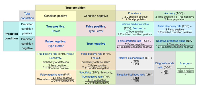
Binary classification has four possible types of results:
True negatives: correctly predicted negatives (zeros)
True positives: correctly predicted positives (ones)
False negatives: incorrectly predicted negatives (zeros)
False positives: incorrectly predicted positives (ones)
We usually evaluate the performance of a classifier by comparing the actual and predicted outputs and counting the correct and incorrect predictions. Our simple graph above conveys the same information, just not as easily interpreted.
A confusion matrix is a table that is used to display the performance of a classification model.
Some other indicators of binary classifiers include the following:
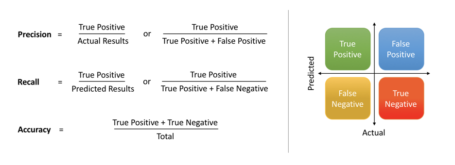
The most straightforward indicator of classification accuracy is the ratio of the number of correct predictions to the total number of predictions (or observations).
The positive predictive value is the ratio of the number of true positives to the sum of the numbers of true and false positives.
The negative predictive value is the ratio of the number of true negatives to the sum of the numbers of true and false negatives.
The sensitivity (also known as recall or true positive rate) is the ratio of the number of true positives to the number of actual positives.
The precision score quantifies the ability of a classifier to not label a negative example as positive. The precision score can be interpreted as the probability that a positive prediction made by the classifier is positive.
The specificity (or true negative rate) is the ratio of the number of true negatives to the number of actual negatives.
The extent of importance of recall and precision depends on the problem. Achieving a high recall is more important than getting a high precision in cases like when we would like to detect as many heart patients as possible. For some other models, like classifying whether a bank customer is a loan defaulter or not, it is desirable to have a high precision since the bank wouldn’t want to lose customers who were denied a loan based on the model’s prediction that they would be defaulters.
There are also a lot of situations where both precision and recall are equally important. Then we would aim for not only a high recall but a high precision as well. In such cases, we use something called F1-score. F1-score is the Harmonic mean of the Precision and Recall:

This is easier to work with since now, instead of balancing precision and recall, we can just aim for a good F1-score and that would be indicative of a good Precision and a good Recall value as well.

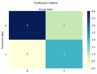
Model Evaluation using Confusion Matrix
The confusion matrix is a table that is used to evaluate the performance of a classification model. You can also visualize the performance of an algorithm. The fundamental content of a confusion matrix is the number of correct and incorrect predictions are summed up class-wise.
# import the metrics class
from sklearn import metrics
cnf_matrix = metrics.confusion_matrix(y_pred, y_test)
cnf_matrix
array([[4, 1],
       [0, 2]])
However it is often more visible in a heatmap structure
import seaborn as sns
import pandas as pd
class_names=[0,1] # name  of classes
fig, ax = plt.subplots()
tick_marks = np.arange(len(class_names))
plt.xticks(tick_marks, class_names)
plt.yticks(tick_marks, class_names)
# create heatmap
sns.heatmap(pd.DataFrame(cnf_matrix), annot=True, cmap="YlGnBu" ,fmt='g')
ax.xaxis.set_label_position("top")
plt.tight_layout()
plt.title('Confusion matrix', y=1.1)
plt.ylabel('Predicted label')
plt.xlabel('Actual label');
Confusion Matrix Evaluation Metrics: evaluate the model using model evaluation metrics such as accuracy, precision, and recall. Its all built-in to sklearn (although we could get it entirely from our homebrew results too!)
print("Accuracy:",metrics.accuracy_score(y_test, y_pred))
print("Precision:",metrics.precision_score(y_test, y_pred))
print("Recall:",metrics.recall_score(y_test, y_pred))
print("F1-score:",metrics.f1_score(y_test, y_pred))
Accuracy: 0.8571428571428571
Precision: 1.0
Recall: 0.6666666666666666
F1-score: 0.8
from sklearn.metrics import classification_report
print(classification_report(y_test, y_pred))
              precision    recall  f1-score   support

           0       0.80      1.00      0.89         4
           1       1.00      0.67      0.80         3

    accuracy                           0.86         7
   macro avg       0.90      0.83      0.84         7
weighted avg       0.89      0.86      0.85         7