7. Flood Hydrology and Urban Hydrology#
This lesson explores key methods for estimating flood magnitude and frequency, along with how urbanization affects hydrologic responses. Emphasis is placed on the tools used for design, regulation, and sustainable urban stormwater management.
Readings#
Archive(s)#
Videos#
Flood Estimation and Design Floods#
Flood frequency analysis (Log-Pearson Type III): Flood frequency analysis is a statistical method used to estimate the probability of various flood magnitudes occurring. The Log-Pearson Type III distribution, widely adopted by agencies such as the USGS and FEMA, is used to model the annual peak streamflow data. By fitting this distribution to observed data, engineers can estimate discharges for specified return periods (e.g., 10-, 50-, or 100-year floods) to guide infrastructure design and risk communication.
The 100-year flood does not mean a flood occurs once every 100 years—it means there’s a 1% chance of such a flood in any given year.
Regional flood equations and statistical approaches: In areas with limited streamflow data, regional regression equations derived from gaged watersheds provide a means to estimate flood discharges. These equations relate flood magnitudes to watershed characteristics such as area, slope, and rainfall. They enable engineers to perform flood assessments in ungauged or newly developed basins by leveraging data from similar hydrologic regions.
Hydrologic Statistics and Probability Estimation Modeling#
Most textbooks, including Gupta spend some time reviewing statistics and probability concepts. The link that follows is a quick refresher of important measures of data: Descriptive Statistics
Note
Time-series (where serial correlation is important) share these measures but other tools are used to make prediction engines. These tools are somewhat outside the scope of this course.
Probability Estimation Modeling#
Probability estimation modeling is the use of probability distributions (population data models) to model or explain behavior in observed (sample data) values. Once a particular distribution is selected, then the concept of risk (probability) can be explored for events of varying magnitudes.
Two important “extremes” in engineering:
Uncommon (rare) events (floods, nuclear plant explosions, etc.)
Common, almost predictable events (routine discharges, traffic accidents at a dangerous intersection, network failure on a due date, etc.)
The probability distribution is just a model of the data, like a trend line for deterministic behavior; different distributions have different shapes, and domains and can explain certain types of observations better than others.
Some Useful Distributions (data models) include:
Normal
LogNormal
Gamma
Weibull
Extreme Value (Gumbell)
Beta
There are many more; they all have the common property that they integrate to unity on the domain \(-\infty~to ~ \infty\).
The probability distributions (models) are often expressed as a density function or a cumulative distribution function.
Note
A large part of what follows is adapted from Theodore G. Cleveland, Farhang Forghanparast (2021), Computational Thinking and Data Science: Instructor’s Notes for ENGR 1330 at TTU, with contributions by: Dinesh Sundaravadivelu Devarajan, Turgut Batuhan Baturalp (Batu), Tanja Karp, Long Nguyen, and Mona Rizvi. Whitacre College of Engineering with some changes to be hydrologically relevant. The example data file is supplied as part of a homework exercise and is linked at http://54.243.252.9/ce-3354-webroot/ce-3354-webbook-2024/my3354notes/lessons/06-ProbabilityEstimation/beargrass.txt
import math

def normdensity(x,mu,sigma):
    weight = 1.0 /(sigma * math.sqrt(2.0*math.pi))
    argument = ((x - mu)**2)/(2.0*sigma**2)
    normdensity = weight*math.exp(-1.0*argument)
    return normdensity

def normdist(x,mu,sigma):
    argument = (x - mu)/(math.sqrt(2.0)*sigma)
    normdist = (1.0 + math.erf(argument))/2.0
    return normdist
# Standard Normal

mu = 0
sigma = 1

x = []
ypdf = []
ycdf = []

xlow = -10
xhigh = 10
howMany = 100
xstep = (xhigh - xlow)/howMany

for i in range(0,howMany+1,1):
    x.append(xlow + i*xstep)
    yvalue = normdensity(xlow + i*xstep,mu,sigma)
    ypdf.append(yvalue)
    yvalue = normdist(xlow + i*xstep,mu,sigma)
    ycdf.append(yvalue)

#x
#ypdf
#ycdf
Make the plot below, nothing too special just yet. Plots of the density (in blue) and cumulative density (probability) in red.
import matplotlib.pyplot # the python plotting library
myfigure = matplotlib.pyplot.figure(figsize = (10,5)) # generate a object from the figure class, set aspect ratio

# Built the plot
matplotlib.pyplot.plot(x, ypdf, color ='blue')
matplotlib.pyplot.plot(x, ycdf, color ='red')
matplotlib.pyplot.xlabel("Value of RV")
matplotlib.pyplot.ylabel("Density or Quantile Value")
matplotlib.pyplot.title("Normal Distribution Data Model")
matplotlib.pyplot.show()
Exceedence Probability#
The purpose of distributions is to model data and allow us to estimate an answer to the question, what is the probability that we will observe a value of the random variable less than or equal to some sentinel value. A common way to plot the quantile function is with accumulated probability on the horizontal axis, and random variable value on the vertical axis. Consider the figure below;

The RV Value is about 50,000 indicated by the horizontal magenta line.
The blue curve is some data model, for instance one of our distributions below.
The accumulated probability value at 50,000 is 0.1 or roughly 10% chance, but we also have to stipulate whether we are interested in less than or greater than.
In the figure shown, \(P(x <= 50,000)~ =~1.00~-~0.1~= 0.9~or~90\%\) and is a non-exceedence probability. In words we would state “The probability of observing a value less than or equal to 50,000 is 90%” the other side of the vertical line is the exceedence probability; in the figure \(P(x > 50,000)~=~0.1~or~10\%\). In words we would state “The probability of observing a value equal to or greater than 50,000 is 10%.” In risk analysis the sense of the probability is easily confusing, so when you can - make a plot. Another way to look at the situation is to simply realize that the blue curve is the quantile function \(F(X)\) with \(X\) plotted on the vertical axis, and \(F(X)\) plotted on the horizontal axis.
Now lets put these ideas to use. We will sample from the population of integers from 0 to 100, with replacement. Any single pull from the population is equally likely. Lets take 25 samples (about 1/4 of the total population - usually we dont know the size of the population).
import numpy

population = []
for i in range(0,101,1):
    population.append(i)

sample = numpy.random.choice(population,25)
# lets get some statistics
sample_mean = sample.mean()
sample_variance = sample.std()**2
# sort the sample in place!
sample.sort()
# built a relative frequency approximation to probability, assume each pick is equally likely
weibull_pp = []
for i in range(0,len(sample),1):
    weibull_pp.append((i+1)/(len(sample)+1))
# Now plot the sample values and plotting position
myfigure = matplotlib.pyplot.figure(figsize = (10,5)) # generate a object from the figure class, set aspect ratio

# Built the plot
matplotlib.pyplot.scatter(weibull_pp, sample, color ='blue')
matplotlib.pyplot.plot(ycdf, x, color ='red')
matplotlib.pyplot.ylabel("Value of RV")
matplotlib.pyplot.xlabel("Density or Quantile Value")
matplotlib.pyplot.title("Normal Distribution Data Model")
matplotlib.pyplot.show()
What a horrible plot, but lets now use the sample statistics to “fit” the data model (red) to the observations (blue). Notice we have already rotated the axes so this plot and ones that follow are structured like the “Exceedence” plot above.
# Fitted Model

mu = sample_mean
sigma = math.sqrt(sample_variance)

x = []
ycdf = []

xlow = 0
xhigh = 100
howMany = 100
xstep = (xhigh - xlow)/howMany

for i in range(0,howMany+1,1):
    x.append(xlow + i*xstep)
    yvalue = normdist(xlow + i*xstep,mu,sigma)
    ycdf.append(yvalue)
# Now plot the sample values and plotting position
myfigure = matplotlib.pyplot.figure(figsize = (10,5)) # generate a object from the figure class, set aspect ratio

# Built the plot
matplotlib.pyplot.scatter(weibull_pp, sample,  color ='blue')
matplotlib.pyplot.plot(ycdf, x,  color ='red')
matplotlib.pyplot.ylabel("Value of RV")
matplotlib.pyplot.xlabel("Quantile Value")
mytitle = "Normal Distribution Data Model sample mean = : " + str(sample_mean)+ " sample variance =:" + str(sample_variance)
matplotlib.pyplot.title(mytitle)
matplotlib.pyplot.show()
popmean = numpy.array(population).mean()
popvar = numpy.array(population).std()**2
# Fitted Model

mu = popmean
sigma = math.sqrt(popvar)

x = []
ycdf = []

xlow = 0
xhigh = 100
howMany = 100
xstep = (xhigh - xlow)/howMany

for i in range(0,howMany+1,1):
    x.append(xlow + i*xstep)
    yvalue = normdist(xlow + i*xstep,mu,sigma)
    ycdf.append(yvalue)


# Now plot the sample values and plotting position
myfigure = matplotlib.pyplot.figure(figsize = (10,5)) # generate a object from the figure class, set aspect ratio

# Built the plot
matplotlib.pyplot.scatter(weibull_pp, sample, color ='blue')
matplotlib.pyplot.plot(ycdf, x,  color ='red')
matplotlib.pyplot.ylabel("Value of RV")
matplotlib.pyplot.xlabel("Quantile Value")
mytitle = "Normal Distribution Data Model Population mean = : " + str(popmean)+ " Population variance =:" + str(popvar)
matplotlib.pyplot.title(mytitle)
matplotlib.pyplot.show()
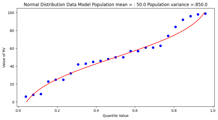
Some observations are in order:
The population is a uniformly distributed collection.
By random sampling, and keeping the sample size small, the sample distribution appears approximately normal.
Real things of engineering interest are not always bounded as shown here, the choice of the Weibull plotting position is not arbitrary. The blue dot scatterplot in practice is called the empirical distribution function, or empirical quantile function.
Now we will apply these ideas to some realistic data.
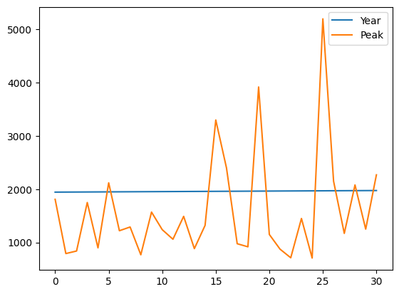
Beargrass Creek#
The file beargrass.txt contains annual peak flows for Beargrass Creek. The year is a water year, so the peaks occur on different days in each year; thus it is not a time series. Let’s examine the data and see how well a Normal distribution data model fits, then estimate from the distribution the peak magnitude with exceedence probability 0.01 (1%-chance that will observe a value equal to or greater).
import pandas
beargrass = pandas.read_csv('beargrass.txt')  #Reading a .csv file
beargrass.head()
| Year | Peak | |
|---|---|---|
| 0 | 1945 | 1810 |
| 1 | 1946 | 791 |
| 2 | 1947 | 839 |
| 3 | 1948 | 1750 |
| 4 | 1949 | 898 |
beargrass.plot()
<Axes: >
Now we will just copy code (the miracle of cut-n-paste!)
sample = beargrass['Peak'].tolist() # put the peaks into a list
sample_mean = numpy.array(sample).mean()
sample_variance = numpy.array(sample).std()**2
sample.sort() # sort the sample in place!
weibull_pp = [] # built a relative frequency approximation to probability, assume each pick is equally likely
for i in range(0,len(sample),1):
    weibull_pp.append((i+1)/(len(sample)+1))
################
mu = sample_mean # Fitted Model
sigma = math.sqrt(sample_variance)
x = []; ycdf = []
xlow = 0; xhigh = 1.2*max(sample) ; howMany = 100
xstep = (xhigh - xlow)/howMany
for i in range(0,howMany+1,1):
    x.append(xlow + i*xstep)
    yvalue = normdist(xlow + i*xstep,mu,sigma)
    ycdf.append(yvalue)
# Now plot the sample values and plotting position
myfigure = matplotlib.pyplot.figure(figsize = (7,9)) # generate a object from the figure class, set aspect ratio
matplotlib.pyplot.scatter(weibull_pp, sample ,color ='blue')
matplotlib.pyplot.plot(ycdf, x, color ='red')
matplotlib.pyplot.xlabel("Quantile Value")
matplotlib.pyplot.ylabel("Value of RV")
mytitle = "Normal Distribution Data Model sample mean = : " + str(sample_mean)+ " sample variance =:" + str(sample_variance)
matplotlib.pyplot.title(mytitle)
matplotlib.pyplot.show()
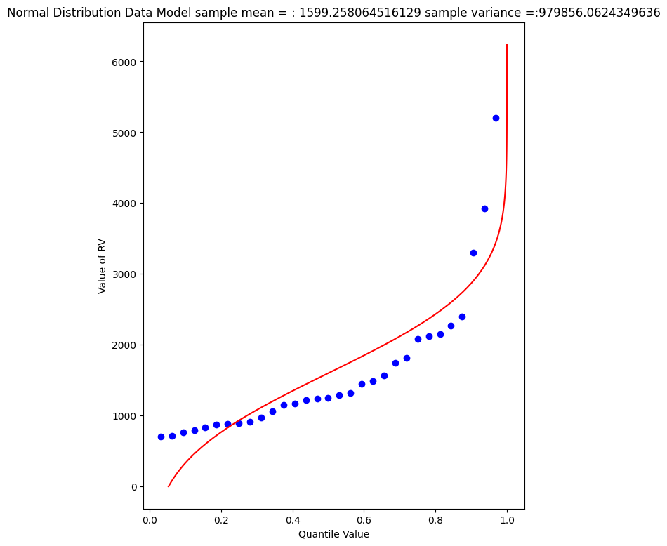
beargrass['Peak'].describe()
count      31.000000
mean     1599.258065
std      1006.239500
min       707.000000
25%       908.000000
50%      1250.000000
75%      1945.000000
max      5200.000000
Name: Peak, dtype: float64
A 1% chance exceedence is on the right side of the chart, it is the compliment of 99% non-exceedence, in terms of our quantile function we want to find the value \(X\) that returns a quantile of 0.99.
myguess = 6000
print(mu,sigma)
print(normdist(myguess,mu,sigma))
1599.258064516129 989.8767915427474
0.9999956206542673
# If we want to get fancy we can use Newton's method to get really close to the root

from scipy.optimize import newton

def f(x):
    mu = 1599.258064516129
    sigma = 989.8767915427474
    quantile = 0.99999
    argument = (x - mu)/(math.sqrt(2.0)*sigma)
    normdist = (1.0 + math.erf(argument))/2.0
    return normdist - quantile

print(newton(f, myguess))
5820.974479887303
So a peak discharge of 4000 or so is expected to be observed with 1% chance, notice we took the value from the fitted distribution, not the empirical set. As an observation, the Normal model is not a very good data model for these observations.
Log-Normal#
Another data model we can try is log-normal, where we stipulate that the logarithms of the observations are normal. The scripts are practically the same, but there is an inverse transformation required to recover original value scale. Again we will use Beargrass creek.
def loggit(x):  # A prototype function to log transform x
    return(math.log(x))

logsample = beargrass['Peak'].apply(loggit).tolist() # put the peaks into a list
sample_mean = numpy.array(logsample).mean()
sample_variance = numpy.array(logsample).std()**2
logsample.sort() # sort the sample in place!
weibull_pp = [] # built a relative frequency approximation to probability, assume each pick is equally likely
for i in range(0,len(sample),1):
    weibull_pp.append((i+1)/(len(sample)+1))
################
mu = sample_mean # Fitted Model in Log Space
sigma = math.sqrt(sample_variance)
x = []; ycdf = []
xlow = 1; xhigh = 1.05*max(logsample) ; howMany = 100
xstep = (xhigh - xlow)/howMany
for i in range(0,howMany+1,1):
    x.append(xlow + i*xstep)
    yvalue = normdist(xlow + i*xstep,mu,sigma)
    ycdf.append(yvalue)
# Now plot the sample values and plotting position
myfigure = matplotlib.pyplot.figure(figsize = (7,9)) # generate a object from the figure class, set aspect ratio
matplotlib.pyplot.scatter(weibull_pp, logsample ,color ='blue')
matplotlib.pyplot.plot(ycdf, x, color ='red')
matplotlib.pyplot.xlabel("Quantile Value")
matplotlib.pyplot.ylabel("Value of RV")
mytitle = "Log Normal Data Model log sample mean = : " + str(sample_mean)+ " log sample variance  =:" + str(sample_variance)
matplotlib.pyplot.title(mytitle)
matplotlib.pyplot.show()
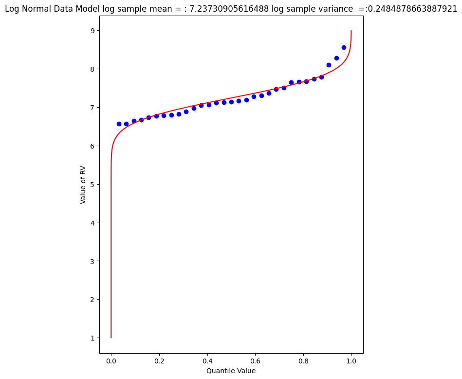
The plot doesn’t look too bad, but we are in log-space, which is hard to interpret, so we will transform back to arithmetic space
def antiloggit(x):  # A prototype function to log transform x
    return(math.exp(x))

sample = beargrass['Peak'].tolist() # pull original list
sample.sort() # sort in place
################
mu = sample_mean # Fitted Model in Log Space
sigma = math.sqrt(sample_variance)
x = []; ycdf = []
xlow = 1; xhigh = 1.05*max(logsample) ; howMany = 100
xstep = (xhigh - xlow)/howMany
for i in range(0,howMany+1,1):
    x.append(antiloggit(xlow + i*xstep))
    yvalue = normdist(xlow + i*xstep,mu,sigma)
    ycdf.append(yvalue)
# Now plot the sample values and plotting position
myfigure = matplotlib.pyplot.figure(figsize = (7,9)) # generate a object from the figure class, set aspect ratio
matplotlib.pyplot.scatter(weibull_pp, sample ,color ='blue')
matplotlib.pyplot.plot(ycdf, x, color ='red')
matplotlib.pyplot.xlabel("Quantile Value")
matplotlib.pyplot.ylabel("Value of RV")
mytitle = "Log Normal Data Model sample log mean = : " + str((sample_mean))+ " sample log variance  =:" + str((sample_variance))
matplotlib.pyplot.title(mytitle)
matplotlib.pyplot.show()
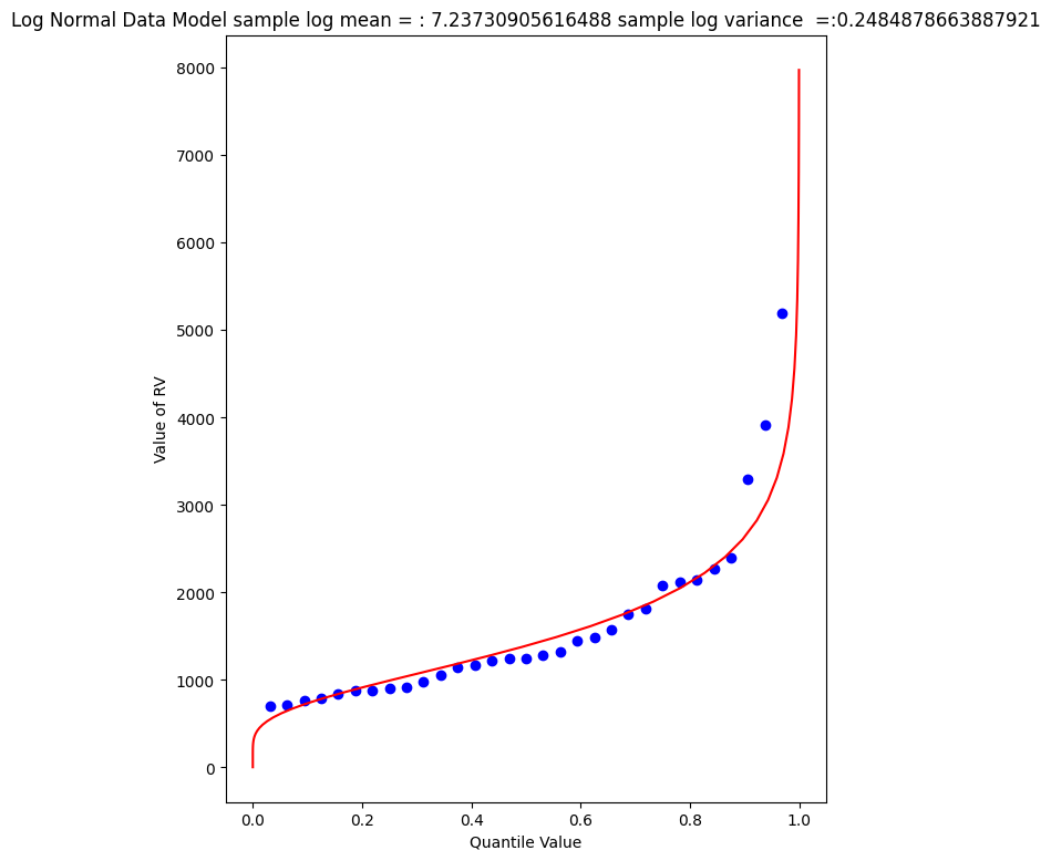
Visually a better data model, now lets determine the 1% chance value.
myguess = 4440
print(mu,sigma)
print(normdist(loggit(myguess),mu,sigma)) # mu, sigma already in log space - convert myguess
7.23730905616488 0.4984855728993489
0.9900772507418303
# If we want to get fancy we can use Newton's method to get really close to the root

from scipy.optimize import newton

def f(x):
    mu = 7.23730905616488
    sigma = 0.4984855728993489
    quantile = 0.99
    argument = (loggit(x) - mu)/(math.sqrt(2.0)*sigma)
    normdist = (1.0 + math.erf(argument))/2.0
    return normdist - quantile

print(newton(f, myguess))
4433.567789173268
Now we have a decent method, we should put stuff into functions to keep code concise, lets examine a couple more data models
Gumbell (Double Exponential) Distribution#
The Gumbell is also called the Extreme-Value Type I distribution, the density and quantile function are:
The distribution has two parameters, \(\alpha\) and \(\beta\), which in some sense play the same role as mean and variance. Lets modify our scripts further to see how this data model performs on the Bearcreek data.
Of course we need a way to estimate the parameters, a good approximation can be obtained using:
and
where \(\mu\) and \(\sigma^2\) are the sample mean and variance.
def ev1dist(x,alpha,beta):
    argument = (x - alpha)/beta
    constant = 1.0/beta
    ev1dist = math.exp(-1.0*math.exp(-1.0*argument))
    return ev1dist
Now literally substitute into our prior code!
sample = beargrass['Peak'].tolist() # put the peaks into a list
sample_mean = numpy.array(sample).mean()
sample_variance = numpy.array(sample).std()**2
alpha_mom = sample_mean*math.sqrt(6)/math.pi
beta_mom = math.sqrt(sample_variance)*0.45
sample.sort() # sort the sample in place!
weibull_pp = [] # built a relative frequency approximation to probability, assume each pick is equally likely
for i in range(0,len(sample),1):
    weibull_pp.append((i+1)/(len(sample)+1))
################
mu = sample_mean # Fitted Model
sigma = math.sqrt(sample_variance)
x = []; ycdf = []
xlow = 0; xhigh = 1.2*max(sample) ; howMany = 100
xstep = (xhigh - xlow)/howMany
for i in range(0,howMany+1,1):
    x.append(xlow + i*xstep)
    yvalue = ev1dist(xlow + i*xstep,alpha_mom,beta_mom)
    ycdf.append(yvalue)
# Now plot the sample values and plotting position
myfigure = matplotlib.pyplot.figure(figsize = (7,8)) # generate a object from the figure class, set aspect ratio
matplotlib.pyplot.scatter(weibull_pp, sample ,color ='blue')
matplotlib.pyplot.plot(ycdf, x, color ='red')
matplotlib.pyplot.xlabel("Quantile Value")
matplotlib.pyplot.ylabel("Value of RV")
mytitle = "Extreme Value Type 1 Distribution Data Model sample mean = : " + str(sample_mean)+ " sample variance =:" + str(sample_variance)
matplotlib.pyplot.title(mytitle)
matplotlib.pyplot.show()
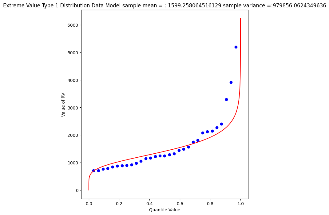
Again a so-so visual fit. To find the 1% chance value
myguess = 3300
print(alpha_mom,beta_mom)
print(ev1dist(myguess,alpha_mom,beta_mom)) #
1246.9363972503857 445.4445561942363
0.990087892543188
# If we want to get fancy we can use Newton's method to get really close to the root

from scipy.optimize import newton

def f(x):
    alpha = 1246.9363972503857
    beta = 445.4445561942363
    quantile = 0.99
    argument = (x - alpha)/beta
    constant = 1.0/beta
    ev1dist = math.exp(-1.0*math.exp(-1.0*argument))
    return ev1dist - quantile

print(newton(f, myguess))
3296.0478279991366
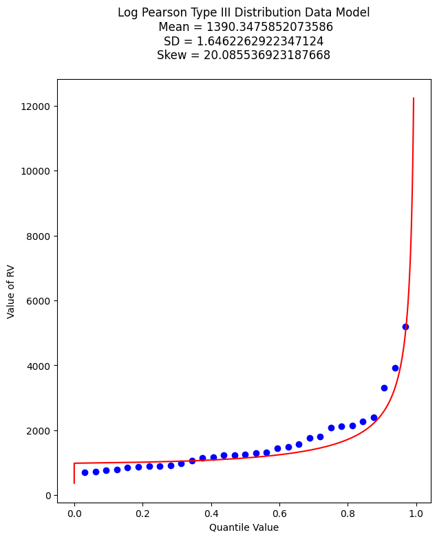
Gamma Distribution (as Pearson Type 3)#
One last data model to consider is one that is specifically stipulated for use by federal agencies for probability estimation of extreme hydrologic events. The data model ia called the Log-Pearson Type III distribution, its actually a specific case of a Gamma distrubution.
This example we will dispense with tyring to build it in python primative, and just use a package - the density function is not all that hard, but the quantile function is elaborate.
Learn more at http://54.243.252.9/engr-1330-webroot/3-Readings/NumericalRecipesinF77.pdf (in particular around Page 276)
As usual, lets let Google do some work for us, using the search term “gamma quantile function; scipy” we get to this nice blog entry https://docs.scipy.org/doc/scipy/reference/generated/scipy.stats.gamma.html which is a good start.
A Pearson Type III data model has the following density function:
If we make some substitutions: \( \lambda = \frac{1}{\beta} ; \hat{x} = x -\tau \) then the density function is
which is now a one parameter Gamma density function just like the example in the link.
Reading a little from http://54.243.252.9/ce-3354-webroot/3-Readings/Bulletin17C/Bulletin17C-tm4b5-draft-ACWI-17Jan2018.pdf we can relate the transformations to descriptive statistics (shown below without explaination) as:
\(\mu = \text{sample mean}\),
\(\sigma = \text{sample standard deviation}\),
\(\gamma = \text{sample skew coefficient} = (\frac{n}{\sigma^3(n-1)(n-2)})\sum_{i=1}^n(x_i - \mu)^3 \)
\(\alpha = \frac{4}{\gamma^2}\)
\(\beta = sign(\gamma)\sqrt{\frac{\sigma^2}{\alpha}}\)
\(\tau = \mu - \alpha \cdot \beta\)
So we have a bit of work to do. The name of the functions in scipy we are interested in are gamma.pdf(x,a) and gamma.cdf(x,a) So lets build a tool to generate a Log-Pearson Type III data model, then apply it to Beargrass Creek. We will use a lot of glue here.
First load in dependencies, and define support functions we will need
import scipy.stats # import scipy stats package
import math        # import math package
import numpy       # import numpy package
# log and antilog
def loggit(x):  # A prototype function to log transform x
    return(math.log(x))
def antiloggit(x):  # A prototype function to log transform x
    return(math.exp(x))
def weibull_pp(sample): # plotting position function
# returns a list of plotting positions; sample must be a numeric list
    weibull_pp = [] # null list to return after fill
    sample.sort() # sort the sample list in place
    for i in range(0,len(sample),1):
        weibull_pp.append((i+1)/(len(sample)+1))
    return weibull_pp
Then the gamma distribution from scipy, modified for our type of inputs.
def gammacdf(x,tau,alpha,beta): # Gamma Cumulative Density function - with three parameter to one parameter convert
    xhat = x-tau
    lamda = 1.0/beta
    gammacdf = scipy.stats.gamma.cdf(lamda*xhat, alpha)
    return gammacdf
Then load in the data from the data frame, log transform and generate descriptive statistics.
#sample = beargrass['Peak'].tolist() # put the peaks into a list
sample = beargrass['Peak'].apply(loggit).tolist() # put the log peaks into a list
sample_mean  = numpy.array(sample).mean()
sample_stdev = numpy.array(sample).std()
sample_skew  = 3.0 # scipy.stats.skew(sample)
sample_alpha = 4.0/(sample_skew**2)
sample_beta  = numpy.sign(sample_skew)*math.sqrt(sample_stdev**2/sample_alpha)
sample_tau   = sample_mean - sample_alpha*sample_beta
Now generate plotting positions for the sample observations
plotting = weibull_pp(sample)
Now generate values for the data model (for plotting our red line “fit”), set limits to be a little beyond the sample range.
x = []; ycdf = []
xlow = (0.9*min(sample)); xhigh = (1.1*max(sample)) ; howMany = 100
xstep = (xhigh - xlow)/howMany
for i in range(0,howMany+1,1):
    x.append(xlow + i*xstep)
    yvalue = gammacdf(xlow + i*xstep,sample_tau,sample_alpha,sample_beta)
    ycdf.append(yvalue)
Now reverse transform back to native scale, and plot the sample values vs plotting position in blue, and the data model in red
# reverse transform the peaks, and the data model peaks
for i in range(len(sample)):
    sample[i] = antiloggit(sample[i])
for i in range(len(x)):
    x[i] = antiloggit(x[i])
myfigure = matplotlib.pyplot.figure(figsize = (7,8)) # generate a object from the figure class, set aspect ratio
matplotlib.pyplot.scatter(plotting, sample ,color ='blue')
matplotlib.pyplot.plot(ycdf, x, color ='red')
matplotlib.pyplot.xlabel("Quantile Value")
matplotlib.pyplot.ylabel("Value of RV")
mytitle = "Log Pearson Type III Distribution Data Model\n "
mytitle += "Mean = " + str(antiloggit(sample_mean)) + "\n"
mytitle += "SD = " + str(antiloggit(sample_stdev)) + "\n"
mytitle += "Skew = " + str(antiloggit(sample_skew)) + "\n"
matplotlib.pyplot.title(mytitle)
matplotlib.pyplot.show()
And as before lets find the value that retruns the 99% quantile - we will just use the newton method above. First recover the required model parameters. Then we will paste these into the \(f(x)\) function for the Newton’s method.
print(sample_tau)
print(sample_alpha)
print(sample_beta)
6.904985340898647
0.4444444444444444
0.7477283593490234
# If we want to get fancy we can use Newton's method to get really close to the root

from scipy.optimize import newton

def f(x):
    sample_tau = 5.976005311346212
    sample_alpha = 6.402272915026134
    sample_beta = 0.1970087438569494
    quantile = 0.9900
    argument = loggit(x)
    gammavalue = gammacdf(argument,sample_tau,sample_alpha,sample_beta)
    return gammavalue - quantile

myguess =  5000
print(newton(f, myguess))
5856.10913158364
Trust, but verify!
round(gammacdf(loggit(5856.109),sample_tau,sample_alpha,sample_beta),4)
np.float64(0.9753)
Now lets summarize our efforts regarding Beargrass Creek annual peaks and probabilities anticipated.
Data Model |
99% Peak Flow |
Remarks |
|---|---|---|
Normal |
3902 |
so-so visual fit |
Log-Normal |
4433 |
better visual fit |
Gumbell |
3296 |
better visual fit |
Log-Pearson III |
5856 |
best (of the set) visual fit |
At this point, now we have to choose our model and then can investigate different questions. So using LP3 as our favorite, lets now determine anticipated flow values for different probabilities (from the data model) - easy enought to just change the quantile value and rerun the newtons optimizer, for example:
Exceedence Probability |
Flow Value |
Remarks |
|---|---|---|
25% |
968 |
First Quartile Divider |
50% |
1302 |
Median, and Second Quartile Divider |
75% |
1860 |
3rd Quartile Divider |
90% |
2706 |
10% chance of greater value |
99% |
5856 |
1% chance of greater value (in flood statistics, this is the 1 in 100-yr chance event) |
99.8% |
9420 |
0.002% chance of greater value (in flood statistics, this is the 1 in 500-yr chance event) |
99.9% |
11455 |
0.001% chance of greater value (in flood statistics, this is the 1 in 1000-yr chance event) |
# If we want to get fancy we can use Newton's method to get really close to the root

from scipy.optimize import newton

def f(x):
    sample_tau = 5.976005311346212
    sample_alpha = 6.402272915026134
    sample_beta = 0.1970087438569494
    quantile = 0.50
    argument = loggit(x)
    gammavalue = gammacdf(argument,sample_tau,sample_alpha,sample_beta)
    return gammavalue - quantile

myguess =  1000
print(newton(f, myguess))
1302.814639184079
Empirical Frequency Distributions and Plotting Positions in Hydrologic Data#
Empirical Frequency Distributions (EFDs) are essential tools in hydrology for analyzing the occurrence and intensity of various hydrologic events, such as rainfall and streamflow. These distributions are derived directly from observed data, providing a realistic and data-driven understanding of hydrological patterns.
In rainfall data analysis, an EFD involves plotting the observed rainfall amounts against their corresponding frequencies or probabilities. By sorting and counting the occurrences of different rainfall intensities, hydrologists create a distribution that highlights patterns such as the most common rainfall amounts and the probability of extreme rainfall events. This is crucial for designing stormwater management systems, predicting flood risks, and understanding climatic trends.
For streamflow data, an EFD is constructed by analyzing flow rates recorded over time. By organizing and plotting these observed flow values, hydrologists gain insights into river and stream behaviors, such as typical flow conditions and the likelihood of high or low flow events. This information is vital for water resource management, flood forecasting, and ecological conservation.
Plotting Positions in Empirical Distributions#
Plotting positions (formulas) are used to estimate the probabilities of observed data points within an empirical frequency distribution. These positions help to place data points on a probability scale, facilitating the creation of empirical cumulative distribution functions (CDFs).
Several methods exist for calculating plotting positions, with some of the most common ones being:
Weibull Plotting Position:
\(P_i=\frac{i}{n+1}\)
where \(P_i\) is the plotting position for the i-th ranked observation, i is the rank (with 1 being the smallest value), and n is the total number of observations. The Weibull plotting position is simple and widely used.
Gringorten Plotting Position:
\(P_i=\frac{i-0.44}{n+0.12}\)
This method provides a slight adjustment to the Weibull method, improving the estimation of probabilities, especially for small datasets.
Hazen Plotting Position:
\(P_i=\frac{i-0.5}{n}\)
The Hazen plotting position is another adjustment that centers the probabilities more evenly across the dataset.
Cunnane Plotting Position:
\(P_i=\frac{i-0.4}{n+0.2}\)
The Cunnane method is often recommended for hydrological studies, as it provides a balance between the Weibull and Gringorten methods.
General Application and Interpretation#
When creating an empirical frequency distribution, hydrologists first rank the observed data in ascending order. Then, they apply one of the plotting position formulas to each data point to determine its exceedance probability. By plotting these probabilities against the observed values, they generate an empirical CDF, which visually represents the distribution of the data.
This approach helps in identifying the likelihood of various hydrological events, aiding in risk assessment and decision-making. For example, plotting positions can help estimate the return period of extreme rainfall or streamflow events, which is crucial for infrastructure design and floodplain management.
By incorporating plotting positions, empirical frequency distributions become more robust and provide clearer insights into the probabilities of different hydrological events, enhancing the accuracy and reliability of hydrological analyses.
Annual Duration Series#
The Annual Duration Series is a hydrological tool used to analyze the variability and extremities of rainfall and streamflow over time. This series involves selecting specific data points, typically the maximum (or minimum) values, from each year within a given period.
For rainfall data, the Annual Duration Series might consist of the highest daily rainfall recorded each year. This allows hydrologists to study patterns, identify trends, and estimate the probability of extreme rainfall events, which are crucial for flood forecasting and water resource management.
In the context of streamflow data, the Annual Duration Series often focuses on the peak flow rates (maximum streamflow) observed annually. Analyzing these peak flow rates helps in understanding river behavior, flood risks, and the potential impacts of climate change on water systems.
By examining these annual extremes, researchers can assess the long-term trends and variations in hydrological phenomena, aiding in the development of robust water management strategies and infrastructure designs.
Partial Duration Series#
The Partial Duration Series is a hydrological analysis technique used to capture the frequency and intensity of substantial events over a specified period, beyond just the annual maxima. Unlike the Annual Duration Series, which only considers the highest value each year, the Partial Duration Series includes all events exceeding a certain threshold, regardless of their occurrence within the year.
For rainfall data, the Partial Duration Series involves identifying all rainfall events that surpass a predefined intensity threshold. This method allows for a more comprehensive analysis of extreme rainfall events, providing insights into the frequency and distribution of heavy rainfalls. This is particularly useful for designing drainage systems and managing flood risks, as it accounts for multiple significant events within a single year.
In streamflow data, the Partial Duration Series focuses on recording all peak flows that exceed a set flow rate threshold. This approach captures not only the annual peak flows but also other substantial flow events, offering a detailed understanding of river dynamics and flood potential. It is valuable for floodplain management, infrastructure planning, and assessing the impacts of land use changes and climate variability on river systems.
By considering multiple substantial events over time, the Partial Duration Series provides a richer database for statistical analysis and enhances the accuracy of risk assessments and hydrological predictions.
Note
For precipitation data the two series are indistinguishable at 1% chance, however at lower recurrance intervals, the PDS is thought to be a more useful representation. You can visualize the difference using the NOAA PFDS website - just pick anywhere. Have the server generate an IDF diagram using a PDS, screen capture; then repeat using an AMS and compare side-by-side, like the figure below:
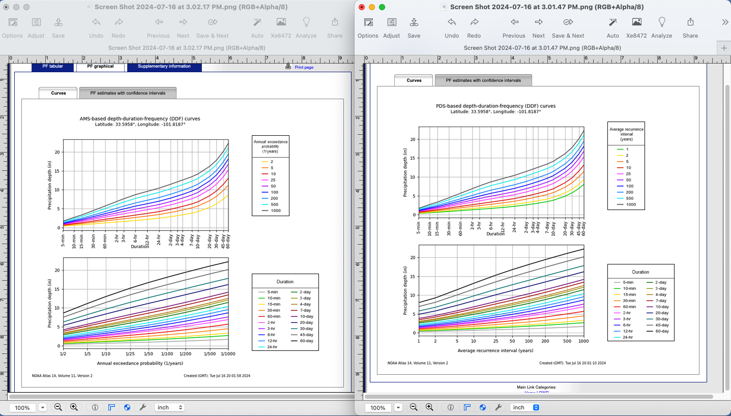
The difference is quite subtle, but apparent on the left side of each plot at the high probability/low recurrence interval side.
Flood Frequency Analysis using Bulletin 17C#
Flood hydrology is typically studied using the annual peak streamflow data collected by the U.S. Geological Survey (USGS) at streamgages. Hydraulic design engineers need standard of practice guidance for various tasks involving the analysis and application peak streamflow information. Analyses of this information materially influences bridge design, operational safety of drainage infrastructure, flood-plain management, and other decisions affecting society.
Bulletin 17B was the standard of practice for decades, recently superceded by Bulletin 17C. These and similar tools relate certain statistical metrics (mean, variance, and skew) to a prescribed probability distribution function (Log-Pearson Type III) to extrapolate (predict) the magnitude of rare (low probability) events to inform engineering design.
Tasker and Stedinger (1986) developed a weighted least squares (WLS) procedure for estimating regional skewness coefficients based on sample skewness coefficients for the logarithms of annual peak-streamflow data. Their method of regional analysis of skewness estimators accounts for the precision of the skewness estimator for each streamgage, which depends on the length of record for each streamgage and the accuracy of an ordinary least squares (OLS) regional mean skewness. These methods automated much of B17B process and were incorporated into software used for streamgage analysis.
Recent updates to B17B in terms of software improvements and different handling of gage statistics (in particular EMA) are incorporated into the current tool B17C
Summary
B17C is a report containing methods for estimating magnitudes of rare events
The methods are incorporated into software products such as PeakFQ and HEC-SSP
Software is employed because the Pearson Type III distribution is applied to model streamflow, precipitation extremes, and flood frequency because it can accommodate the skewness (3rd moment) observed in these datasets. For example, the Log-Pearson Type III distribution, where data is logarithmically transformed, is used by the U.S. Geological Survey (USGS) for flood frequency analysis, helping hydrologists estimate the magnitude of extreme flood events at prescribed probabilities (e.g., 100-year floods), or conversely the likely probability associated with a particular magnitude.
By adjusting parameters such as mean, variance, and skewness, Pearson distributions can fit a wide range of data types - but the fitting itself is complex and requires a lot of tedious computations - just the thing for a computer program to do the heavy lifting. The programs above replace older tabular methods that were prone to calculation errors when done by hand, and interpretation errors from by-hand plotting of the results.
Illustrative Example using HEC-SSP#
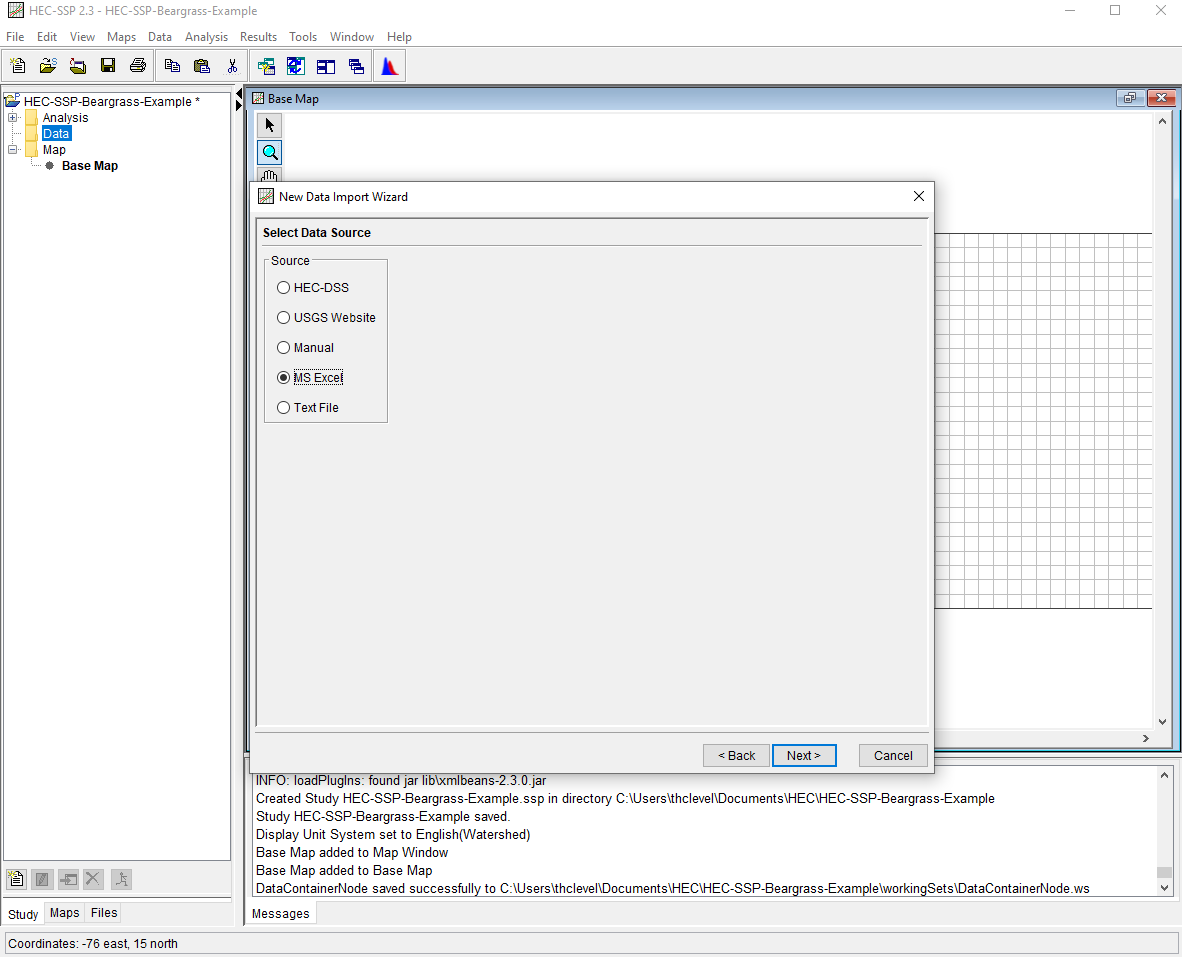
HEC-SSP is a tool that can implement various Bulletin 17B and 17C analyses (among many more). Here we will illustrate using the Beargrass Creek data (same as above). Beargrass Creek is not a real site, therefore is not in the NWIS database, so we have to import the data into HEC-SSP.
Prepare a data file. Here we will simply use a modified
beargrass.txtfile restructured and stored in a spreadsheet. The software expects the Date_Time information to be formatted as: DD MMM YYYY for example our first entry is changed from 1945 to 01 JAN 1945. The spaces are actually characters, so the field itself is 11 characters. The software will also infer a time (24:00) and include it, but this artifical time is unimportant in the subsequent analysis. The file itself looks like: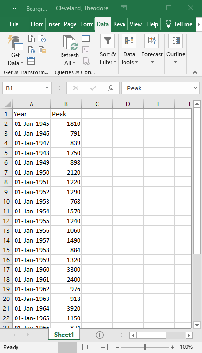
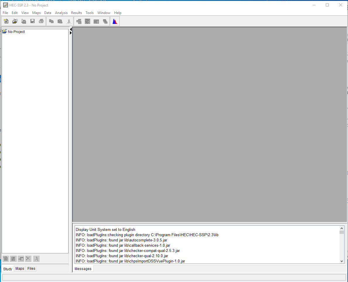
Start HEC-SSP. Next we start the program (you have to download and install the software first). The interface looks like:
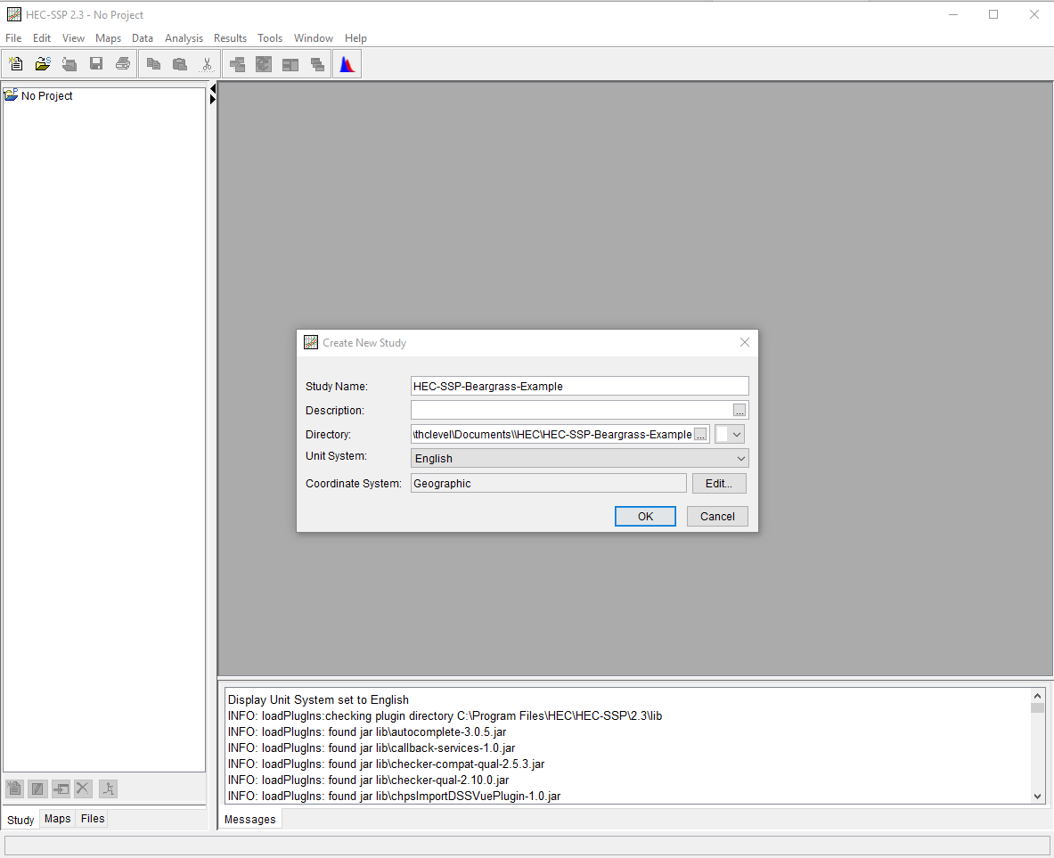
Create a Project Use File/New Study to generate a study metafile (The study is like a named directory that is managed within the software.)
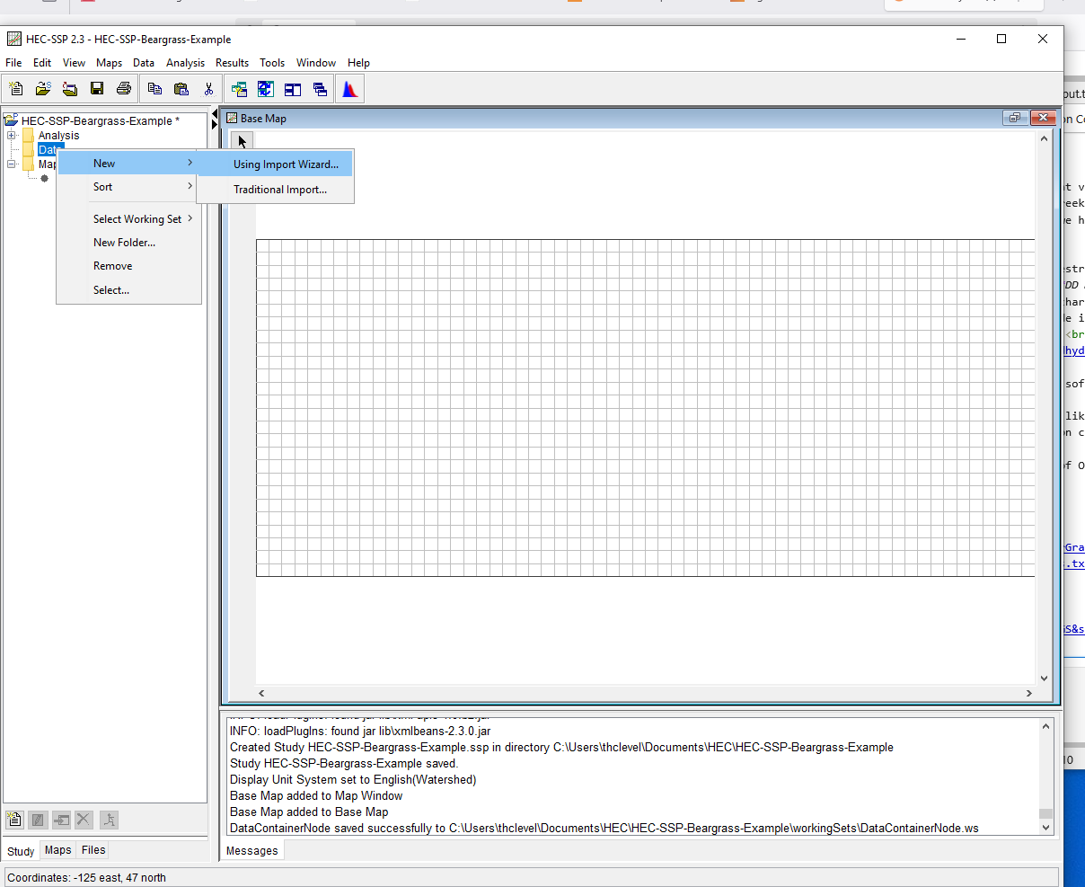
Upon completion a map canvas will appear (which we will ignore; for our needs a map is unecessary).Upload the Data To upload right-click Data and choose /New/Upload Wizzard (yes of Oz)
Now follow the wizzard prompts.For the first dialog box, provide a name for the data, then select Next.
For the second dialog box, choose data source - in this case MS Excel file
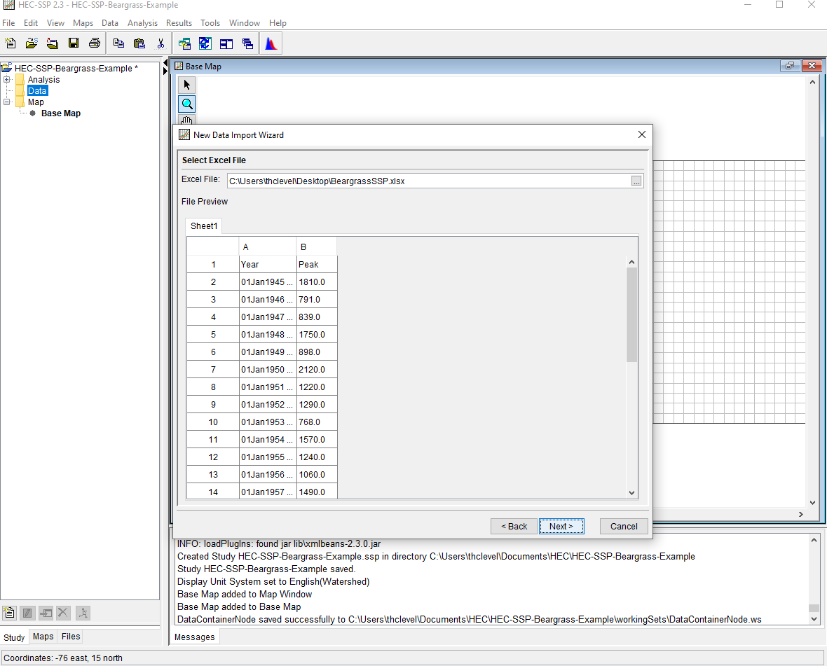
The next dialog we find the file (pull down search tool)
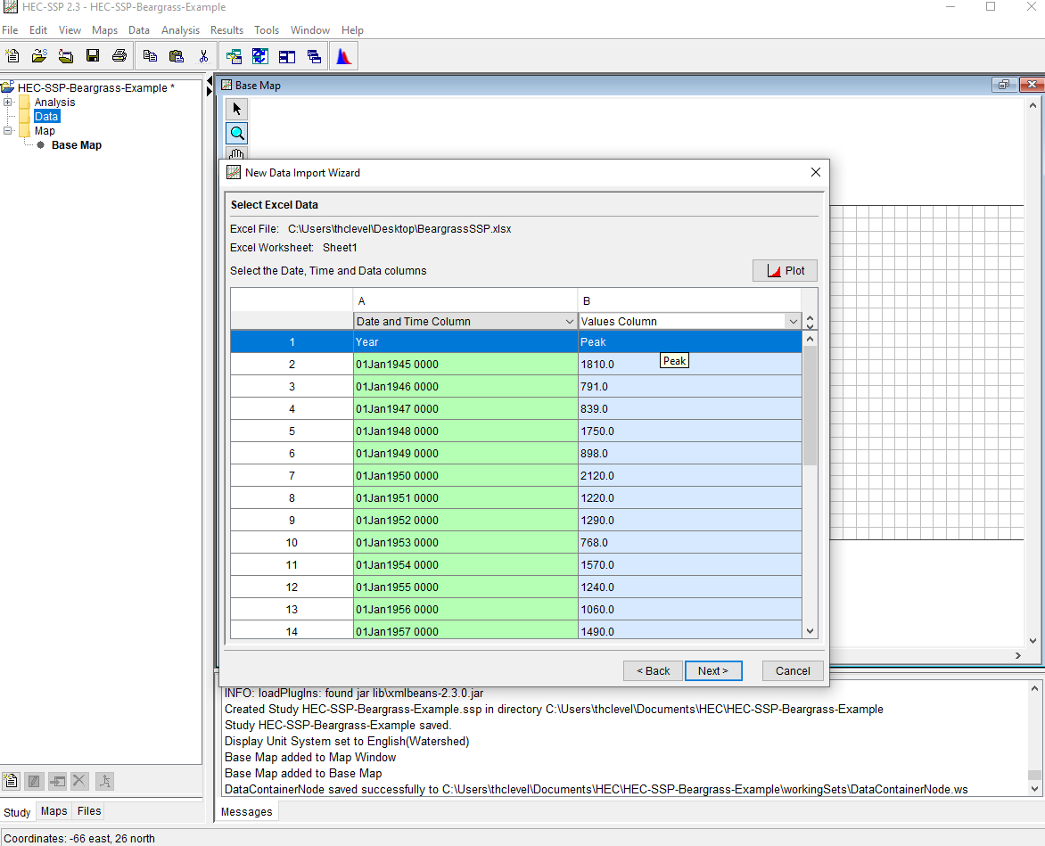
Once we have the proper file, we will tell the program to ignore the header row, and import columns A and B as Date-Time, and Value respectively
Lastly we have to specify file paths, populate boxes with meaningful names and proceede.
Examine and Analyze Now the data are loaded, one can run necessary analysis.
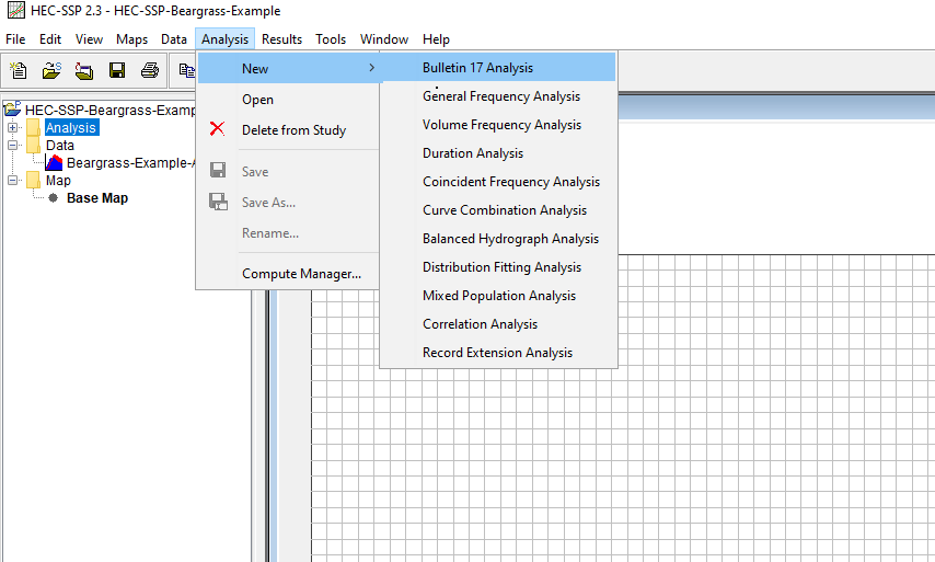
First select Bulletin 17 tools
Then give the analysis a name, and point it to the data just uploaded
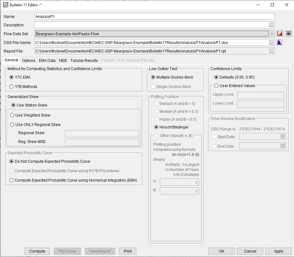
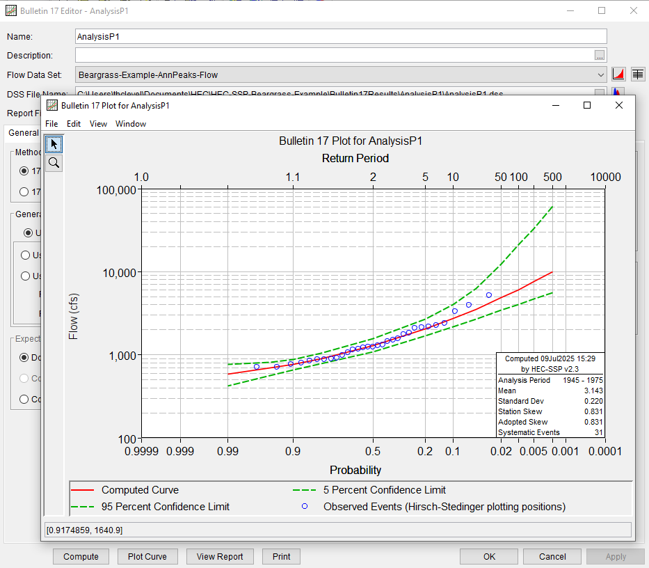
Then run an analysis (the above settings are just defaults, as you gain expertise – and read the documentation, you can explore other options), the results are reported in tables (tab sheet) and plots after selecting and running Compute
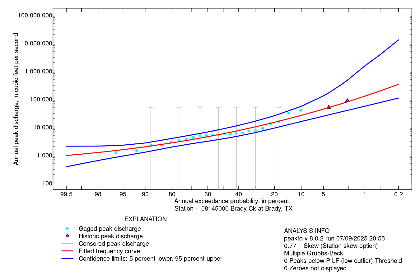
Illustrative Example using PeakFQ Web Tool#
The example below uses NWIS data for Brady Creek 08145000 and performs the analysis using the USGS on-line tool.
Navigate to the gaging station page on NWIS
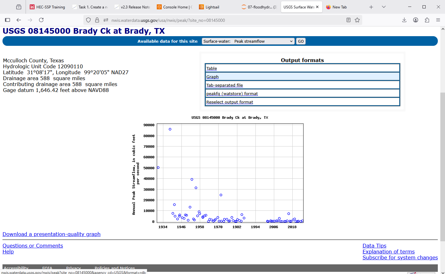
Download the peak file as
tab delimited, give the download a memorable name.Navigate to the peakFQ webster interface.
Upload the file to the webster.
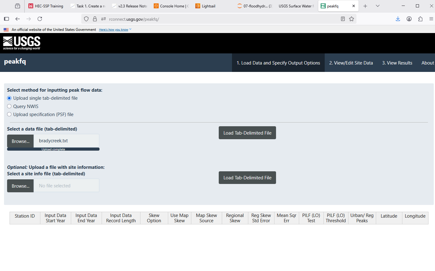
Examine, select options, then run analysis. On main page after choose load data, then scroll to bottom to set the output file zip folder name.
Run analysis after choose skew method, etc.
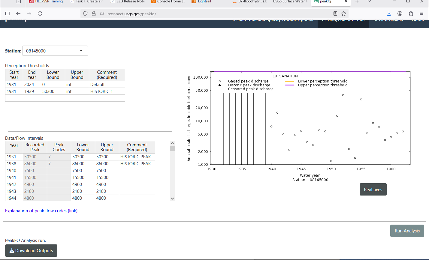
Extract the output from .ZIP download.
Gage Transposition Approach#
Note
This section is based upon Asquith, W.H., Roussel, M.C., and Vrabel, Joseph, 2006 and McCuen, R. H. and Levy, B. S. 2000. A key observation is that the transposition is a power-law model to relate known to unknown locations, and the power ranges from 1/2 to nearly 1.
A method that is often quite useful is a Gage Transposition Approach.
If gauge data are not available at the design location, discharge values can be estimated by transposition of a peak flood-frequency curve from a nearby gauged location. This method is appropriate for hydrologically similar watersheds that differ in area by less than 50 percent, with outlet locations less than 100 miles apart.
An estimate of the desired AEP peak flow at the ungauged site is provided by
\(Q_1 = Q_2(\frac{A_1}{A_2})^{0.5} \)
Where:
\(Q_1\) = Estimated AEP discharge at ungauged watershed 1
\(Q_2\) = Known AEP discharge at gauged watershed 2
\(A_1\) = Area of watershed 1
\(A_2\) = Area of watershed 2
Transposition of peak flow is demonstrated with the following example. A designer requires an estimate of the 1% AEP streamflow at an ungauged location with drainage area of 200 square miles. A nearby (within 100 miles) stream gauge has a hydrologically similar drainage area of 450 square miles. The 1% AEP peak streamflow at the gauged location is 420 cfs based on the peak flow-frequency curve developed for that location. Substituting into Equation 4-10 results in 280 cfs as an estimate of the 1% AEP peak discharge at the ungauged location:
If flow-frequency curves are available at multiple gauged sites, Equation 4-10 can be used to estimate the desired peak AEP flow from each site. Then, with judgment and knowledge of the watersheds, those estimates could be weighted to provide an estimate of the desired AEP flow at the ungauged location. This process should be well documented.
Design of a storage facility, such as a detention pond, may require estimates of AEP flows for longer durations. If a flow-frequency curve for longer flow duration is available at a nearby gauged location, then the following equation, based on an analysis of mean-daily flows , may be used for transposition:
\(Q_1 = Q_2(\frac{A_1}{A_2})^{0.9} \)
Summary
Flood frequency analysis is a mature field supported by robust statistical methodologies and widely accepted computational tools. For sites with digital streamflow records available through NWIS or comparable databases, automated workflows are readily available. In contrast, analysis based on legacy or paper records requires manual data preparation and formatting. In such cases, HEC-SSP provides a flexible input framework for conducting frequency analyses with custom datasets.
For standardized analysis of USGS streamgage records, PeakFQ is probably the preferred tool, conforming to Bulletin 17C guidelines and accessible via the USGS web interface. When direct data are unavailable at the location of interest, regionalization via gage transposition can be applied, assuming physiographic and hydrologic similarity criteria are met.
Regional flood equations and statistical approaches: In areas with limited streamflow data, regional regression equations derived from gaged watersheds provide a means to estimate flood discharges. These equations relate flood magnitudes to watershed characteristics such as area, slope, and rainfall. They enable engineers to perform flood assessments in ungauged or newly developed basins by leveraging data from similar hydrologic regions.
Regional Regression Equations#
Where sufficient data exist, one technique for gross estimates of streamflow based largely on watershed area, rainfall input, and location are regional regression equations. These exist in some fashion for each state in the USA, and most terrortories (Puerto Rico, Guam …). They probably exist for many other countries, and are all obtained in a similar fashion.
The equations are constructed by first fitting an appropriate probability distribution to observations at a gaged location (station flood frequency). Then the station flood frequency curves are used as surrogate observations (at a specified AEP) to relate discharge to select geomorphic variables:
The “betas” are obtained by trying to make “epsilon” small, the AREA, SLOPE, and other watershed characteristics are the explainatory variables.
The resulting equations are typically expressed in a power-law form (rather that the linear combination above) for actual application
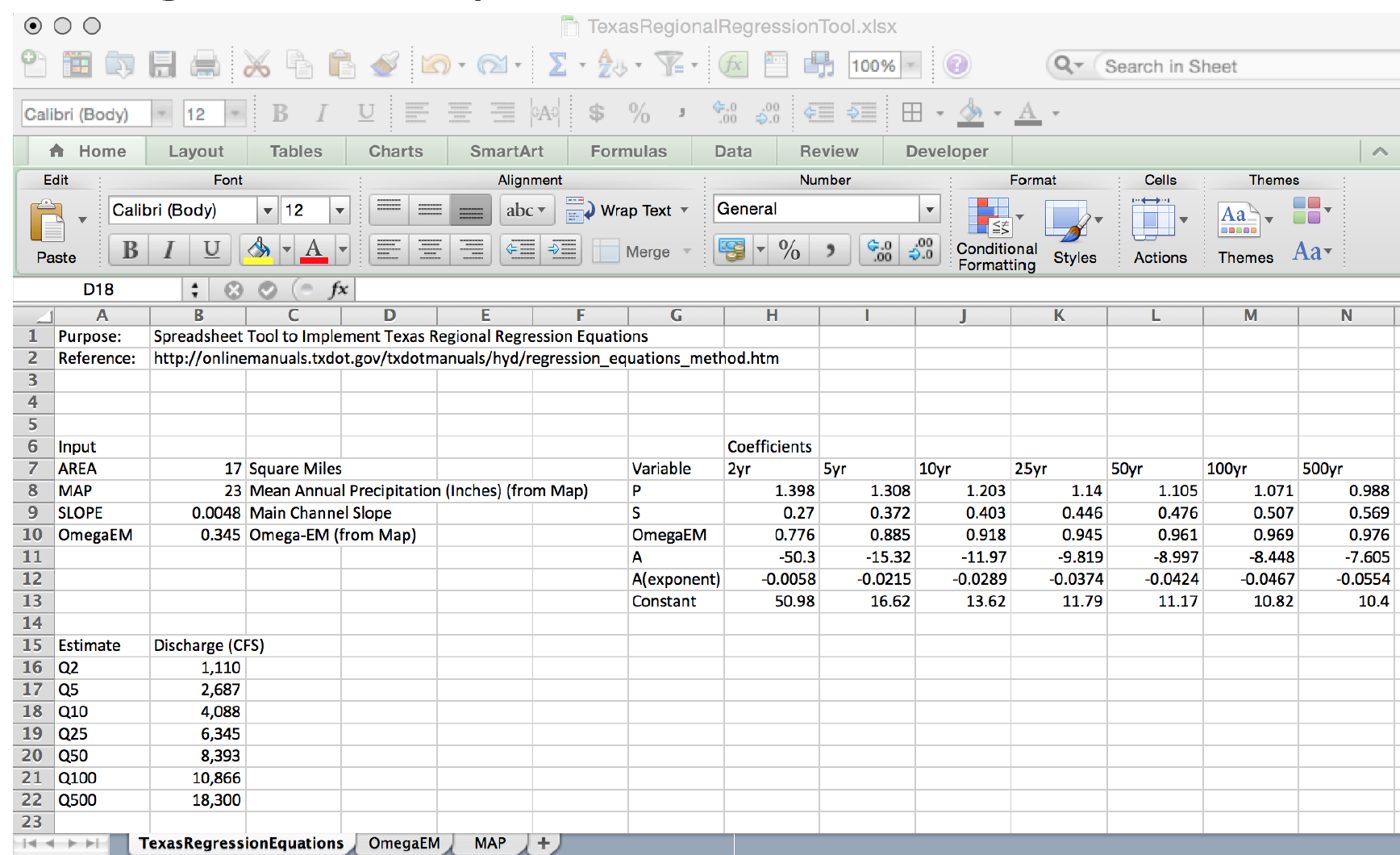
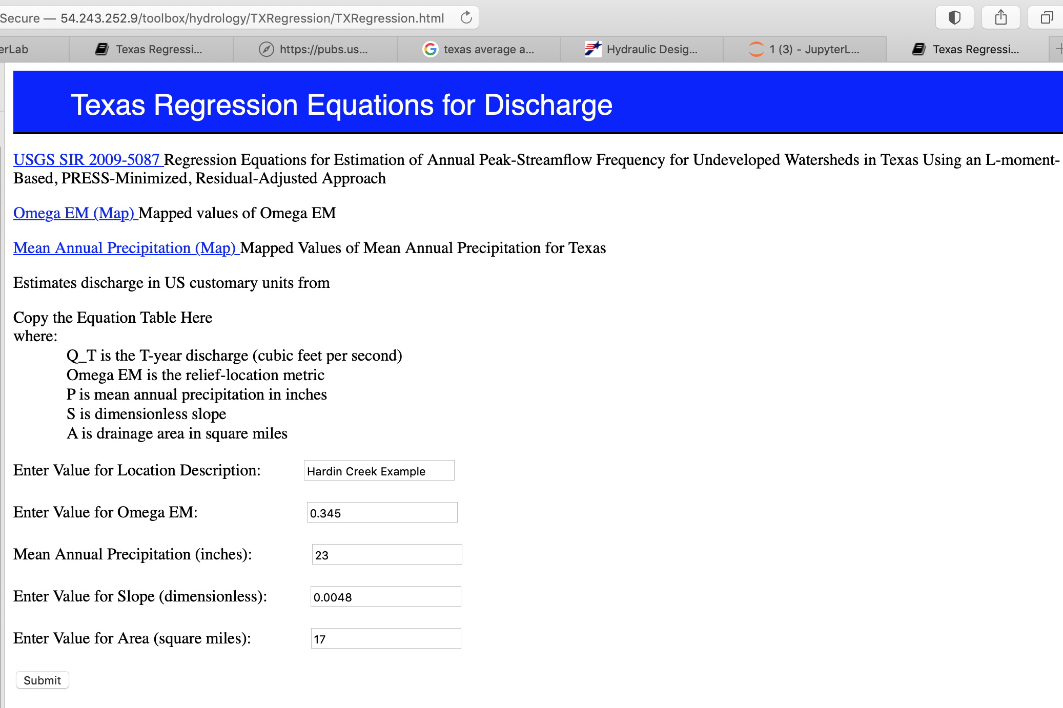
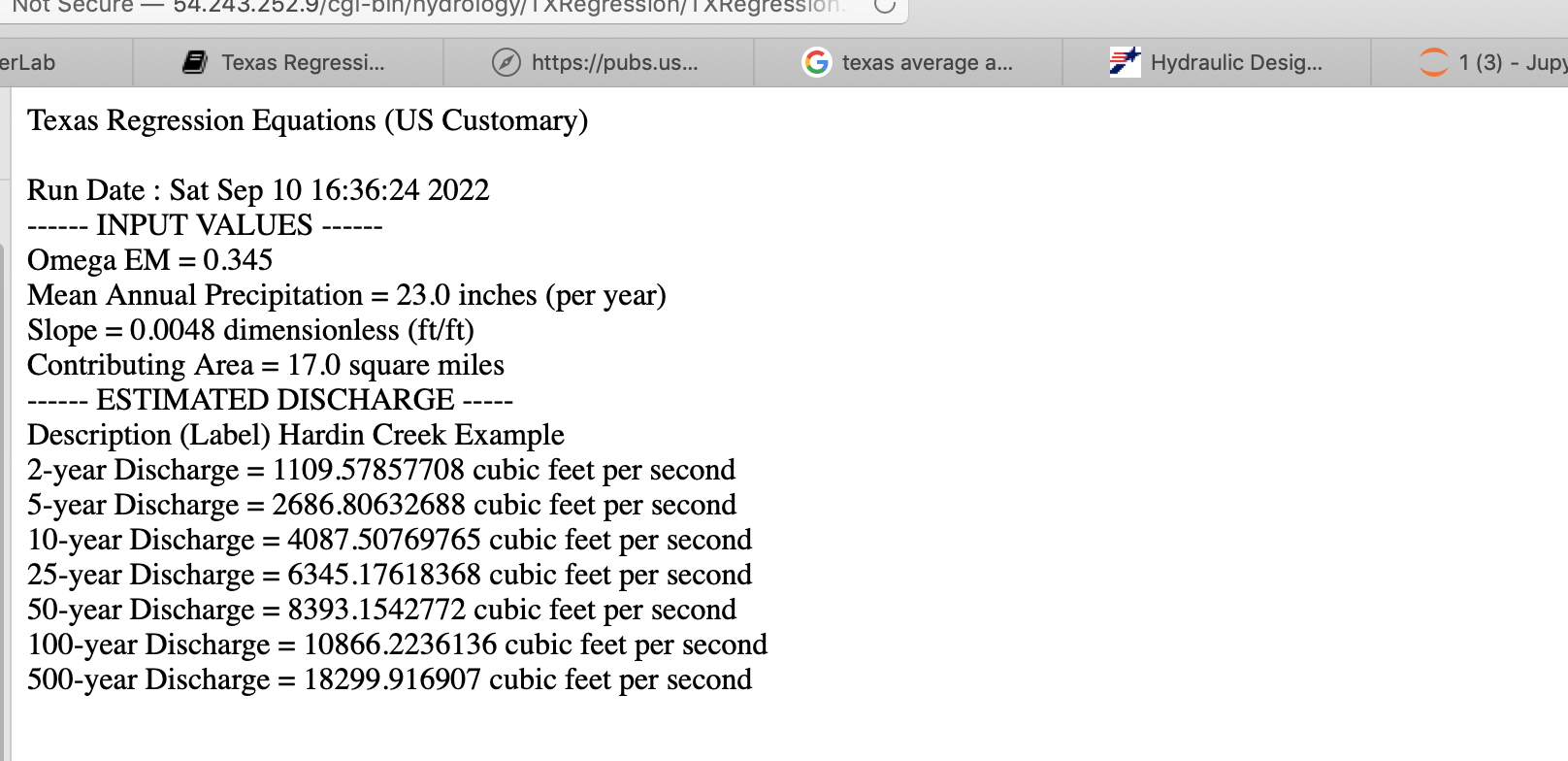
For example in Texas the following guidance is found in Chapter 4 of the Texas Hydraulics Manual:
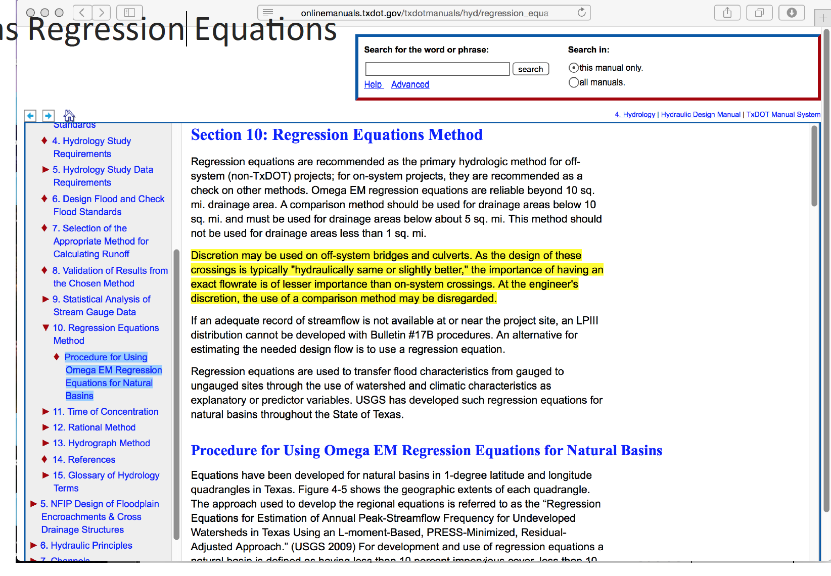
The actual equations in current use are
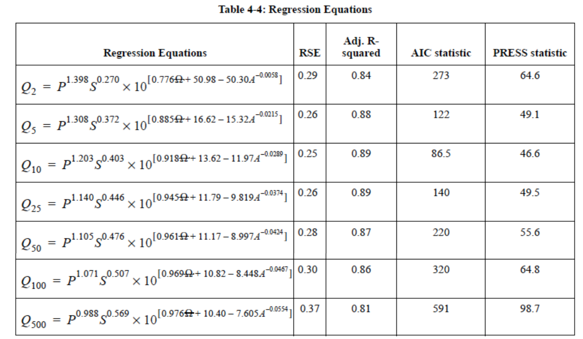
Two needed input values are the mean annual precipitation (MAP) and the Omega-EM factor both of which are mapped and available on the almighty internet
Using the table above and the known equation structure it is fairly straightforward to create a tool for routine use in either a spreadsheet form or in python
Illustrative example for the Hardin Branch location (near Eden Texas).
Apply the Regression Equations for the Hardin Branch Watershed – provide a comparative estimate to help guide the project
AREA = 17 sq. mi.
MAP = 23 inches/year
OmegaEM = 0.345
Slope = 0.0048
Below is result using the spreadsheet tool
And the on-line web interface
and the on-line results
Urban Hydrology and Stormwater Management#
Effects of urbanization on runoff and flooding: Urbanization dramatically alters the hydrologic cycle. Impervious surfaces like roads, rooftops, and parking lots reduce infiltration and increase surface runoff. This hydrologic influence leads to:
Higher peak discharges
Shorter time to peak
Increased risk of flash flooding
Urban drainage systems must account for these altered dynamics. Traditional flood estimation techniques are often inadequate without adjustments for land use change.
One method used to quantify development magnitudes on small watersheds is the Basin Development Factor (BDF), often attributed to Sauer et al. (1983). Alternative development characteristics are discussed in Southard, R. E. (1986). Liscum, F. (2001) presents an accounting of the effects of urban development in the Houston area.
A description of how to determine the basin development factor is provided in Cleveland T.G., and Botkins, W. (2008) and replicated below.
The Basin Development Factor, BDF is a measure of runoff transport efficiency of the drainage systems in a watershed (Sauer et al., 1983). It is a categorical variable, which is assigned a value based on the prevalence of certain drainage conditions that predict the urbanization of a watershed. The BDF takes the numerical value based on the significant presence of certain properties which are briefly explained below:
Channel Improvements: Refers to engineered improvements in the drainage channel and its principal tributaries (creating, widening, deepening, straightening, etc.). If any of these activities are present in at least 50% of the main channel and its tribu- taries, then, a value of one is given to the third of the watershed under consideration; otherwise the third of the watershed is assigned a value of zero.
Channel linings: If more than 50% of the main channel length is lined with concrete or other friction reducing material, then a value of one is given to the third of the watershed under study, otherwise a value of zero is assigned. Usually, if the drainage channel is lined it will also reflect some level of channel improvement. Hence this aspect is an added factor to portray a highly developed drainage system.
Storm drains or Storm sewers: Enclosed drainage structures that are used on the secondary tributaries, that collect the drainage from parking lots, streets etc., and drain into open channels or into channels enclosed as pipe or box culverts. When over 50% of the secondary tributaries have storm drains, then a value of one is assigned, otherwise a value of zero is assigned.
Curbs and Gutters: this element reflects the actual urbanization of the watershed area. If more than 50% of the area is developed or contains residential or commercial buildings and if streets and freeways are constructed, then a value of one is assigned. Else the value zero is given. Curbs and gutters take drainage to storm drains. In this part of the study, the placement of streets in the hypothetical models is reflected by this scoring component – thus the additon of a street, that could serve intentionally or unintentionally as a conduit elevates this score.
As an illustrative example, consider , an aerial image for Station 0807320 Ashcreek, Dallas, Texas.
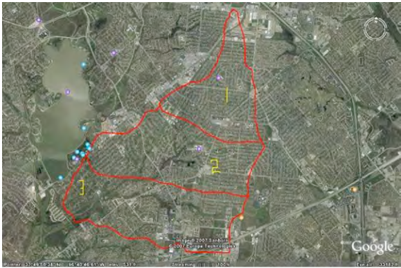
An approximate delineation is shown on the figure and the watershed is divided into thirds. The 3 parts are then examined for channel improvements, channel linings, storm drains and curbs and gutters. Presence of these features in substantial quantity is assigned a score of 1, otherwise 0.
The table below lists the values for each component in each third of the watershed in the figure.
Component |
Channel Improvements |
Channel linings |
Storm drains |
Curbs and gutters |
|---|---|---|---|---|
Top (1) |
0 |
0 |
0 |
1 |
Middle (2) |
1 |
1 |
0 |
1 |
Bottom (3) |
1 |
1 |
0 |
1 |
The top portion of the watershed (Area # 1) has no channel and thus channel improvements,channel lining, and storm sewers are assigned a value 0, however the image shows it has some residential or commercial set up. So curbs and gutters are assigned a value of 1. In the middle and the bottom portion of the watershed, the channel improvements and linings are assigned the value 1 as the enlarging of the channel is observed and concrete walls can be seen when observed closely. Also, the curbs and gutters are assigned a value 1 because of the obvious transportation infrastructure. Thus the BDF value for the Ashcreek watershed is 1 + 3 + 3 = 7.
Although some subjectivity remains—particularly when relying solely on aerial imagery or in the absence of a site visit—most analysts typically arrive at BDF values that differ by no more than ±1.
The general observations from simulations Cleveland T.G., and Botkins, W. (2008)) and actual data (Sunder, S. et. al. (2009)) are:
As the % impervious is changed from a net of 0% to a net of 30% the excess rainfall approximately doubles.
Even small increases in impervious cover can significantly raise flood risk if stormwater systems are not upgraded.
As the basin development factor is increased from 0 to 9 without consideration of sewers there is a “mild” increase in peak discharge from the watershed. There is typically a 50% to 100% increase in peak discharge for any development (basin development factor (BDF) from 0 to any larger value). Addition of sewers working from the outlet upstream induces nearly another doubling of discharge. The first doubling of discharge (in these models) is caused by the developmental effect on runoff generation (or watershed losses); this doubling not only impacts peak discharge, but is an actual doubling of net runoff volume. The second doubling of peak discharge is a consequence of faster travel times for stormwater to accumulate and be conveyed to receiving waters (exactly the purpose of sewer systems — there is no surprise here).
Any development of about 1/3 of a watershed doubles the peak discharge, and the runoff volume.
The single most important hydraulic element affecting discharge in these hypothetical models after watershed development begins is the presence/absence of sewers. The presence of sewers over an entire hypothetical watershed typically doubles the peak discharge (with consequent reduction in lag time). As a useful rule of thumb from these hypothetical watersheds there is at most a doubling of discharge with basin improvement (streets, ditches, etc.) and a second doubling with addition of a complete sewer system. Thus all other things being equal, one could reasonably expect that peak discharge from a fully developed and sewered watershed would be about four times the undeveloped discharge.
Any channel improvement (lining, etc.) or any substantial storm sewer system, including streets, curbs, gutters, or ditches of over 1/3 of a watershed additionally doubles the peak discharge.
These findings highlight the sensitivity of urban hydrology to structural features, land cover, and engineered flow paths. While rural hydrologic modeling can often tolerate broader assumptions, urban environments demand greater precision—even modest changes in imperviousness or drainage infrastructure can dramatically alter both the volume and timing of runoff, often resulting in a doubling of peak discharge. This underscores the critical importance of detailed characterization in urban watershed analysis and design.
Green infrastructure and detention basins: Modern stormwater management increasingly incorporates green infrastructure, such as rain gardens, bioswales, green roofs, and permeable pavements. These techniques mimic natural hydrology by promoting infiltration, evapotranspiration, and pollutant removal. Detention basins are engineered basins designed to temporarily store stormwater and release it at controlled rates, reducing peak flow and downstream flood risks.
A well-designed system may combine both detention (volume control) and green infrastructure (infiltration + water quality).
Exercises#
ce3354-es7-2025-2.pdf Apply flood frequency methods for estimating magnitudes at prescribed probabilities.